Reporting
Export information available from the SEAD interface
CSV exports
Downloadable CSV exports are available throughout the Administrator Interface for each of the system objects (Projects, Products, Users etc).
NOTE: Exports are only available in CSV.
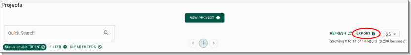
Fig. 1. Export button shown throughout object interfaces, at the right of screen
The CSV file will appear on the top right of your screen. Click to open.
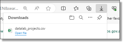
Fig. 2. Downloaded report
What export information is available
Table. 1. Export information
| Export from view | Contains |
| Projects |
|
| |
| |
| |
| |
| |
| |
| |
| |
| |
| |
| |
| |
| Virtual Machines |
|
| |
| |
| |
| |
| |
| |
| |
| |
| |
| Users |
|
| |
| |
| |
| |
| |
| |
| |
| Products |
|
| |
| |
| Packages |
|
| |
Desktop Sessions To apply the formulas during exporting, refer to the code on the right hand side of the table |
needs conversion =DATEVALUE(MID(G4,1,10))+TIMEVALUE(MID(G4,12,8))+(10/24) when in excel you will then need to format the cells · right click menu, Format cells... · pop up box appears, select Time · select first type and press ok |
needs conversion =DATEVALUE(MID(G4,1,10))+TIMEVALUE(MID(G4,12,8))+(10/24) when in excel you will then need to format the cells · right click menu, Format cells... · pop up box appears, select Time · select first type and press ok | |
needs conversion =CONCATENATE(TEXT(INT(D4/1000)/86400,”[hh]:mm:ss”)) *should display correctly so no need to format cells | |
| |
| |
Start and end time display in UTC, to convert to AEST (+10) use: =DATEVALUE(MID(G4,1,10))+TIMEVALUE(MID(G4,12,8))+(10/24) G4 is the cell with the UTC date/time | |
| Organisations |
|
| |
| |
| Action Log |
|
| |
| |
| |
| |
| |
| |
| |
| |
|
Hardware usage dashboard
An integrated hardware usage dashboard is available to SEADpod owners, providing interactive system usage metrics incurred by the SEADpod. The dashboard is an additional tool to help with tracking costs at the pod, project, and user levels. It does not show the total SEADpod charges, or Azure costs that cannot be attributed directly to the SEADpod. The costs displayed on the dashboard are for preview purposes only and should be considered indicative. Final billing may be subject to change. The ABS will continue to monitor the costs incurred by individual SEADpods and will provide regular usage reports to SEAD administrators.
To access the usage dashboard, as a SEADpod owner, navigate to the ‘Hardware Usage’ tab

Fig.1. Hardware usage navigation tab
Once on the interface, you can see spending over time based on the filters, grouping, and granularity you have chosen displayed on the chart which will update dynamically with the filters set.
Image
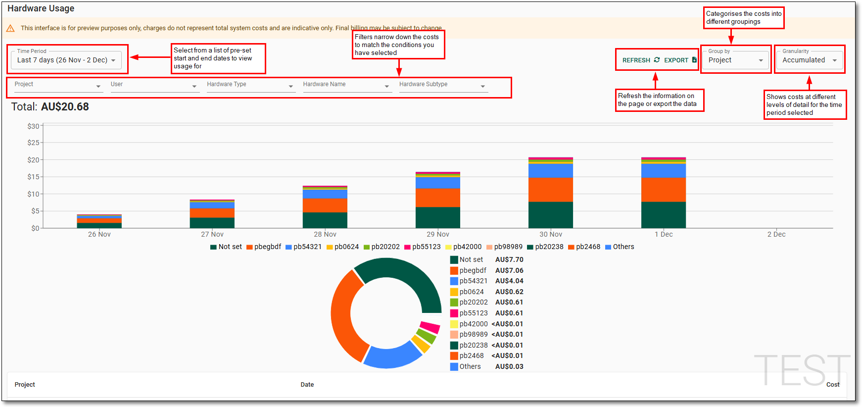
Description
Time Period: Allows you to select from pre-set start and end dates to view hardware usage for.
Refresh: Allows you to refresh the information on the page.
Export: Download a CSV report of the currently displayed data.
Group by: Categorises the costs into different groupings useful for exporting information and drilling down into costs.
Granularity: Shows the cost at different levels of detail for the time period selected. You have the option of Accumulated, daily, monthly, quarterly and totals, depending on the time period selected.
Filters: Narrow down the costs to match the conditions you have set.
The following filters are available to help track usage:
- Project: Select from the list of projectID's that have incurred costs during the selected time period.
- User: Select from the list of usernames for the user associated with the hardware that has incurred costs during the selected time period.
- Hardware Type: View aggregated SEADpod costs by the type of resource i.e. 'Virtual Machines', 'Storage', or 'Databricks'.
- Hardware Name: Identify the compute resources by the name of the hardware that incurred costs during the selected time period. In the case of VM's this is the virtual machine name, for Databricks this is the workspace name.
- Hardware Subtype: The size or part of the hardware. Provides more detailed information on the hardware types incurring costs. Hardware subtypes have been aggregated for easier reporting.
The pie graph shows the highest consumption objects and will update dynamically depending on how the dashboard has been grouped. If there are more than 10 objects, the remaining objects will be categorised under ‘Other’.
The information will also be displayed as a table and can be extracted using the ‘export’ button at the top of the page. This downloads a CSV file which separate all objects so that each object can be viewed independently.
Please note: The default ‘time period’ is the last 7 days and grouped by the project. Changes to the filters will reset to the default after navigating away from the interface.