Paper forms design standards: Layout
Introduction
The layout guidelines will help you integrate the elements for paper forms covered in other chapters to create a composite form.
Consult form design standards and finalise the questions before you begin designing the layout.
The measurements recommended are what we use because they are specific to our scanning software. Your measurements may differ.
Keep margins consistent
Use the recommended page margins for all pages in a form:
- Top: 5 mm
- Bottom: 5 mm
- Inside edge: 7 mm
- Outside edge: 5 mm
Keep all text or answer spaces inside the text and boundary line. On coloured forms, the background object colour fill must extend 5mm out to satisfy the bleed requirement. Bleed is the area on a paper form that will be trimmed off (Diagram 1).
Apply crop marks to any print job that needs to be trimmed to size. Crop marks (trim marks located in the corner) are applied during the export to PDF process and should be visible above the bleed area. A form that is not being printed will not require crop marks or bleed.
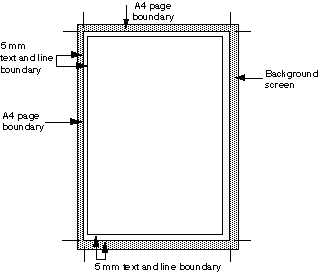
Diagram 1
Include a form identifier
Include a form identifier in the top right corner of every page for all survey forms. Placing the form identifier in the same location for all forms will help processing staff quickly identify the collection.
On the front of form, the identifier should be 14 point bold. On all other pages, it should be 12 point plain.
The form identifier should be a meaningful acronym or abbreviation of the survey's name, to help respondents recognise and reference it when communicating with you. For example, the form identifier for the Survey of Employment and Earnings is 'SEE'.
Provide an overview of the form
Include a contents list when respondents need an overview of the form to put their data in the correct place.
Forms that need a contents list are usually reasonably long or contain modules that cover quite distinct topics (Diagram 3).
Use section or part headings in the contents list.
Do not use page numbers. The contents list is not intended to help respondents skip to sections they are interested in.
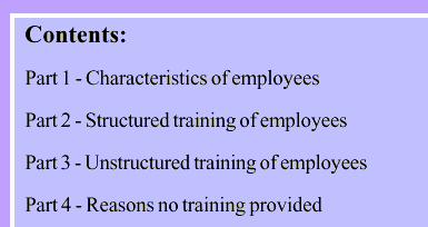
Diagram 3
Use grids to ensure consistent layouts
A layout grid is a plan that gives you the positions on a page for each of the graphic elements of the form.
Use grids to help you achieve consistent layouts.
Full page or single column layout
The full-page or single column layout creates a spread-out arrangement of questions that is often the most attractive layout. The grid for the full page allows for notes alongside answer boxes.
Use single column layouts for the front of form to minimise visual clutter.
Double column layout
A double column layout makes better use of space when there are many short questions and answers.
This layout is easier for respondents to read because of the short line width and structured linear design.
Do not use a double column layout when there is an answer box or matrix spanning the full width of the page.
Matrices
The matrix layout involves the answer box being divided into two or more columns, which may be grouped together under a hierarchy of column headings, with a set of sub-questions listed down the left-hand side of the answer box.
Avoid mixing layouts
Avoid mixing single column and double column designs on the same page.
A mixture of layouts may lead to some instructions or questions being overlooked.
A double column layout above a full-page layout can cause respondents to overlook the right-hand column at the top of the page.
Avoid placing response options across rather than down the page. The layout contrast to the rest of the form forces the respondent into a different reading pattern that can lead to error.
Avoid changing the layout too often within a form. You can use a single column on one page and a double column on another, but this should be done sparingly.
Do not use triple columns.
Use left aligned text
Text alignment (also called justification) refers to how blocks of text are arranged horizontally on a page.
Left aligned text is easier to read than centred text for paragraphs. This is because when you centre your text, the starting place of each line changes. This forces respondents to work harder to find where each line begins to continue reading. Without a straight left edge, there is no consistent place where respondents can move their eyes to when they complete each line.
However, when your paragraph text is left aligned, a straight left edge appears. Respondents can read each line by simply moving their eyes to the left edge each time. This makes your paragraphs faster and easier to read because the respondent’s eyes don’t have to work as hard to find where the line starts each time.