General forms design principles: Layout, lines, boxes and typography
Introduction
Forms design principles, style rules and conventions can help respondents to understand the survey completion task and motivate them to complete the survey.
Apply the forms design principles outlined in this chapter to all survey forms regardless of mode (the way the information is collected). More detailed principles specific to modes are included in the relevant chapters.
Refer to the Australian Government Style Manual for further guidance on style rules and conventions about the topics that are covered in this chapter.
Motivate the respondent
Motivate respondents to provide accurate data when they complete their survey form.
Use space, layout, and colours to ensure a positive user experience for respondents when they complete the form.
Tailor elements of the form so that it makes sense for the collection and increases respondent recognition. For example, the term 'Income’ in the instructions could be replaced with 'Total assets' or 'Total turnover' if it is more familiar to respondents.
Remove obstacles for respondents – e.g. complex language, dense layout, and confusing question structure.
Remove anything that is not essential for respondents to complete the form.
Many minor obstacles increase the time and effort required to complete the form. This impacts respondent motivation.
Respondents can reach a fatigue point when minor obstacles add up. A fatigue point describes a state where respondents no longer care about what answers they provide on the form, and this is reflected by the diminished quality of their responses. For example, they may start skipping questions (known as item non-response), give shorter text responses, or even abandon the survey altogether.
Be consistent
Use consistent type, graphic and layout conventions throughout your form.
Consistency reduces respondent and interviewer errors and associated processing costs.
Follow a logical sequence
A logical sequence helps respondents move forwards through the form one step at a time. This reduces errors and creates a sense of progress.
Avoid making respondents backtrack through the form (e.g. to look for instructions).
Group elements within a question closely together
The Gestalt law of proximity states that when similar items are located closely together, they belong together.
Following this law helps respondents to see each question as a whole and distinguishes it from other questions.
A question consists of several elements including the question text, notes, the answer options, and the response boxes.
All of the elements within a question should be closer to each other than they are to surrounding questions.
For example: The answer box for question 8 is closer to the top of the text of question 9 than it is to the other elements of question 8 (Diagram 1). This makes it hard to tell if the answer box belongs to question 8 or question 9.
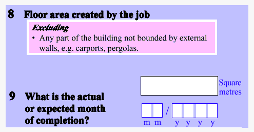
Diagram 1
Use spacing between questions in a grid to help the respondent answer them in the correct order.
When respondents must complete items going across the page (Diagram 2), there should be less space between columns than between the rows, and vice versa when the respondent is expected to read down the page.
Diagram 2
Align field labels and answer boxes
Align field labels consistently throughout a form, regardless of the type of alignment used (Diagram 3). Field labels tell the respondents about the specific information that is required from them for a particular answer space.
Diagram 3
Align answer boxes on a form, especially those for the same kind of data items. For example, all financial boxes should be aligned and all lists of 'tick/select all that apply' boxes should be aligned.
It is not necessary to align answer boxes for different kinds of data items if that makes it hard to read. For example, answer boxes for financial items do not have to align with tick boxes.
Use sentence case
Do not put whole words in capitals (upper-case).
Put text in lower case and only use capital letters as outlined below (also refer to the Australian Government Style Manual for more advice on the use of capital letters).
Use capital letters for the start of key words in form titles.
Use capital letters for the first letters of:
- sentences
- section headings
- appropriate names
- titles
- field labels.
Use capital letters for abbreviations.
Upper-case text is harder to read because words lose their distinctive shapes, and all become rectangles. Consequently, it takes longer to recognise upper-case text. This adds to respondent fatigue and is likely to create response problems.
Example: THIS PARAGRAPH IS WRITTEN IN UPPER-CASE. THE WORDS LOSE THEIR DISTINCTIVE SHAPES AND SO TAKE LONGER TO RECOGNISE. READING IS MADE MORE DIFFICULT. THIS ADDS TO RESPONDENT FATIGUE AND IS LIKELY TO CREATE RESPONSE PROBLEMS.
Use minimal punctuation
Use simple punctuation in forms.
Write instructions under 'Notes' headings as complete sentences with full stops.
Write instructions under 'Including' and 'Excluding' headings as lists without full stops.
Hyphens and dashes are used for different purposes.
- A hyphen (-) is a punctuation mark that is used to join words or parts of words. Use a hyphen within a word-break.
- An ‘en’ dash is longer than a hyphen. Use an 'en' (–) dash for indented lines of text such as presenting sub-sub-sub-questions.
Format bullets/dot points consistently
- Ensure bullets or dot points are the same size as the text they accompany.
- Left align bullets so they are under the beginning of the text heading.
Keep instructions and questions together
Instructions in a survey form includes notes, includes, excludes and definitions.
Only include instructions that are necessary and most useful for completing the survey.
Place instructions immediately after the question and before or to the left of the answer box (Diagram 4) to ensure respondents read them before answering the question.
Diagram 4
Similarly, place instructions immediately after each part of a question, and before or to the left of the answer box when the instructions only apply to that part (Diagram 5).
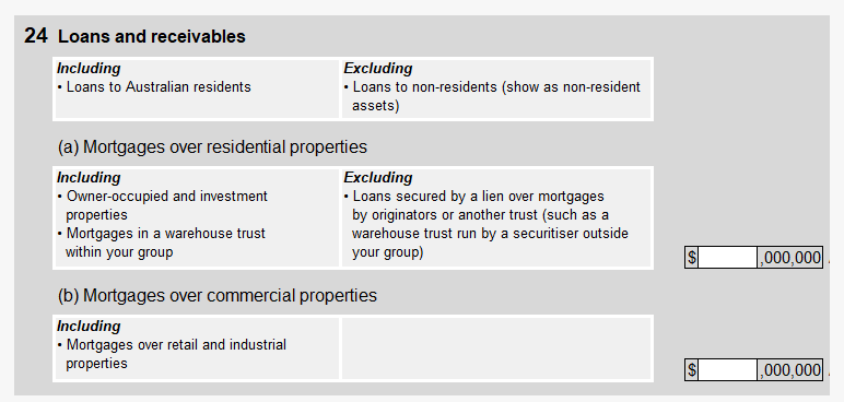
Diagram 5
Avoid placing instructions below the answer box because respondents will answer the question without reading the instructions.
Keeping instructions and questions together means that respondents only need to remember the instruction for a few seconds before applying it, which makes the task easier.
Add an instruction if an excluding item should be recorded in another question on the form. The instruction can be noted within brackets beside the excluding item using the wording, 'include in Question xx' (Diagram 6).

Diagram 6
Questions and instructions do not have to be kept together when:
- instructions apply to most of the questions
- respondents need to know what information is required in different parts of the form up front
- questions are presented in a matrix format.
Place instructions at the beginning of the form when they apply to most questions so respondents can read them before answering the questions.
Use a contents description at the start of long forms so respondents know what information is required in different parts of the form up front. The contents description could be static (e.g. contents page) or interactive (e.g. navigation panel) depending on the mode. This helps ensure that respondents do not put their data in the wrong place.
Include the unit of measurement
Present units of measurement to the right of the answer box to make it clear to the respondent what is required.
Example: Questions that ask for weight of production, construction area added, or size of property reported for should include kg, m2 and ha respectively.
Financial items are generally stated in thousands of dollars (i.e. $ ,000) to ensure consistency across forms (Diagram 7).
Place commas in the response field for large numbers.
For dollar amounts, place the dollar sign to the left and thousands of dollars to the right of the answer box.
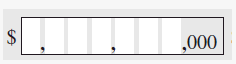
Diagram 7
Financial items can be rounded to the nearest whole dollar when very small values are expected from a significant number of respondents and it is important to know how many respondents are involved in that particular economic activity, regardless of the size of their contribution.
Write a label for every field
Use short and clear text for field labels to describe the information that respondents should provide.
Include 'hint text' or 'help text' when it is important for respondents to provide information in a particular format (Diagram 8). Position the help text between the label and input field. Avoid using ‘placeholder text’ that is usually located in the type-in field because it disappears when a respondents clicks into the field.
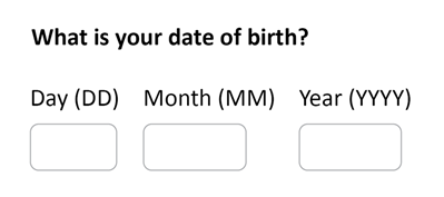
Diagram 8
Hint text is optional when other features of a form already provide some information about the required format. For example, digit boxes in paper forms provide information about how respondents should report the date (Diagram 9).
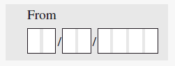
Diagram 9
Allow respondents to provide feedback
Seek feedback from respondents to gain valuable information about various aspects of the form including design, content, data, and burden. The specific wording can be tailored to the survey.
Ask respondents for their comments on:
- the information they have provided
- any difficulties they may have encountered in providing the information that was requested
- questions that have been difficult to answer
- what they think can be done to improve the form.
(See Diagram 10 and Diagram 11).
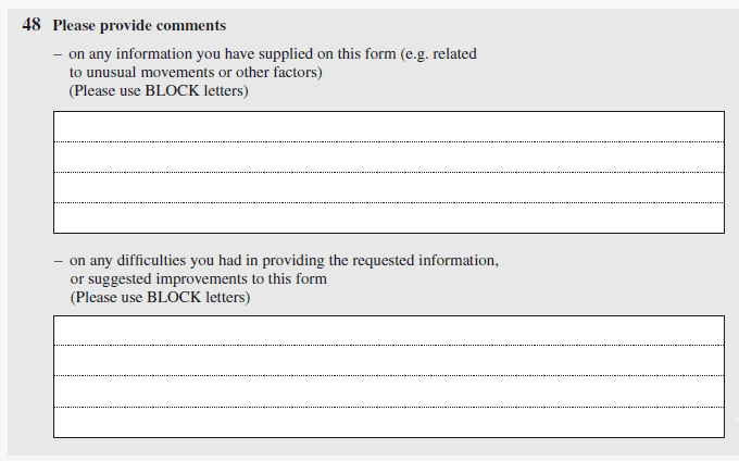
Diagram 10
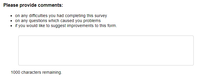
Diagram 11
When testing a form, ask respondents to tell you about their general experience completing the form (Diagram 12).
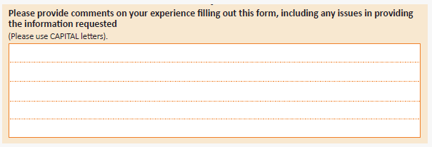
Diagram 12
Ask respondents the time it has taken them to complete the form (Diagram 13). This provides an indication of respondent burden. For some surveys additional instructions can be added, particularly when record checking is involved, and multiple people are required to fill out the form (Diagram 14).
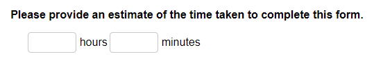
Diagram 13
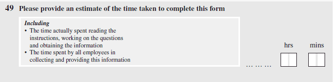
Diagram 14
Additional resources
Refer to the Australian Government Style Manual. This manual contains comprehensive information about style rules and conventions. It is the standard for Australian Government writing and editing to inform the general presentation of text.
The following case study on the redesign of Centrelink forms also contains information about general forms design principles: Redesigning Centrelink forms.