Latest release

ABS Forms Design Standards

Best practice advice for anyone involved in question development, visual and experience design, and testing of survey forms

Reference period
2023
Released
11/08/2023

About the ABS Forms design standards

This manual is designed for you to use as a resource. It will help you create statistical survey forms that collect good quality data and minimise respondent burden. 

The Forms design standards combines external and internal ABS scientific research to evidence-based principles and recommendations. These will help you create survey forms that are easier for respondents to understand and complete.

Forms design is a distinct field of scientific study that draws from disciplines such as:

  • Cognitive psychology
  • Social psychology 
  • Behavioural economics
  • Usability and accessibility 
  • Design and communications 
  • Applied statistics.  

Completing a survey is a unique activity which is influenced by each respondent's own characteristics and experiences. A respondent’s understanding of the survey completion task and their motivation to complete it are essential to getting the most useful and accurate responses from them.

The principles and recommendations in the manual provide prescriptive advice to support routine forms design activities, as well as more complex and unusual forms design issues. The standard designs and wording reflect those used in ABS forms.

How to use this manual

Use this manual when you design or develop forms for statistical surveys.  

This manual can also be used to guide the design and development of other kinds of forms (e.g. internal staff surveys and administrative forms such as compliance reporting or application forms).  

Use the manual in conjunction with other resources relating to survey content and materials. 

The term 'respondent' is used in this manual to mean the person who actually fills out the form or interacts with the interviewer.   

Examples included in this manual are illustrative only. They are a visual aid to provide an idea of what a particular principle or recommendation may look like in practice. The examples do not necessarily reflect the ABS standard question wording or represent the most up-to-date version of a particular question or layout. 

This manual does not cover absolutely everything related to forms design. There are also many other resources that cover forms design topics from a different angle or cover certain topics in more depth. Details of additional resources are provided at the end of each chapter where appropriate. 

General forms design principles: Layout, lines, boxes and typography

Introduction

Forms design principles, style rules and conventions can help respondents to understand the survey completion task and motivate them to complete the survey.

Apply the forms design principles outlined in this chapter to all survey forms regardless of mode (the way the information is collected). More detailed principles specific to modes are included in the relevant chapters.  

Refer to the Australian Government Style Manual for further guidance on style rules and conventions about the topics that are covered in this chapter.

Motivate the respondent

Motivate respondents to provide accurate data when they complete their survey form.

Use space, layout, and colours to ensure a positive user experience for respondents when they complete the form.

Tailor elements of the form so that it makes sense for the collection and increases respondent recognition. For example, the term 'Income’ in the instructions could be replaced with 'Total assets' or 'Total turnover' if it is more familiar to respondents.

Remove obstacles for respondents – e.g. complex language, dense layout, and confusing question structure.

Remove anything that is not essential for respondents to complete the form.

Many minor obstacles increase the time and effort required to complete the form. This impacts respondent motivation.

Respondents can reach a fatigue point when minor obstacles add up. A fatigue point describes a state where respondents no longer care about what answers they provide on the form, and this is reflected by the diminished quality of their responses. For example, they may start skipping questions (known as item non-response), give shorter text responses, or even abandon the survey altogether.

Be consistent

Use consistent type, graphic and layout conventions throughout your form.

Consistency reduces respondent and interviewer errors and associated processing costs.

Follow a logical sequence

A logical sequence helps respondents move forwards through the form one step at a time. This reduces errors and creates a sense of progress.

Avoid making respondents backtrack through the form (e.g. to look for instructions).

Group elements within a question closely together

The Gestalt law of proximity states that when similar items are located closely together, they belong together.

Following this law helps respondents to see each question as a whole and distinguishes it from other questions.

A question consists of several elements including the question text, notes, the answer options, and the response boxes.

All of the elements within a question should be closer to each other than they are to surrounding questions.

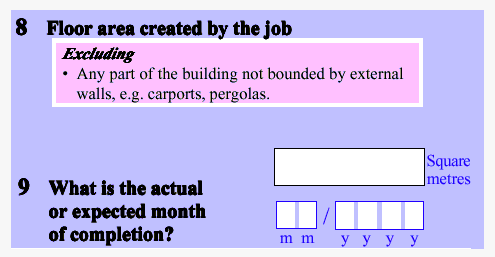
For example: The answer box for question 8 is closer to the top of the text of question 9 than it is to the other elements of question 8 (Diagram 1). This makes it hard to tell if the answer box belongs to question 8 or question 9.  

An example of a survey form that has not followed the Gestalt law of proximity.

Diagram 1

Use spacing between questions in a grid to help the respondent answer them in the correct order.

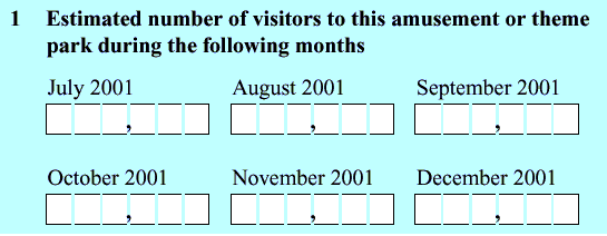
When respondents must complete items going across the page (Diagram 2), there should be less space between columns than between the rows, and vice versa when the respondent is expected to read down the page.

Example of a survey form where respondents are required to complete items across the page, e.g., Estimated number of visitors up to 6 digits for the months of: July 2001, August 2001, September 2001, new line: October 2001, November 2001, December 2001..

Diagram 2

Align field labels and answer boxes

Align field labels consistently throughout a form, regardless of the type of alignment used (Diagram 3). Field labels tell the respondents about the specific information that is required from them for a particular answer space.

Extract from a survey form where field labels are left aligned and sit above the answer boxes.

Diagram 3

Align answer boxes on a form, especially those for the same kind of data items. For example, all financial boxes should be aligned and all lists of 'tick/select all that apply' boxes should be aligned.

It is not necessary to align answer boxes for different kinds of data items if that makes it hard to read. For example, answer boxes for financial items do not have to align with tick boxes.   

Use sentence case

Do not put whole words in capitals (upper-case).

Put text in lower case and only use capital letters as outlined below (also refer to the Australian Government Style Manual for more advice on the use of capital letters).

Use capital letters for the start of key words in form titles.

Use capital letters for the first letters of: 

  • sentences
  • section headings
  • appropriate names
  • titles
  • field labels.

Use capital letters for abbreviations. 

Upper-case text is harder to read because words lose their distinctive shapes, and all become rectangles. Consequently, it takes longer to recognise upper-case text. This adds to respondent fatigue and is likely to create response problems.  

Example: THIS PARAGRAPH IS WRITTEN IN UPPER-CASE. THE WORDS LOSE THEIR DISTINCTIVE SHAPES AND SO TAKE LONGER TO RECOGNISE. READING IS MADE MORE DIFFICULT. THIS ADDS TO RESPONDENT FATIGUE AND IS LIKELY TO CREATE RESPONSE PROBLEMS.

Use minimal punctuation

Use simple punctuation in forms.  

Write instructions under 'Notes' headings as complete sentences with full stops.

Write instructions under 'Including' and 'Excluding' headings as lists without full stops.

Hyphens and dashes are used for different purposes.

  • A hyphen (-) is a punctuation mark that is used to join words or parts of words. Use a hyphen within a word-break.
  • An ‘en’ dash is longer than a hyphen. Use an 'en' (­–) dash for indented lines of text such as presenting sub-sub-sub-questions.

Format bullets/dot points consistently

  • Ensure bullets or dot points are the same size as the text they accompany.
  • Left align bullets so they are under the beginning of the text heading.

Keep instructions and questions together

Instructions in a survey form includes notes, includes, excludes and definitions.   

Only include instructions that are necessary and most useful for completing the survey.

Place instructions immediately after the question and before or to the left of the answer box (Diagram 4) to ensure respondents read them before answering the question.

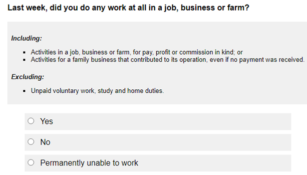
Extract from a survey form showing placement of instructions. For example: Question: 'Last week did you do any work in a job, business or farm?' New line, instruction: 'Including: Activities in a job, business or farm, for pay, profit or commission.' New line: response categories: Yes; No; Permanently unable to work.

Diagram 4

Similarly, place instructions immediately after each part of a question, and before or to the left of the answer box when the instructions only apply to that part (Diagram 5).

Extract from a survey form showing placement of instructions.

Diagram 5

Avoid placing instructions below the answer box because respondents will answer the question without reading the instructions.

Keeping instructions and questions together means that respondents only need to remember the instruction for a few seconds before applying it, which makes the task easier.

Add an instruction if an excluding item should be recorded in another question on the form.  The instruction can be noted within brackets beside the excluding item using the wording, 'include in Question xx' (Diagram 6). 

Extract from a survey form showing placement of an excluding item, e.g. 'Excluding: Delivery charges not separately invoiced or itemised to customers (include in Question 7).'

Diagram 6

Questions and instructions do not have to be kept together when:

  • instructions apply to most of the questions
  • respondents need to know what information is required in different parts of the form up front
  • questions are presented in a matrix format.  

Place instructions at the beginning of the form when they apply to most questions so respondents can read them before answering the questions.

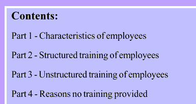
Use a contents description at the start of long forms so respondents know what information is required in different parts of the form up front. The contents description could be static (e.g. contents page) or interactive (e.g. navigation panel) depending on the mode. This helps ensure that respondents do not put their data in the wrong place.

Include the unit of measurement

Present units of measurement to the right of the answer box to make it clear to the respondent what is required.

Example: Questions that ask for weight of production, construction area added, or size of property reported for should include kg, m2 and ha respectively.

Financial items are generally stated in thousands of dollars (i.e. $ ,000) to ensure consistency across forms (Diagram 7).

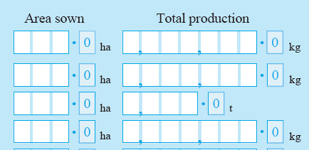
Place commas in the response field for large numbers.

For dollar amounts, place the dollar sign to the left and thousands of dollars to the right of the answer box.

Extract from a survey form showing 7 spaces (or boxes) for the respondent to record their dollar amount in the following format: $ X, X X X ,X X X, 000

Diagram 7

Financial items can be rounded to the nearest whole dollar when very small values are expected from a significant number of respondents and it is important to know how many respondents are involved in that particular economic activity, regardless of the size of their contribution.

Write a label for every field

Use short and clear text for field labels to describe the information that respondents should provide.

Include 'hint text' or 'help text' when it is important for respondents to provide information in a particular format (Diagram 8). Position the help text between the label and input field. Avoid using ‘placeholder text’ that is usually located in the type-in field because it disappears when a respondents clicks into the field. 

Instructions placed next to the label above the answer box show what format to enter your Date of birth: Day (DD)/Month (MM)/Year(YYYY)

Diagram 8

Hint text is optional when other features of a form already provide some information about the required format. For example, digit boxes in paper forms provide information about how respondents should report the date (Diagram 9).

Extract from a survey form showing 2 digit boxes for day and month, and 4 digit boxes for year.

Diagram 9

Allow respondents to provide feedback

Seek feedback from respondents to gain valuable information about various aspects of the form including design, content, data, and burden. The specific wording can be tailored to the survey.

Ask respondents for their comments on:

  • the information they have provided
  • any difficulties they may have encountered in providing the information that was requested
  • questions that have been difficult to answer
  • what they think can be done to improve the form.

(See Diagram 10 and Diagram 11).

Extract from a survey form showing two large free text boxes for respondents to provide feedback specifically on problems providing information and questions that were difficult to answer.

Diagram 10

Extract from a survey form showing a single free text field for respondents to provide general comments. The field clearly states the character limit for the field at the bottom left e.g., 1000 character limit.

Diagram 11

When testing a form, ask respondents to tell you about their general experience completing the form (Diagram 12).  

Extract if a survey with a response box included at the end of the form to capture general feedback, e.g., 'Please provide comments on your experience filling out this form, including any issues in providing the information requested.'

Diagram 12

Ask respondents the time it has taken them to complete the form (Diagram 13). This provides an indication of respondent burden. For some surveys additional instructions can be added, particularly when record checking is involved, and multiple people are required to fill out the form (Diagram 14).

Extract from a survey form with two boxes provided for respondents to record the time taken to complete the form in hours and minutes.

Diagram 13

Extract from a survey form where fields have been included for respondents to record time taken to complete the form in: hours, 2 digits and minutes, 2 digits.

Diagram 14

Additional resources

Refer to the Australian Government Style Manual. This manual contains comprehensive information about style rules and conventions. It is the standard for Australian Government writing and editing to inform the general presentation of text. 

The following case study on the redesign of Centrelink forms also contains information about general forms design principles: Redesigning Centrelink forms.

General forms design principles: Question type

Introduction

The type of question you are asking has important implications for many aspects of the survey cycle beyond the data collection phase (e.g. data processing and data analysis).

Consider the following guidelines to inform decisions made when developing new questions or updating old ones:

  • determine the type of data to be collected
  • determine the answer format required
  • determine the type of measurement to be used.

Refer to the additional resources for further information about the types of questions used in surveys.

Use this chapter in conjunction with the 'Question structure' chapter which provides guidelines on asking, arranging, and presenting questions.  

Determine the type of data to be collected

Factual

Use 'factual' questions to gather facts or concrete, quantifiable information, and observable phenomena.

Responses to 'factual' questions can usually be verified through:

  • asking another similar question
  • conducting a post-enumeration study (an activity completed following a survey to evaluate the accuracy of the data collected) 
  • other independent sources of information (e.g. records and documents, another observer of the event).

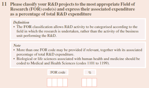
Respondents can answer 'factual' questions through checking their records (Diagram 1), recall (Diagram 2) or the use of classifications (Diagram 3). 

Funding for operational costs from federal, state and/or local government

Diagram 1

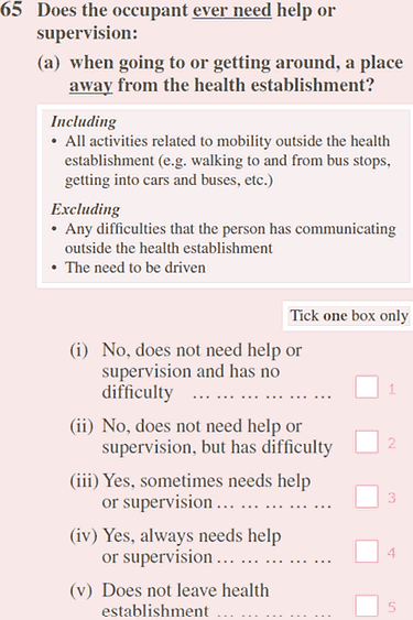
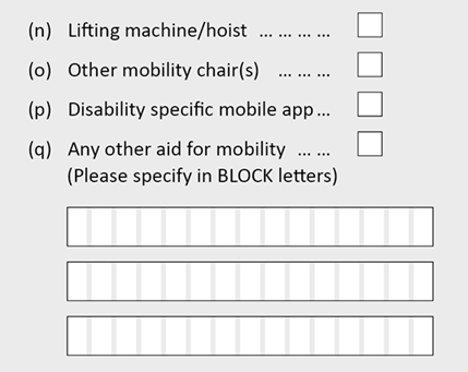
Respondents are asked to recall the level of supervision patients need for mobility outside the hospital

Diagram 2

The Field of research classification is used to categorise research and development projects.

Diagram 3

Survey questions can also be used to test factual knowledge (e.g. Who is the Prime Minister?).

Non-factual

Use 'non-factual' questions to gather information on subjective phenomena including attitudes, beliefs, awareness, knowledge, and preferences.

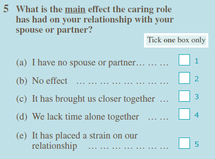
Responses to 'non-factual' questions cannot usually be verified (e.g. what motivates a business and the impact of caring on a relationship shown in Diagram 4 and Diagram 5 respectively).

Note that responses to 'non-factual' questions can be influenced by:

  • attitudes that are not fully developed
  • limited in-depth thinking around the issue
  • changes to question wording
  • context effects, including the presence of other people.
Did any of the following factors motivate this business to implement improvements to environmental management? (Tick one box per line). Responses: Compliance with government regulations was a main motivator; Compliance with government regulations was a minor motivator; Compliance with government regulations was not a motivator.

Diagram 4

Response options measure the impact caring has on a relationship. For example, No effect, It has brought us closer together, We lack time alone together, It has placed a strain on our relationship.

Diagram 5

It should be noted that the distinction between non-factual and factual questions is more of a continuum than a dichotomy. Some questions are not factual or non-factual, but rather 'somewhere in between.' For example, the following question does not fall clearly in the factual or non-factual category: 'Do you expect to be working for this (employer/business) in 12 months' time?'

Avoid the use of proxy reporting for non-factual questions (e.g. attitudinal questions) because the respondent answering questions on behalf of other household members generally could not know what another person would report.

Behavioural and hypothetical

Use behavioural questions to gather information about respondents' activities based on factual circumstances (Diagram 6).

Question asks: Last week, did you do any work at all in a job, business or farm?

Diagram 6

Make it easier for respondents to answer behavioural questions by:  

  • setting a reasonable and specific time frame (e.g. Last week...)
  • covering topics that respondents can remember easily
  • encouraging record checking, where possible. 

Also see 'Be aware of memory bias' in the 'Question structure' chapter.

Questions about behaviour can also be hypothetical (e.g. 'What would you do if...?') but these types of questions are best avoided because responses tend to be unreliable. 

Hypothetical questions are best used when respondents are familiar with the situation (e.g. asking a respondent responsible for the payroll, 'If an employee went on holidays at the end of January and was paid in advance for all of February, would you include them in the number of employees reported for the pay period ending on or before 21 February?').

Demographic

Include demographic questions so that the main groups of respondents can be identified (e.g. by age, industry etc.). This can help explain the survey findings.

Place demographic questions at the end of the survey where possible because:

  • they are not 'simple' starter questions (topics such as sex and age can be sensitive and complicated for some respondents)
  • the added context of the survey content encourages respondents to answer honestly
  • it helps ensure details for the right respondent are captured if more than one person is completing the questionnaire.

They can be placed at the start of the survey in some circumstances, but this section should be kept as brief as possible.

Place demographic questions throughout the survey as filter or sequencing questions when necessary.

Determine the answer format required

There are three types of questions: open-ended, closed and partially-closed.

The answer format determines the degree of freedom respondents have when answering a question.

Consider the following factors when determining which question type to use

  • The level of detail that data users require (e.g. for 'total income' respondents can either select from an income range or write in an exact dollar amount)
  • What information is potentially available from the respondent (e.g. do respondents have enough detailed information to report an exact dollar amount?)
  • The position of the questions in the form
  • Whether the survey is a one-off or a continuing request
  • Whether it is a sensitive question (also see 'Carefully consider where sensitive questions are placed' in the 'Question structure' chapter)
  • How the data will be processed (e.g. captured electronically or manually coded)
  • Availability of your organisation's resources (e.g. time, money, staff)

Test the question to determine whether the correct type has been selected. 

Open-ended questions

Open-ended questions allow respondents to freely enter their answer, rather than having to select from options (Diagram 7).

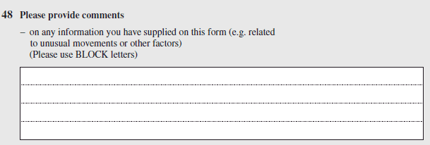
Free text field asking respondents to provide any comments on 'this job'.

Diagram 7

Ensure the size of the answer box is appropriate for the expected responses, with a larger box for longer responses (Diagram 8), and a smaller one for shorter responses (Diagram 9).

Large free text field has at 4 or more lines for people to write in their response

Diagram 8

Free text field has 3 lines to record their answer

Diagram 9

Provide examples or directions on how to answer an open-ended question (Diagram 10).

Question with examples: Please describe the activity from which this business derives its main income (e.g., road freight transport, footwear retailing, house building, real estate property management)?

Diagram 10

Advantages of open-ended questions are that they: 

  • allow many possible answers
  • obtain the exact value from a wide range of possible values
  • add richness to responses that is difficult, or impossible, to achieve through closed questions
  • determine the range of possible answers and the availability of the data being sought during initial testing
  • can speed up an interview because there are no response options for the interviewer to read aloud.

Disadvantages of open-ended questions are that they:  

  • are time consuming to answer. Respondents must write out or verbally formulate an answer compared to selecting a response in a close-ended question
  • are more resource intensive to process manually where a coding frame is used to interpret responses. This is because responses will often differ in detail and accuracy making them difficult to categorise (Diagrams 11a and 11b) 
  • can be difficult when electronic scanners can not accurately recognise poor handwriting, especially numbers, when using paper forms that rely on Optical Character Recognition (OCR)

  • can be difficult for interviewers to code or write verbatim responses depending on the level of detail respondents provide.

What is your occupation? Response: 'Clerk'

Diagram 11a

What is your occupation? Response: 'Trainee sales clerk in a life insurance company.'

Diagram 11b

Closed questions

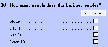
Closed questions require respondents to select an answer from a list of response options (Diagram 12).

'How many people does this business employ? (Tick one box)'. Response options: None; 1 to 4; 5 to 10; Over 10.

Diagram 12

Include instructions that tell respondents how they should complete closed questions. These instructions can be placed in the 'Please read this first' box (Diagram 13), included in caption headings (Diagram 14) and mentioned in instructions specific to the question (Diagram 15).

'Please read this first' is centred, followed by 3 dot points: Please complete a separate form for each person in this dwelling, including children aged less than 15; For children aged less than 15, answer Part 1 - General information, Questions 1 to 7 only; Answer questions by ticking the appropriate box, or where required, by writing in an answer.

Diagram 13

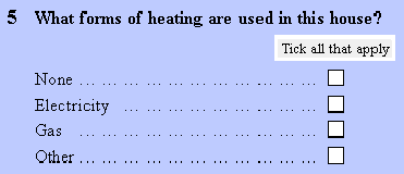
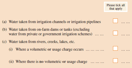
Caption heading placed above answer boxes: 'Please tick all that apply'.

Diagram 14

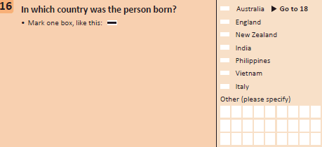
Question specific instruction: 'Is the person an Australian citizen? (Mark one box, like this (answer field is marked with a black line).

Diagram 15

Use terminology that makes sense for the survey mode when providing instructions for completing closed questions such as 'tick' in paper forms (Diagram 14) and 'select' in web forms (Diagram 16).

Web form uses: 'Select one per row' rather than 'Tick all that apply'.

Diagram 16

Do not instruct respondents to circle the appropriate option or cross out incorrect options.

Response options for closed questions must adhere to the following principles:

  • Cover all possible response options, ensuring the list is exhaustive with no possible answers left out or implied.  
  • Include options that cater for a zero, 'not applicable', 'don't know' or 'prefer not to answer' response if it makes sense for a particular question.
  • Ensure that the response options provided reflect the respondents' characteristics or experience.
  • Keep the list of response options to a manageable length.
  • Ensure response options are self-explanatory.
  • Use words and terms in the response options that are familiar to respondents. Test the question to ensure respondents understand the words as intended.
  • Ensure that all response options for a particular question are mutually exclusive. Do not overlap your response categories.

For example:

Do say

  • Under 1 year
  • 1 year and under 5 years
  • 5 years and under 10 years
  • 10 years or more

Don't say 

  • 1 to 5 years
  • 5 to 10 years
  • Over 10 years

Consider the advantages of closed questions which include:

  • comparatively less effort for respondents to answer as an exact value is not needed
  • less time taken to complete the survey because respondents can generally select their answer from a list of response options
  • the ease and cost effectiveness of processing data because nearly all the responses can be anticipated
  • making a question less sensitive (e.g. asking respondents to select from a personal income range is less sensitive than asking for an exact dollar value).

Consider the disadvantages of closed questions which include:

  • the effort required to develop well-crafted questions that avoids the need for respondents to qualify their answers
  • difficulty in developing comprehensive lists of response options
  • slower administration during interviews if a running prompt needs to be used, where each response option is read out and respondents must indicate whether it applies to them or not 
  • repetition when rating scales are used (e.g. satisfied/dissatisfied) in a personal interview because the scale must be verbally presented to the respondent each time it is used.

Partially-closed questions

A partially-closed question is a mixture of an open-ended and closed question. Respondents can select an answer from a list of response options but also have the option of writing-in a response that is not on the list (Diagram 17).

Present partially closed questions by placing the list of pre-determined response options first and ending the list with an 'Other (please specify)' option followed by an appropriately sized answer box.

Partially closed question: 1. Nurseries, cut flowers or cultivated Turf; 2. Grapevines; 3. Other crops (please specify).

Diagram 17

Consider the advantages of partially-closed questions which include:

  • the ease and cost effectiveness of processing data compared to open questions 
  • being able to still use a closed question format even when there is uncertainty around whether the list of response options is comprehensive
  • having a format that is ideal for dress rehearsals or a pilot test instrument to help develop a more comprehensive list of response options for the final instrument.

Consider the disadvantages of partially-closed questions which include:

  • instances where respondents restrict their responses to the choices that are explicitly offered and not use the 'Other (please specify)' option
  • greater demand on office processing if the response options are not comprehensive and the 'Other (please specify)' option is used extensively.

Determine the type of measurement to be used

Types of measurement include nominal categories, ranking questions, rating scales and numeric quantities.

Select the type of measurement to be used for data collection carefully because it impacts subsequent statistical procedures that can be used for data analysis.

Nominal categories

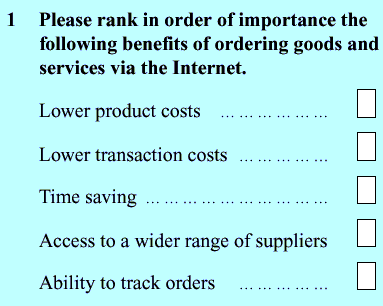
Avoid ranking questions

Rating scales

Numeric quantities

Additional resources

Bryman, A. (2012). Social research methods. Oxford University Press.

Walliman, N. (2011). Research methods: The basics. Routledge Taylor & Francis Group.

General forms design principles: Question structure

Introduction

The way questions are asked influences how well a survey works.

When designing or developing any survey, it is important to conduct testing with actual respondents to find out whether the questions can be understood and answered accurately. Following the guidelines alone cannot ensure that questions will work as intended by the researcher. 

Refer to the Language chapter when designing or developing survey questions. 

Follow basic guidelines for designing questions

Consider the following factors when you design questions

  • The data needs of users
  • The level of accuracy needed
  • Whether data is available from the respondent
  • Whether the language used is appropriate for respondents
  • The data item definitions, standard question wordings and any other relevant information (e.g. accounting standards, or classifications)
  • The office processing system you are using, including editors, data entry staff, OCR etc.
  • The sequencing, or order of questions
  • The answer space required for each question.

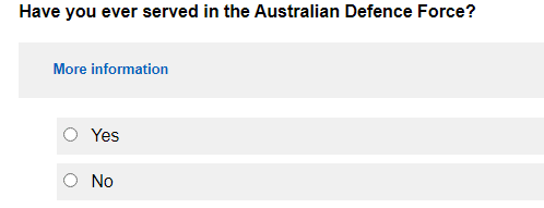
A question in a survey is any set of words which ask the respondent to give information. For example, 'Have you ever served in the Australian Defence Force?' (Diagram 1).

Example of a survey question

Diagram 1

A question can have subsidiary questions, often called 'sub-questions'. Sub-questions are additional questions that help to answer your main question (Diagram 2).  

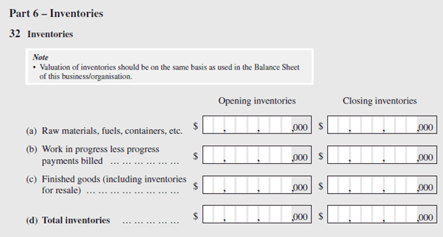
Asking about 'Raw materials, fuels, containers, etc.', and 'Work in progress less progress payments billed' are examples of sub questions. These are related to the main topic which is inventories.

Diagram 2

For financial data items in business survey forms, use captions or items based on accounting standards which are well understood by respondents. A question consisting of a caption or item only, does not use a question mark or any other punctuation such as a full stop (Diagram 3). 

Income items: 1. Income from services (report net of discounts given) 2. Sales of goods (report net of discounts given)

Diagram 3

Avoid joining separate concepts together in a question. These double-barrelled questions are characterised by using the conjunctions 'and' and 'or'. 

Double barrelled questions are cognitively difficult to answer because only some of the concepts may apply to the respondent, or all may apply but in opposite directions. Respondents are therefore more likely to make mistakes when answering these questions or skip over them altogether. An example of a double barrelled question is: How often and for how long do you visit the gym per week? 

Keep questions as simple as possible. Do this by placing the broadest or most common category first and using specialised or less common categories as examples. 

For example, do ask:

  • 'Does this business use the services of a financial advisor, such as an accountant or a tax advisor?'

Don't ask:

  • 'Does this business use the services of a financial advisor or accountant or tax advisor?'

Avoid qualifiers in a question if they contain a lot of information. This can:

  • make a familiar concept seem unfamiliar
  • interfere with the respondent's grasp of the main element of a question.

Alternative ways of presenting the information from qualifiers include:

  • turning qualifiers into instructions (Diagram 4).
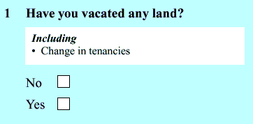
The 'including' statement in the question 'Have you vacated any land including change in tenancies?' can be presented as an instruction beneath the question text.

Diagram 4

  • placing the information from short qualifiers to the end of a question in brackets (Diagram 5).
For example: Sales of goods (report net of discounts given).

Diagram 5

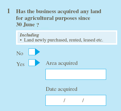
Choose a set of simple questions over one complex question (Diagram 6). 

For example, Do ask: 'Has the business acquired any land for agricultural purposes since June 30? No/Yes, provide details.' Do not ask: 'Has the business operating the holding acquired (by purchase, rent, lease etc.) or vacated (by sale, transfer for surrender of lease etc.) any land for agricultural purposes since 30 June?' Please give details below.'

Diagram 6

Use exact or precise terms for the concept and context being measured. For example, avoid using a general term like 'screen time' if you are only interested in time spent watching TV shows and not time spent playing games.

Avoid using the following when writing a question 

  • ambiguous or vague words (e.g. 'frequently' or 'average' can mean different things to different respondents)
  • acronyms
  • abbreviations
  • jargon

Use simple words.

Avoid double negatives because they make questions difficult to interpret.  

Ask questions in a balanced way

Phrase rating questions in a balanced way where both the negative and positive options are presented (e.g. "Do you favour or oppose....").

Balanced questions imply that responses in either direction are acceptable and therefore minimises bias.

Consider the following when writing the negative and positive options:

  • List the negative option first, especially for sensitive questions, to indicate that it is a perfectly acceptable response (also see 'Carefully consider where sensitive questions are placed'). 
  • Choose words for the negative and positive options that are exact opposites (e.g. 'Difficult' and 'Easy').
  • Ensure that the negative and positive options are equivalent in intensity (e.g. 'Very difficult' and 'Very easy').

Avoid leading questions

Leading questions steer respondents towards a particular answer or make some responses seem more desirable than others.

For example, asking: 'Do you believe that climate change will impact your holding?', is leading because it assumes the respondent agrees the climate is changing.

The same question could be rephrased to avoid leading respondents towards a particular answer, e.g. 'Do you consider the climate affecting your holding has changed?'

Avoid loaded questions

Avoid loaded questions. Loaded questions contain words or phrases that bring to mind powerful emotions or opinions.

For example, don't ask: 'Do you engage in behaviour that puts your health at risk such as smoking?' The phrase 'puts your health at risk' is loaded because it is likely to provoke strong emotions or opinions. Respondents will tend to react more to the loaded phrase than the issue posed in the question.

Instead, ask the question in a more neutral way, e.g. 'Do you currently smoke?'

Use examples

Including examples is important because it can help:

  • clarify the meaning of a question
  • increase the level of detail reported
  • reduce the level of inaccurate responses by helping people remember information that they would not have otherwise recalled (also see 'Be aware of memory bias.').

Consider the following guidelines when determining the type and number of examples that are provided in questions:

  • Include both common (e.g. eating carrots) and unusual (e.g. eating celeriac) examples. This will aid recall of common as well as more infrequent or unusual events.
  • Keep the list of examples short. Longer lists may be incorrectly interpreted by the respondent as an exhaustive list from which to choose an answer.
  • Test questions to help identify those that require examples to help clarify their meaning and determine the number of examples required.

Be aware of order effects

A list of response options can be ordered or unordered.

Ordered response options are arranged in a particular sequence.

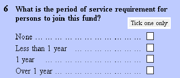
Ensure a list of options is ordered whenever there is an inherent order (Diagram 7). 

Ordered list based on length of service: None, Less than 1 year, 1 year, Over 1 year.

Diagram 7

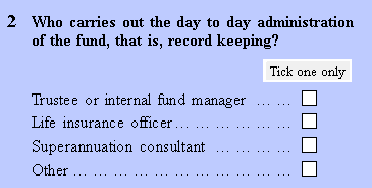
Unordered response options (Diagram 8) have no inherent order that offers a natural graduation of answers (also see 'Nominal categories' in the 'Question type' chapter).

For example: Trustee or internal fund manager, Life insurance officer, Superannuation consultant, Other.'

Diagram 8

Be aware of order effects where the order in which the response options are presented influences the respondent's answer.  For example, the respondent may interpret the options as having an order that was not intended. This perceived order could lead the respondent to misinterpret the question or give inconsistent answers.

Order effects are more pronounced in longer lists of unordered response options. For example, respondents might only select the first few options of a long list, so they don't have to read the others.

There are two common types of response order effects:

  • Primacy effects mean that options presented earlier are more likely to be selected. These are prevalent in self-administered surveys.
  • Recency effects mean that options heard last by the respondent are more likely to be selected. These tend to occur in interviewer-administered surveys.

Use a split sample experiment during the testing stage to assess whether response order effects are likely to be problematic. 

Reducing the cognitive demands for respondents will help counter both order effects and also satisficing behaviour where respondents choose the first adequate response option rather than carefully considering each one. 

Consider the following solutions if pre-testing shows that response order effects are likely to be an issue:

  • Keep the question wording simple.
  • Ensure the survey is as short as possible.
  • Place the most common answer first (which also reduces the reading that respondents must do).
  • List the options randomly for web forms or computer-assisted interviewing instruments.
  • Counterbalance the order in which response alternatives are presented by giving a random half of respondents one order, and the other half the reverse order if using a paper form.
  • For multi-modal surveys, use the same method to manage order effects across modes (e.g. counterbalancing for both web and paper form).
  • Use two orders for rating scales (i.e. negative to positive or positive to negative).
  • Include no more than ten options on the list if the items contain two or three words.
  • Aim to have a maximum of five options if each item is longer than two or three words. 
  • Ensure that all response options are as grammatically similar as possible (e.g. how it is phrased, the length of the items).
  • Categorise response options into groups or sub-questions.

Be aware of context effects

The order in which questions are placed can produce context effects. When preceding questions influence the response to later questions it can lead to bias and error.

Consider these opposite approaches to manage context effects depending on why general questions are included:

  • Use the 'funnel principle' by placing general questions first followed by detailed and specific questions. General questions are more susceptible to influence from more detailed and specific questions than vice versa.
  • Use a 'specific-first order' by placing questions covering specific topics before the more general question (e.g. providing a breakdown of income before providing 'total income' or an 'overall satisfaction' rating at the end of a list of contributing aspects).  Ordering questions in this way 'creates' a controlled context effect where respondents are encouraged to consider specific topics before answering a more general question.
  • This helps to reduce both bias and the diversity of interpretation.

Use classifications for factual questions

Use classifications for factual questions (see 'Factual questions' in the 'Question type' chapter).

Formal classification systems attempt to describe something which is almost infinitely varied in structured categories (e.g. Australian and New Zealand Standard Industrial Classifications (ANZSIC)).

There are two key challenges related to using formal classification systems:

  • It can be difficult to ensure a consistent understanding of the classification categories, particularly the residual (i.e. "other") categories, as the full range of things these categories include may not be clear.
  • The formal classification may not correspond to the informal classification systems respondents use.

Be prepared to adapt formal classifications to get useful answers from respondents.

Consult organisations responsible for statistical standards for guidance. The Australian Bureau of Statistics standards and classifications should be used where applicable. 

Use testing

Use testing to find out how well:

  • respondents understand the categories used in the classification
  • the categories apply to respondents' circumstances
  • interviewers can code the responses.

For paper forms, investigate the following solutions in the order listed if testing shows that respondents might find it hard to use the classification:

  • Maintain the conceptual basis of the classification categories but change the examples of the categories to suit the population of the survey.
  • Use specifically designed response categories and map these to the output classification after the data has been collected.
  • Include a partially-closed question in the classification to give respondents (or the interviewer) the opportunity to provide different responses (Diagram 9).
For example, a 'Please specify' free text field allows respondents to enter a different response.

Diagram 9

Use open-ended questions only and interpret the responses according to the formal classification system (Diagram 10).

For example, when asking for a person's occupation, a free text field allows respondents to write in a response. The response can then be coded to an appropriate occupation classification item in the office.

Diagram 10

Consider using an open-ended question with a coder for web forms or a computer-assisted interviewing instrument. A trigram coder, for example, dynamically codes the open text response. The user (either the respondent or interviewer) types in the first three letters of the response, then selects the correct option from a list that pops up in a separate window.

Test all the alternatives before deciding on the best method for your survey.

Include explicit 'Don't know, 'Not applicable' or 'Refusal' response options where valid

For multi-modal surveys, ensure that 'don't know' and 'not applicable' options offered to respondents are equivalent across modes. For example, if a 'don't know' option is offered in the self-administered mode (e.g. web form), consider whether the same option should be explicitly offered in the interviewer-administered version.

Self-administered surveys

Be clear about what you want respondents to do when questions do not apply to them or if they don't know the answer to the question.

Consider the following options that eliminate the need for a 'not applicable' response option:

  • Instruct respondents to leave answer boxes blank when they have no response or data to enter. This option is suitable for surveys that contain mostly factual questions and when sparse data is expected. For example, for some business surveys, respondents may not have data to enter for a large portion of the questions so instructing them to leave the boxes blank creates a better user experience. 
  • Use a filter or sequencing question to instruct respondents to skip past questions that are not applicable to them or that they do not have an answer to.

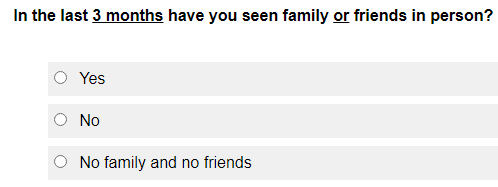
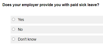
Avoid other types of questions that allow respondents to correctly leave the answer space blank when they have been sequenced to that question. These questions make it unclear whether the respondent should have recorded an answer or not. Include a 'not applicable’ or 'don't know' response option to allow respondents to indicate they do not think the question applies to them or that they have no knowledge of that topic (Diagram 11 and Diagram 12).

In the last 3 months have you seen family or friends in person? Response options: Yes; No; No family and no friends (not applicable option)

Diagram 11

Does your employer provide you with paid sick leave? Response options: Yes; No; Don't know (not applicable option)

Diagram 12

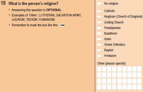
Placing the 'not applicable' option at the top of the response options list (Diagram 13) is appropriate when:

  • it is a factual question 
  • respondents are likely to be confident in their answer 
  • acquiescence (i.e. where respondents tend to simply agree to everything) is not expected
  • reading through the entire list of response options creates unnecessary respondent burden
  • it is needed to act as a filter question because there is a lack of space on paper forms for a separate filter question. 
The question asks: What is the person's religion? The first response option listed is: No religion.

Diagram 13

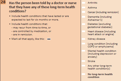
Placing the 'not applicable' option at the end of the response options list (Diagram 14) is appropriate when:

  • acquiescence is anticipated
  • misinterpretation of the question scope or other confusion is expected
  • it is important to encourage respondents to consider the entire list of response options.
Has the person been told by a doctor or nurse that they have any of these long-term health conditions? Response option: 'No long-term health condition' is listed last.

Diagram 14

Make 'don't know' and 'not applicable' options visually distinct, if possible (e.g. different colour, a vertical line separating this option, use bold) (Diagram 14).

Instruct respondents to record zero when they need to indicate a particular result (Diagram 15) or demonstrate that they have read a particular question when sequencing errors are anticipated.

Note: Complete failure (bold text for emphasis) of any crop should be noted by '0' in the Total production (bold text for emphasis) column, but the area of the crops that failed should still be reported (bold text for emphasis)..

Diagram 15

Interviewer-administered surveys

Include non-substantive response options (e.g. 'Don't know', 'Not applicable, 'Refusal') for interviewers to use when respondents:

  • indicate that they don't know the answer
  • indicate that the question is not applicable to them
  • refuse to answer the question
  • are reporting as a proxy on behalf of another household member.

Use filter or sequencing questions to guide respondents

A filter or sequencing question asks respondents to make a choice, where one answer leads them to the next question, and the other to a different question or place on the form.

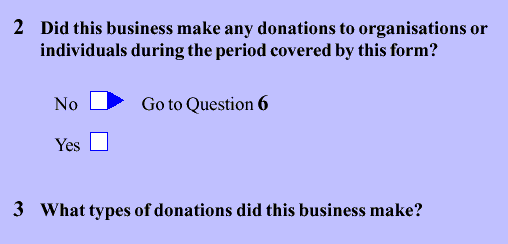
Use a filter or sequencing question to help the respondent understand the sequence of questions and skip past questions that are not relevant to them (Diagram 16).

Filter question: Did this business make any donations to organisations or individuals during the period covered by this form? If 'No' respondents are sequenced to Question 6.

Diagram 16

Place the sequenced response first in filter questions. This takes the respondent to a subsequent question without having to read the other option.

Ensure respondents are given enough information to select the applicable response option in a filter question by providing instructions (e.g. definitions, 'Including', 'Excluding') and clearly wording the response options (Diagram 17).

Does this business operate an agricultural holding/holdings in more than one shire? Including: All land you lease or rent from others; All road permits. Excluding: All land you lease or rent to others; All land operated elsewhere by you under a sharefarming agreement. Response options: No, operates in only one location, shire or Local government area - Go to Question 4; Yes, operates in multiple locations, shires or local government areas.

Diagram 17

Include a 'none of the above' option at the end of the response options with the sequencing instruction where it is appropriate (Diagram 18).

Did this business experience any of the following IT security incidents or breaches during the 12 months to 30 June? Response options: Virus; Trojan or worn; Unauthorised network access; Other; Non identified, go to Question 13.

Diagram 18

Avoid using filter questions towards the end of the survey. Respondents' motivation to provide optimal responses may wane as they progress through the survey. Consequently, they may select a response that helps them avoid answering further questions.

Avoid strongly worded filter questions.  For example, 'Have you read enough about [topic] to have an opinion?'  as opposed to 'Do you have an opinion on [topic] or not?'.

Strongly worded filter questions may discourage respondents from expressing their opinion (e.g. selecting a 'no' response) because it suggests a high level of knowledge is needed to answer the question. This may intimidate respondents who feel that they might not be able to adequately justify their opinions.  

 Do not use filter questions for sensitive topics because they discourage reporting (also see 'Carefully consider where sensitive questions are placed.'). Respondents may avoid options that project a socially undesirable image of themselves. This is more likely to occur in interviewer-administered than self-administered surveys.

Choose filter questions over conditional questions. For example, don't ask: 'If this business has a parent company, what is its name?' With a conditional question it is unclear whether a blank answer is a non-response or if the question has been correctly interpreted by the respondent.

Use computer-assisted or web surveys with automatic sequencing when there is a large amount of complex sequencing to avoid errors.

Be aware of memory bias

Answers to factual questions can be biased and subject to error because respondents may:

  • 'remember' what should have been done rather than what was done
  • recall salient events more accurately and over longer periods, including events that are of importance or interest to them, and events that happen infrequently.

Respondents may also report that an activity happened during the reference period when it actually occurred before or after the reference period (called telescoping). For example, data from the question in Diagram 19 may be inflated by those who bought a car 13 months ago or more.

Did you buy a car in the last year? Response options: No; Yes.

Diagram 19

Consider the following approaches to aid recall and enhance accurate reporting:

  • Ask questions that relate to some form of record keeping (e.g. 'Did you buy a car in [YYYY]'? or 'Did you buy a car in the period of 1 January to 31 December [YYYY]?').
  • Make the reference period as short as possible. Respondents are more likely to remember their activities in the last month than in the last year.
  • Conduct testing to ensure that respondents can recall the information for the specified period.
  • Break a question down into several simple questions (Diagram 20). 
For the question: Please enter the number and approximate age of fridges and freezers currently switched on in this household? You might simplify the question and about type of fridge first, followed by the age of each fridge reported.

Diagram 20

  • Group questions dealing with the same topic together (also see 'Group questions by topic.').
  • Allow respondents to report in the unit they are most familiar with or that is most accessible to them where appropriate (Diagram 21).
How much diesel fuel did this business use in the last year? Response options: 126.6 litres or 65 gallons or $5,400 or more than last year.

Diagram 21

For interviewer-administered surveys, respondents may feel they need to answer a question quickly to avoid long pauses. Help respondents recall information to facilitate more accurate reporting:

  • Train interviewers to read the questions more slowly to promote respondent deliberation as respondents may model their behaviour on that of the interviewer.
  • Encourage respondents to take their time searching their memory (i.e. not saying the first thing that comes to mind).

Place questions in a sensible and logical order

Start with simple questions to establish and later maintain respondents' motivation to complete the survey. Respondents or interviewers will generally work through the questions in the order they appear.

Use the order of questions to facilitate a conversation, between the form and the respondent. The respondent must be able to easily understand and follow the flow of the conversation.

Help respondents navigate their way through a self-administered paper form:

  • Only include 'go to' instructions when respondents should skip questions, or where it is unclear which question, they should answer next. Without this instruction, respondents will generally answer questions sequentially
  • Ensure sequencing instructions are clear and obvious so respondents can follow them and get to the question that is relevant to them.

Use matrices sparingly as respondents: 

  • Cannot follow an obvious single path when responding and this increases their cognitive burden
  • May overlook information that is not presented in a sequential format
  • Could take longer to process information and are more likely to make errors when conceptually related information is presented separately in the row and column headings.

Be aware that in an interview, respondents may answer an early question and provide answers to a topic covered later in the survey, disrupting the flow of the survey. Help interviewers maintain the flow of the conversation:

  • Have them explain the order of upcoming questions as part of their script to make respondents aware that they have an opportunity to provide their answers at a later stage
  • Provide further guidance through their training and briefing.

Group questions by topic

Group questions about related topics together and present questions in a meaningful order. This is especially important for self-administered surveys because when respondents are confused, they may:

  • read the next question when they are not sure what the current questions means
  • review the previous question and the answer provided
  • scan the local topic context when they are not sure about the relevance of the current question topic.

Ask all questions relating to a particular topic before going on to the next one. This enhances both the comprehension and the recall of the respondent (see 'Be aware of memory bias.'). 

Keep context effects in mind (see 'Be aware of context effects.').

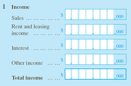
Group questions in a way that aligns with the concepts commonly understood by a particular cohort of respondents. For example, group questions related to income generated by a business together (Diagram 22).

Income: Sales; Rent and leasing income; Interest; Other income; Total income.

Diagram 22

Use sections or parts

Make the survey easier to complete by using sections or parts: 

  • Respondents may need to skip some parts and return to complete them later (e.g. some information may not be available at the time).
  • Several different people may need to enter data into the one form (e.g. accounts staff, HR staff).

Ensure the questions within the part or section are more related to each other than they are to the questions in the surrounding groups.

Ensure section and part headings are not merely replicating question text as this increases clutter without aiding comprehension.

Label the part or section with letters (e.g. Part A - General information, Part B - Employment) or numbers (e.g. Part 1 - General information, Part 2 - Income).  

Avoid using sections or parts when it is not necessary because it makes the form visually complicated.

Avoid having a section or part with only one question if possible.

Ensure parts or sections are used consistently throughout the form and that every question belongs to one. Inconsistent use will make it difficult for the respondent to tell which questions go together, and what the questions mean.  

Apply the following guidelines to paper forms that have parts or sections:

  • Start a new section or part on a new page. This helps respondents realise that the topic has changed.
  • Repeat part headings with '-continued' on even-numbered pages (i.e. 'left' pages) where a part continues over to the following page (also see the 'Typography' chapter for paper forms).
  • Do not repeat the part heading on odd-numbered ('right' pages), as the facing page already displays the part heading.
  • Continued part headings can be repeated on odd-numbered pages if desired, provided that this be done consistently throughout the form, and does not further clutter a page already full of question content.

Use sections or parts to help interviewers navigate through the questions they are asking more easily. However, interviewers should not read out the section title. If respondents need to be informed about a new section or part, interviewers will be given a script for a transition statement that is phrased in a conversational tone. For example, 'I would now like you to think about the visa you had when you first came to live in Australia. We will call this your first visa.'

Carefully consider where sensitive questions are placed

Be aware that when respondents are required to answer questions using information (e.g. health or income details) that might seem socially undesirable, they may provide a response that they believe is more 'acceptable'. This tends to be more of an issue for interviewer-administered surveys compared to self-administered surveys.

Avoid placing sensitive questions at the beginning of the form. This may contribute to non-response if respondents are unwilling to continue with the survey. Respondents will be more comfortable answering sensitive questions as they progress and build rapport with the survey or interviewer.

Avoid placing sensitive questions all together at the end of the form if this results in unrelated topics being mixed. This can be confusing and can also highlight to the respondent that the questions are supposed to be sensitive.

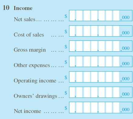
Place sensitive questions in a section of the form where they are most meaningful in the context of other questions. For example, in an Income question from an unincorporated business, the item 'owners’ drawings' might be sensitive. Putting it in the context of this question may make it less sensitive (Diagram 23). 

Income: Net sales; Cost of sales; Gross margin; Other expenses; Operating income; Owners' drawings; Net income

Diagram 23

Place less desirable options first when a sensitive question has several response options. This indicates to respondents that it is acceptable for them to choose from all the options, even the less desirable one (Diagram 24).

Example: To whom were the IT security incidents or breaches reported? (Tick all that apply). First response option listed: None were reported.

Diagram 24

Keep 'No/Yes' or 'Yes/No' options in the same order

Arrange 'No/Yes' or 'Yes/No' options in the same order throughout the form, regardless of which order you choose.

Place the least desirable answer first for 'No/Yes' (or 'Yes/No') options to counter the tendency to report socially desirable behaviour. This helps indicate that the less desirable answer is an acceptable response.

Adopt a 'No/Yes' order to help prevent acquiescence. For example, when questions are not particularly sensitive, respondents may just say 'yes' to all the questions whether it is indeed the case or not.

Format questions consistently

Present the main question text on the same line as the question number with the answer box to the right or below it. 

Include 'sub questions' if there is a strong association between the parts or if the main question is a filter to the next main question.

Label the sub-parts of a question whenever they are long or have their own instructions. This makes it clear which bits belong together.

Ensure that any sub-sub parts are quite short and simple. Otherwise, the whole question gets too complicated, and the sub-question should be turned into a main question. 

Follow the pattern 1 a, b, c, 2 a, and so on for labelling questions and sub questions.

Ensure that each labelled question has its own answer box (Diagram 25).

Do not use decimals to label questions and sub-questions (e.g. 1, 1.1, 1.2).

Inventories response table: Column headers: a) Opening inventories; b) Closing inventories; 1st line response header: a) Raw materials, fuels, containers; 2nd line response header: b) Work in progress less progress payments billed; 3rd line response header: c) Finished goods; last line header: d) Total inventories

Diagram 25

Additional resources

Barnett, Robert (1991) "Empirical bases for documentation quality", Proceedings from the first conference on quality in documentation, Centre for Professional Writing, University of Waterloo, 57-92.

Frohlich, David (1986) "On the organisation of form-filling behaviour", Information Design Journal, 5/1, 43-59.

Flynn, James (1996) "Constructing and reconstructing respondent attitudes during a telephone survey", Proceedings of the section on survey research methods, American Statistical Association, 895-899.

Jenkins, Cleo R., & Dillman, Don A. (1997) "Towards a theory of self-administered questionnaire design" Survey Measurement and Process Quality, Lyberg et al (eds), John Wiley & Sons, 165-195.

Krosnick, J.A. & Presser, S. (2010). Question and questionnaire design. In P.V. Marsden & Wright, J.D. (Eds.) Handbook of Survey Research (2nd Edition). Emerald Group Publishing Limited.

Oppenheim, A.N. (1992). Questionnaire design, interviewing and attitude measurement (new edition). London: Continuum.

Schuman, Howard, & Presser, Stanley (1981) Questions and Answers in attitude surveys: Experiments on Question Form, Wording and Context, Academic Press Inc., Orlando.

Schwarz, Norbert, & Hippler, Hans-Jurgen, (1991) "Response alternatives: the impact of their choice and presentation order", Measurement Errors in Surveys, Biemer, Groves, Lyberg, Mathiowetz & Sudman (eds), John Wiley and Sons, 41-56.

Schwarz, Norbert, Hippler, Hans-Jurgen, & Noelle-Neumann, Elisabeth (1992) "A cognitive model of response-order effects in survey measurement", Context effects in social and psychological research, Schwarz & Sudman (eds), Springer-Verlag, 187-201.

Tourangeau, Roger, & Smith, Tom W. (1996) "Asking sensitive questions: the impact of data collection mode, question format, and question context", Public Opinion Quarterly, Vol. 60: 275-304.

General forms design principles: Language

Introduction

Language plays an important role in forms design.
We need to use language carefully to help respondents understand what we are asking so they can provide the data we have requested.

Conduct testing to get a better sense of the language respondents use to describe the issues you want to measure.

Refer to the additional resources for further guidance on the use of language.

Understand your respondents

Respondents are people of all social strata who hold different perspectives.   

Use language that assumes respondents:

  • have varying levels of literacy
  • have varying levels of statistical knowledge
  • know nothing about your procedures or structures.

Use simple and clear language that all respondents can easily understand.

Write brief and meaningful form titles

Keep form titles short using as few words as possible.

Communicate the content of the form through the title. Let respondents know straight away what is being asked.

Structure the form title around two key components:

  1. a subject (e.g., Monthly Population) 
  2. a function (Survey).

Using this template, an example of a form title is 'Monthly Population Survey.'  

Add a time reference period at the end of the form title if it is applicable to the collection (e.g. business surveys). For example, 'Economic Activity Survey 2020-21.'

Aim to strike a balance between having a meaningful form title and one that resonates with the population of interest. For example, unemployed or retired respondents might think that a form titled ‘Employment survey' is not relevant to them, even though they are part of the target population. 

Create section heading that act like signposts

Communicate the specific topics in a form by using section headings.

Help respondents identify sections of a form that are relevant to them by using clear section headings. This is particularly important where respondents must manually skip over sections of a form (e.g. following 'go to' instructions when completing a paper form).

Avoid section headings that can be potentially misleading.  For example, if respondents see a section heading stating 'Cereals' they may skip over it if they only have data to report for cotton. In this instance a more specific section heading provides a more useful signpost (e.g. 'Cereals and other crops (including cotton and sugar cane)').  

Include clear instructions to guide respondents

Write clear and concise instructions to help respondents to understand:

  • what to do with the form
  • where to get help
  • how to answer questions.

Group instructions covering similar topics together. For example, instructions about what to do with the form and where to get help are grouped together right at the start of the form. In contrast, all the instructions about how to answer a particular question are placed as closely as possible to that question.

Repeat the same instruction each time it is to be acted upon. For example, an instruction telling respondents to exclude something for domestic use could be repeated throughout a form because it applies to several questions.

Use the same wording for each repeat of the instruction to help respondents interpret it quickly.

Use short sentences

Convey only a single item of information in each sentence. Short sentences are easier to understand than long ones.

Use bullet points to improve the layout of the sentences (Diagram 1).

Use of bullet points to improve layout.

Diagram 1

Keep each item on lists short

Convey only a single item of information for each point in a list (Diagram 2).

List items: All land you leased or rented from others, All land worked for you by sharefarners, All road permits.

Diagram 2

Place clauses in chronological order

Arrange clauses in the order action should be taken. This makes it easier for respondents to read the sentence and understand the instruction.

For example: 

  • Do say - 'Submit the survey form to the ABS. Once everyone in your household has completed their part of the survey, click the 'Submit' button.'
  • Don't say - 'Submit the survey form to the ABS. Click the 'Submit' button once everyone in your household has completed their part of the survey.'

Make the call to action clear

Avoid inserting an explanatory phrase between the clauses naming the respondent and the action. 

For example:

  • Do say - 'You will need to report an estimate of time taken when you have completed this form.'
  • Don't say - 'You will need to, when you have completed this form, report an estimate of time taken.'

Ask positive questions

Positive questions require a 'yes' response for an affirmative answer and a 'no' response for a negative answer.

Positive questions are easier for respondents to understand and reduces the likelihood of errors (Diagram 3).  

Are you of Aboriginal or Torres Strait Islander origin? Response options: Yes; No

Diagram 3

Conversely, negative questions require a 'no' response for an affirmative answer and a 'yes' response for a negative answer.

Avoid asking negative questions because people are generally slower and more prone to making mistakes when answering them. 

For example:

  • Don't say - 'Are you not of Aboriginal or Torres Strait Islander origin?'

Also avoid using 'not' in question wording and instructions wherever possible. It is easy for respondents to miss, so they interpret questions in the opposite way to what was intended.

For example:

  • Do say - 'Complete failure of any crop should be noted by '0' in the Total production column, but the area of the crops that failed should still be reported.'
  • Don't say - 'Crops which were planted but did not grow well enough to be harvested should be noted.'

Another reason to avoid the word 'not' in questions is that it creates double negatives in combination with some response options, which are highly burdensome for respondents to understand. 

For example, respondents may 'disagree' that 'it is not a bad thing':

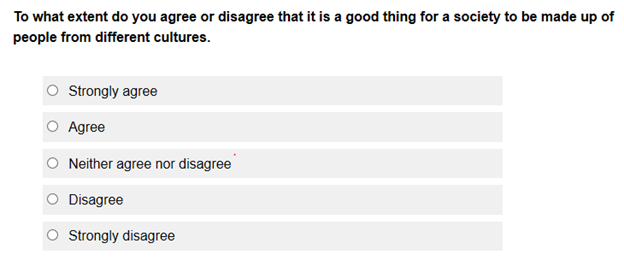
  • Do say - 'To what extent do you agree or disagree that it is a good thing for a society to be made up of people from different cultures.' 
  • Don't say - 'To what extent do you agree or disagree that it is not a bad thing for a society to be made up of people from different cultures.'

Use an active voice

Write sentences using an active voice because most people find it easier to understand. An active voice describes the subject performing the action. For example, the example in Diagram 4 describes the respondent ('you') acting by contacting the National Relay Service.

If you are deaf, or have a hearing or speech impairment, you can contact us through the National Relay Service.

Diagram 4

Avoid using a passive voice, where the subject is acted upon.

For example:

  • Don't say - 'The National Relay Service can be used to contact us if you are deaf or have a hearing or speech impairment.'

Use verbs

Use verbs to write clearer sentences, particularly calls to action. For example, 'correct' is used as a verb in the statement: 'Please correct any errors.' In contrast, the statement: 'Please make any errors correct', shows 'correct' is being used as an adjective.

Adopt a conversational style

Use a conversational writing style because it is generally easier to understand.

Don't leave out words that clarify instructions and questions.

For example:

  • Do say - 'Complete this paper form and return it in the Reply Paid envelope. '
  • Don't say - 'Complete form and return in envelope.'

Use plain English

Choose shorter words over longer words, for example, 'help' rather than 'assistance.’

Choose words that are well understood, for example, 'looking for work' instead of 'seeking employment.’

Avoid overly formal words. For example, use 'people' rather than 'persons'.

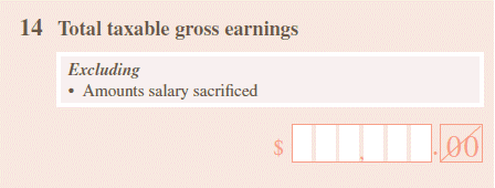
Avoid technical or statistical terms when possible. If they must be used, provide a definition to make sure respondents understand them (Diagram 5).    

Definition of salary sacrifice

Use commercial terms (brands, model names and business names) when respondents are more likely to understand them compared to another description (e.g. brand name of a fertiliser in an agricultural survey). Be careful not to endorse any particular brand, model, and/or business.

Test your form to see if respondents understand the words you are using (e.g. through observational studies or interviews with respondents).

Definitions of specialised terms are not always needed when testing shows that the target population know what they mean. For example, testing may show that respondents who complete the land management section of an agricultural survey know what the terms 'scarifying and harrowing' mean in that context.

Explain the context

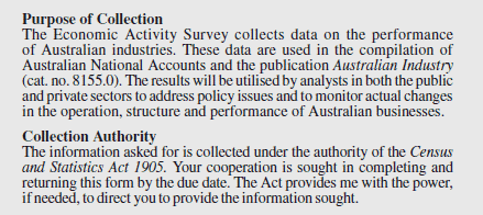
Tell respondents why you want their information. This includes the purpose of the survey, how the information will be used and any legal obligations (Diagram 6). 


Purpose of collection and Collection authority statements used on ABS Economic Activity Survey forms

Diagram 6

Explaining the purpose of the survey alerts respondents that everyday words may have a different meaning in a specialised context, drawing their attention to the definitions provided. For example, the word 'purchases' has a specific meaning when used for the Australian National Accounts and respondents need to take note of the definition (Diagram 7).

Purchases represents total purchases during the year, irrespective of movements in inventories.

Diagram 7

Use simple punctuation

Use commas, full stops, and question marks to help respondents understand the survey completion task.

Use Latin abbreviations sparingly

Only use Latin abbreviations such as 'i.e.' when you are confident that they are commonly understood.  

Include full stops when abbreviations are used (for example, 'e.g.' and 'etc.').

Italicise Latin terms (e.g. 'ad hoc'). 

Avoid using symbols as short forms of words unless you are sure respondents understand it.   

Additional resources

The Australian Government Style Manual has comprehensive information about the use of language. It is the standard for Australian Government writing and editing.

Paper forms design standards: Front of form

Introduction

The front of a survey form facilitates communication between the organisation requesting the data and the respondent. It establishes the context of the survey and provides key instructions for respondents.

Paper forms can be mailed out or hand delivered to respondents. The method of delivery is a factor in determining the necessary front of form elements (e.g. whether an address box is required).

There are elements that are best presented on the front of paper forms.

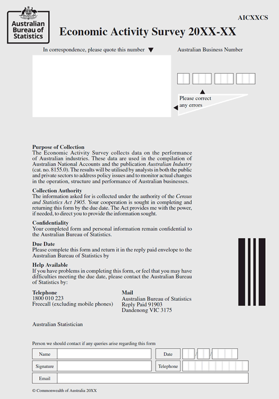
Important elements for paper forms which are mandatory in ABS surveys should include:

  • Title of collection
  • Purpose or scope of the collection
  • Collection authority (if applicable)
  • Confidentiality
  • Due date
  • Help available
  • Form identifier.

Questions should not be on the front of the form.

Front of form elements for postal paper forms should include:

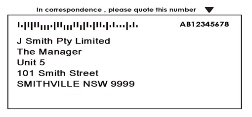
  • Address box
  • Respondent identifier
  • Area around address box
  • 'Please correct' box.

Tailor front of form elements to suit the collection.

Order front of form elements to suit survey field procedures.

Apply the following front of form elements to paper forms as required:

  • Completion instructions
  • Company or business logos
  • Web form offer (if one exists)
  • Identification marks
  • Reference period
  • Office use boxes
  • Respondent identifier
  • Respondent contact details. 

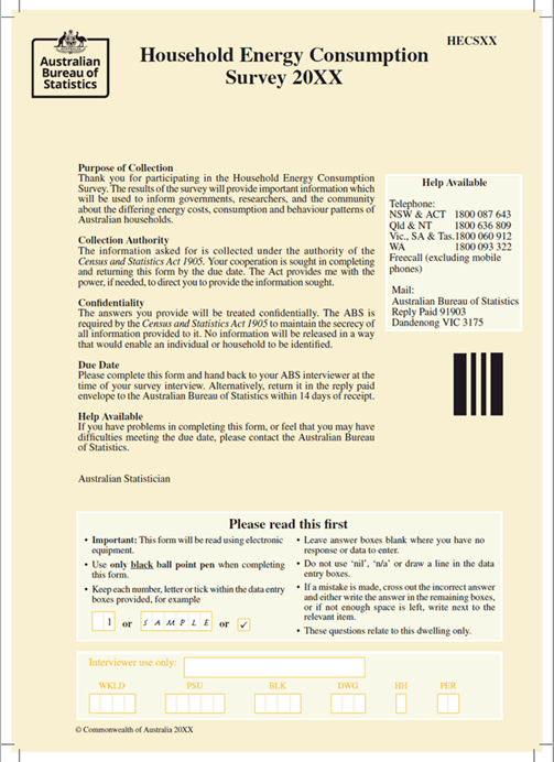
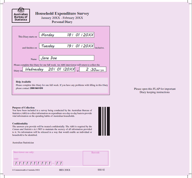
Refer to the front of form illustrations showing a postal business survey form (Diagram 6) and household survey forms (Diagram 7 and Diagram 8).   

These standards only apply to the first or 'main' form for surveys that have multiple forms that are given to respondents all at once. Repeat key information on each form if multiple respondents may complete them.  

Refer to the Typography chapter for more detailed information on typefaces and fonts for the front of form elements.

Form elements

Company or business logo

Place the logo in the top left hand corner on the front of form.

Title of collection

Place the title of the collection to the right of the logo.

Purpose or scope of the collection

Help respondents understand the reason for the questions in the form by explaining the purpose of the collection. Explain the topic of the current form if it is part of a multi-topic survey. A good purpose statement encourages respondents to complete the form.

Include the following information:

  • what the information collected is actually used for
  • who uses the information (e.g. government, private sector )
  • where the information will be published (if there is sufficient space).

Avoid summarising the content of the form. Tailor the exact wording of the 'Purpose of collection' statement to suit the survey or topic of the form and the population being targeted.

Collection authority (if applicable)

Some organisations have a ‘legal’ authority to collect information from people or institutions. If this applied to you, help respondents understand that they should complete the form by including a collection authority paragraph.

For example, the Australian Bureau of Statistics includes the following key sentences: 

  • Use standard wording for the first sentence: 'The information asked for is collected under the authority of the Census and Statistics Act 1905.’
  • Use standard wording for the second sentence where applicable: 'Your cooperation is sought in completing and returning this form by the due date.'
  • Add the compulsion statement where applicable: 'The Act provides me with the power, if needed, to direct you to provide the information sought.’ 

Tailor paragraphs so that the statement makes sense for each survey or topic.

Place the words 'Australian Statistician' (or name of person who has the authority) after all the general instructions. Left align the words with the general instructions. Use 12 point plain type.

Confidentiality

Assure respondents that the information they provide is kept private by including a confidentiality statement.

Due date

Provide clear instructions on when respondents need to return their completed survey form.

Tell respondents how to return their completed survey form (e.g. mail back using reply paid envelope or return directly to the interviewer).

Help available

Include details on how respondents can contact you if they are having problems completing the form, or if they are having difficulties meeting the due date.

Form identifier

Place the form identifier on the top right corner on the front of form (also see 'Layout chapter').

Do not include questions

Avoid placing questions on the front of form except when the questions are related to the coverage (the population the survey covers) of the survey.  

Questions are generally not placed on the front of form because:

  • this can create unnecessary clutter
  • the front of form is a part of the form that focuses almost entirely on providing information and respondents are likely to miss elements requesting information
  • respondents may go straight into answering the questions, but it is preferable for them to have read the general notes and reporting instructions first.

Postal requirements

Forms that are delivered to respondents by post must have front of form elements to meet postal requirements.

Unique identifier

Position a reference number, or a unique identifier, which identifies the unit selected on the top right-hand side of the label (Diagram 1).

Address label with respondent identifier

Diagram 1

Place the note indicating a duplicate form inside the address box when applicable.

Use the following wording for duplicate forms: 'Duplicate. Please keep this copy for your records'. 

Respondent contact details

Encourage respondents to correct any errors. 

Place an instruction on all forms except those which ask the respondent specifically about name and address details elsewhere. For example, on ABS business survey forms (Diagram 2) an instruction 'Please correct any errors' is placed near the contact details and Australian Business Number fields. This encourages respondents to check the information and write in corrections if necessary.


The instruction 'Please correct any errors' is displayed near the address field.

Diagram 2

Tailor form elements to suit the collection

Collection authority (if applicable)

Where applicable, reference to the collection authority will need to be modified under the following circumstances (i.e. 'Your cooperation is sought in completing and returning this form by the due date.''):

  • When respondents hand their completed form to an interviewer during the survey interview: 'Your cooperation is sought in completing and returning this form to the ABS Interviewer in the envelope provided.’
  • For diaries when a range of dates are specified (e.g. This diary starts on [date] and finishes on [date] inclusive): 'Your cooperation is sought in completing the diary on the dates specified above and returning the diary to the interviewer.'

Omit the compulsion sentence from the Collection Authority statement (i.e. ‘The Act provides me with the power, if needed, to direct you to provide the information sought’) when:

  • the target population includes government organisations at the Commonwealth, State or Local level
  • the survey is to be undertaken on a voluntary basis (e.g. pilot tests and dress rehearsals)
  • a self-administered paper form is part of a wider collection, rather than the primary survey instrument. The inclusion of the compulsion statement on the front of form is discretionary provided that it appears in other survey materials (e.g. approach letter and brochure) that are shown to respondents. 

Confidentiality

A statement on confidentiality should be included to assure respondents their completed form and personal information will be treated securely and not publicly released in a way that would allow them to be identified.

Due date

Specify a particular due date rather than a time period where possible because respondents may forget when the form was received. In the case of staggered despatches respondents may also return the form before the end of the reference period.

Specify a time period for when respondents should submit their completed form when the delivery of many forms may be delayed or a due date cannot be printed, overprinted or handwritten.

When using paper forms that are mailed out:

  • Use this standard wording to specify the due date: 'Please complete this form and return it in the reply-paid envelope to ‘name of your organisation’ by xx Month 20xx.'
  • Use this standard wording to specify a time period in addition to the due date: 'Please complete this form and return it in the reply paid envelope to ‘name of your organisation’ by xx Month 20xx or within xx days of receipt.'  
  • Use 14-point bold type for the due date. 
  • Use the normal background shading even when the due date is overprinted on the form after the form has been printed. 

For survey forms that interviewers hand out, use the options outlined below that suit the field procedures of a particular collection:

  • Provide a blank field for interviewers to manually fill in a due date when it is not possible to print or overprint the due date because of field procedures (e.g. forms handed to respondents during an interview).
  • Let respondents know they should return their form to the interviewer by using the following standard wording: 'Please complete this form and hand back to your interviewer at the time of your survey interview.'
  • Include a due date (i.e. the day of the week and the date) if respondents also have the choice of returning their form by mail in the following standard wording: 'Alternatively, return it in the reply paid envelope to ‘name of your organisation’ [by ....................(.... /..../....) (date)].'
  • Specify both a due date (i.e. day of the week and date) and a time (e.g. 2:30 am / pm) when the interviewer will return at a later stage to collect the form (e.g. time use diary) using the following standard wording: 'An interviewer will return on ....................(.... /..../....) (date) at ....: .... am/pm(time) to collect the Diary.'
  • Consider the option of providing some space for the interviewers to fill in their names. Respondents can refer to their interviewer's name if they need to call the telephone number given.

Help available

Present the help available information using one of the two options:

  • Use the standard wording, 'If you have problems in completing this form, or feel that you may have difficulties meeting the due date, please contact ‘name of your organisation’ by: 

                                Telephone          Mail

                                (xx) xxxx-xxxx    Postal Address'

  • Alternatively, place the contact details following the standard wording in a box located to the right-hand side of the page, so that it is side-by-side with the standard wording instead of below it. The heading 'Help available' should be included in the box (Diagram 3). Use this option when there are space restrictions. 
Help available information included on all ABS survey forms

Diagram 3

Format telephone numbers with spaces and brackets in the way that they are commonly used as shown below:

  • Mobile numbers - 018 xxx xxx, 015 xxx xxx or 0411 xxx xxx
  • 1800 numbers or others - 1800 xxx xxx or 0055 xxx xxx
  • STD numbers - (02) xxxx xxxx or (08) xxxx xxxx 
  • ISD numbers - (061) (02) xxxx xxxx

Include the label 'Freecall (excluding mobile phones)' after 1800 numbers.

 For some collections, respondents are required to call their local Regional Office to seek help (Diagram 4).

Contact phone numbers

Diagram 4

Confirm the phone numbers listed prior to finalising the form.

For diaries, interviewers can manually write in the telephone number respondents use to get help when vertical space is limited on the front of form. Use the following standard wording and allow enough blank space for the interview's area code and telephone number: 'If you have any problems with filling in this diary, please contact the office on () ................ for assistance.'.

Avoid including email addresses as part of contact information or details because it may encourage respondents to submit data insecurely.

Very large collections such as the Population Census may provide instructions asking respondents to visit the website first if they require help.   

Contact details for business forms

Ask respondents to provide the details of a contact person from their organisation. Should you have any queries about the form, only the person whose details are provided will be contacted to ensure confidentiality.

Place the request for contact details at the bottom of the front of form.

Use the standard wording for 'Contact Details': 'Person we should contact if any queries arise regarding this form’ followed by boxes containing these items:

  • Mobile number
  • Name
  • Date
  • Signature
  • Telephone number
  • Email.

Provide white answer spaces for respondents to write their contact details.

Only include a separate box for 'Position or Title' between 'Name' and 'Signature' if testing and processing of the form has shown this to be essential.

Provide enough answer space if a 'Position or Title' field is added. The information requested refers to the respondent's position or title within the business (e.g. Senior Accountant). It does not refer to general titles (e.g. 'Mr' or 'Mrs').

Include a field for 'Mobile number' if the target population is known to be difficult to contact at a fixed location during business hours (e.g. farmers, builders, truck drivers).

Place the 'Mobile number' field between 'Telephone number' and 'Email’ if it is used. 

Use a single text box for the 'Email ' field. Ensure that the field is large enough to fit at least 40 characters to accommodate a range of email addresses.

Order form elements to suit survey field procedures

 The ordering and location of the front of form elements can differ across household collections as follows:

  • Place front of form elements in a similar order as that of business survey forms (i.e. Purpose of Collection, Collection Authority, Confidentiality, Due Date, Help Available) when there are no blank fields requiring interviewers to handwrite information for respondents
  • Place blank fields where interviewers handwrite information for respondents (e.g. respondent name, due date, help available) near the top of the page. Locate printed information (e.g. purpose of collection, collection of authority, confidentiality) after the handwritten information.

Use white answer spaces for blank fields where interviewers fill in information for respondents and for their own use only (e.g. Interviewer use only).

Place any fields containing information that the respondent does not need to read (e.g. office use boxes) at the bottom of the page.

Apply discretionary form elements as required

Completion instructions

Completion instructions may be placed on the front of form under some circumstances. For example, completion instructions can be placed on the front of form when space is available there but limited in the remainder of the form.

Include an instruction to provide careful estimates if exact figures are not available on the front of form, if necessary. However, it is usually best placed in other parts of the form.

Additional logos

Other approved logos may appear on the front of form in addition to your organisation’s logo (e.g. if there is an additional survey specific logo or if your organisation is co-branded with another agency for that survey).          

Web form offer

Include information about accessing the web form, when there is a web mode offered at the same time as the paper form.

Web form access information can include:

  • the web address (or URL)
  • instructions on how to navigate to the web
  • the web form number
  • a password or additional code.

Slogans or statements to promote the use of the web from can also be included (e.g. 'Fast, secure and easy with online help available').

Identification marks

Barcodes and various other marks that aid mark-in and page recognition may be placed on the front of Optical Character Recognition (OCR) forms.

Determine the formatting and location of these marks with stakeholders on a case-by-case basis.

Reference period

Information about the reference period can appear on the front of form. This tells respondents the time period that they are required to report for.

Present the reference period in a way that makes sense for the collection. 

For some business survey forms, information about the reference period will appear in the title of some business survey forms.  For other business survey forms, there may be separate 'Reference period' information using wording such as, ‘The reference period for this form is the last pay period ending on or before [date]'.

For household survey forms, the reference can be pre-printed or manually filled in by interviewers (Diagram 8).

Coverage of business forms

Clarify the coverage of the form if respondents might be confused about which business or parts of the business the form relates to, by using one or more of the following options:

  • Include additional information about coverage and place it between the Collection Authority and Confidentiality paragraphs.
  • Place information about the geographic location covered by the form (e.g. Australia or a particular state) between the address box and the Purpose of Collection paragraph.
  • Use a small instruction with an arrow pointing to the address box similar to the ‘Please correct' box (e.g. 'Please complete this form for the Australian-based activities of the business named on this label'). However, it is preferred that this instruction be presented within the form.

Office use boxes for household forms

Place office use boxes at the bottom of the front of form within an instruction box.

Use the heading 'Interviewer use only'.

Use drop-out colour for the text and lines outlining the boxes to ensure that they are easily distinguished from information relevant to respondents (Diagram 5).

Office use only box

Diagram 5

Respondent identifier for household forms

Include a respondent identifier on the front of form when multiple individuals within a household each receive a separate form. For example, interviewers will fill in the respondent's name in the 'Name' field.   

A respondent identifier helps respondents to distinguish between forms within their household and assists in identifying data for processing.

Respondent contact details for household forms

Ask respondents for their contact details when information is required on a household level.

Explain why the information is collected using the following standard wording that is placed before the respondent contact details fields: 'Person we should contact if any queries arise regarding this form'.

Form illustrations

Diagram 6: Economic Activity Survey front of form

Front of form illustration
Top of page - Logo top left - Title centred - Economic Activity Survey Year/Month - Form identifier top right: 'AICXXCS' Below title - Address box with respondent identifier - ABN to the right of the address box with instruction: Please correct any errors Main content - Paragraph 1: Purpose of collection statement - Paragraph 2: Collection authority statement - Paragraph 3: Confidentiality statement - Paragraph 4: Due date - Paragraph 5: Help available - Form signed by: 'Australian Statistician' - OCR identification mark (bar code) located on the right-hand side of the page Bottom of page - Space for respondents to record their contact details - Commonwealth of Australia logo, 4 digit year

Diagram 7: Household Energy and Consumption Survey front of form

Front of form illustration
Top of page - Logo top left - Title centred - Household Energy Consumption Survey Year/Month - Form identifier top right: 'HECSXX' Below title - Paragraph 1: Purpose of collection statement - Paragraph 2: Collection authority statement - Paragraph 3: Confidentiality statement - Paragraph 4: Due date - Paragraph 5: Help available - Help available box located on the right hand side of the page. Contains telephone numbers of each state office, and a mailing address - OCR identification mark (bar code) located to the right-hand side of the page below the 'Help available' box Bottom of page - Instruction box: containing 'Please read this first' along with information on how to complete the form - Office use only box in drop out colour - Commonwealth of Australia logo, 4 digit year

Diagram 8: Household Expenditure Survey Diary front of form

Front of form illustration
Top of page - Logo at top left - Survey title/reference period: Household Expenditure Survey, January 20XX - February 20XX - Words: 'Personal diary' below the survey title and reference period - Instruction box containing instructions on the period the diary covers, who should complete the diary and the date the diary will be collected by the interviewer. - Help available box is contained within the instruction box: 'Please complete this diary for one week. If you have any problems with filling in this diary please contact 1800 060 050.' Below instruction box - Paragraph 1 - Purpose of collection - Paragraph 2 - Confidentiality - Words: 'Australian Statistician' - OCR identification mark (bar code) at right-hand side of form - Office use only box in drop out colour - Bottom of the page - Commonwealth of Australia logo, 4 digit year; Form identifier - 'HES 20XX'; Survey identifier: 'SSS 02'.

Paper forms design standards: Layout

Introduction

The layout guidelines will help you integrate the elements for paper forms covered in other chapters to create a composite form.

Consult form design standards and finalise the questions before you begin designing the layout.

The measurements recommended are what we use because they are specific to our scanning software. Your measurements may differ.

Keep margins consistent

Use the recommended page margins for all pages in a form:

  •  Top: 5 mm
  •  Bottom: 5 mm
  •  Inside edge: 7 mm
  •  Outside edge: 5 mm

Keep all text or answer spaces inside the text and boundary line. On coloured forms, the background object colour fill must extend 5mm out to satisfy the bleed requirement. Bleed is the area on a paper form that will be trimmed off (Diagram 1).

Apply crop marks to any print job that needs to be trimmed to size. Crop marks (trim marks located in the corner) are applied during the export to PDF process and should be visible above the bleed area. A form that is not being printed will not require crop marks or bleed.

Recommended page margins for forms

Diagram 1

Include a form identifier

Include a form identifier in the top right corner of every page for all survey forms. Placing the form identifier in the same location for all forms will help processing staff quickly identify the collection.

On the front of form, the identifier should be 14 point bold. On all other pages, it should be 12 point plain.

The form identifier should be a meaningful acronym or abbreviation of the survey's name, to help respondents recognise and reference it when communicating with you. For example, the form identifier for the Survey of Employment and Earnings is 'SEE'.

Provide an overview of the form

Include a contents list when respondents need an overview of the form to put their data in the correct place. 

Forms that need a contents list are usually reasonably long or contain modules that cover quite distinct topics (Diagram 3).

Use section or part headings in the contents list.

Do not use page numbers. The contents list is not intended to help respondents skip to sections they are interested in.

Contents: Part 1 - Characteristics of employees, Part 2 - Structured training of employees, Part 3 - Unstructured training of employees, Part 4 - Reasons no training provided.

Diagram 3

Use grids to ensure consistent layouts

A layout grid is a plan that gives you the positions on a page for each of the graphic elements of the form.

Use grids to help you achieve consistent layouts. 

Full page or single column layout

The full-page or single column layout creates a spread-out arrangement of questions that is often the most attractive layout. The grid for the full page allows for notes alongside answer boxes.

Use single column layouts for the front of form to minimise visual clutter.  

Double column layout

A double column layout makes better use of space when there are many short questions and answers. 

This layout is easier for respondents to read because of the short line width and structured linear design.

Do not use a double column layout when there is an answer box or matrix spanning the full width of the page.

Matrices

The matrix layout involves the answer box being divided into two or more columns, which may be grouped together under a hierarchy of column headings, with a set of sub-questions listed down the left-hand side of the answer box.

Avoid mixing layouts

Avoid mixing single column and double column designs on the same page.

A mixture of layouts may lead to some instructions or questions being overlooked.

A double column layout above a full-page layout can cause respondents to overlook the right-hand column at the top of the page.

Avoid placing response options across rather than down the page. The layout contrast to the rest of the form forces the respondent into a different reading pattern that can lead to error.

Avoid changing the layout too often within a form. You can use a single column on one page and a double column on another, but this should be done sparingly.

Do not use triple columns.  

Use left aligned text

Text alignment (also called justification) refers to how blocks of text are arranged horizontally on a page. 

Left aligned text is easier to read than centred text for paragraphs. This is because when you centre your text, the starting place of each line changes. This forces respondents to work harder to find where each line begins to continue reading. Without a straight left edge, there is no consistent place where respondents can move their eyes to when they complete each line.

However, when your paragraph text is left aligned, a straight left edge appears. Respondents can read each line by simply moving their eyes to the left edge each time. This makes your paragraphs faster and easier to read because the respondent’s eyes don’t have to work as hard to find where the line starts each time.

Paper forms design standards: Lines and boxes

Introduction

Use lines and boxes consistently to improve the appearance of a form and reduce respondent fatigue and errors.

Lines can be used to:

  • create columns for split page forms
  • divide forms into sections to facilitate navigation
  • link text and answer boxes through eye-guide lines.

Follow these guidelines when using boxes:

  • Present instruction boxes consistently
  • Outline answer box boundaries clearly
  • Provide sufficient space for answer boxes
  • Left align answer boxes used in matrices
  • Format ballot or tick boxes consistently
  • Label fields for financial items ($ ,000).

Lines

Use lines only when they are needed for the form to work properly.

Every extra bit of unnecessary ink on a form has to be mentally discarded, contributing to respondent load. This is detrimental to data quality.

Lines should be no thicker than is needed and used consistently throughout the form.

Create columns for split page forms

Use a line to divide columns in a split page layout.

Use a 2-point white line for coloured forms (Diagram 1).

Use a 0.5-point black line for black and white forms (Diagram 2).

Ensure the line begins at the top of the first line of type (or the top of any boxes) and ends at the bottom of the last line of type (or the base of any boxes).

Split page layout for coloured forms

Diagram 1

Split page layout for black and white forms

Diagram 2

Divide forms into sections to facilitate navigation

Only use section dividers when they are needed to help respondents navigate their way through the form.

Use section dividers consistently throughout the form.

For coloured forms, use a 2 point (0.7 mm) white line to divide sections (Diagram 3).

For black and white forms, use a 0.5 point (0.18 mm) black line to divide sections (Diagram 4).   

For a full-page layout, make sure the dividing line spans the full width of content on the page.  

For a split page layout, join the section dividers and column dividers neatly.

Avoid forming a cross where section dividers in both columns meet, as this may lead respondents to incorrectly read across the page rather than down.

Section divider for coloured forms

Diagram 3

Section divider for black and white forms

Diagram 4

Link text and answer boxes through eye-guide lines

Eye-guide lines help link the field label with the answer box.

Print eye guides in solid colour or black.

Use a 0.5-point irregular dotted line for eye-guide lines on both coloured and black and white forms. The dotted lines usually consist of three dots then a space (Diagram 5).

Bottom align eye-guide lines to connect the field label and corresponding answer box.

Eye-guide lines linking field label to answer box

Diagram 5

Boxes

Consistent formatting and presentation of boxes in forms help respondents quickly understand what is required from them, and where they should put their answers.

Present instruction boxes consistently

For coloured forms, place a 10% screened box drawn with a 2-point white line around the instructions (Diagram 6). Screen (also known as opacity) refers to the shading on a form's background created by printing the same colour in varying intensity.

For black and white forms, use a 0.5 black line around the boxes containing instructions (Diagram 7).

Instruction box on a coloured form

Diagram 6

Black and white forms use 0.5 black line around boxes containing instructions

Diagram 7

Avoid different alignments where possible.

Present similar elements within the instruction boxes consistently throughout the form.

Extend instruction boxes to the full width of the page, or slightly less to incorporate an answer box to the right. This includes 'Including/Excluding', 'Note', 'Definition' and 'Examples' boxes.

All instruction boxes should be the same width, even when different kinds of instructions are used within the form (Diagram 8). 

'Note' and 'Including' instruction boxes used within the form

Diagram 8

Maintain the same width even when instruction boxes only have an 'Including' or 'Excluding' rather than both. Put the information in the same position in the box, so that all 'includings' in the form are aligned with each other and all 'excludings' as well (Diagram 9).   

'Excluding' instructions aligned to the right of the box

Diagram 9

Extend 'Note' boxes when there are two columns of text to the full useable width of the page where possible.

Outline answer box boundaries clearly

Use a 0.5-point line for normal answer boxes on both coloured and black and white forms (Diagram 10).

Boundary outlines of a normal answer box on a form

Diagram 10

The line for normal answer boxes is a solid drop-out for Optical Character Recognition (OCR) forms and black for other forms.

Use a 1-point line for 'Total' answer boxes so they stand out more (Diagram 11).

Example of normal and total answer boxes on a form

Diagram 11

Provide sufficient space for answer boxes

All answer spaces should be white and bounded by a continuous solid line of the appropriate thickness.

The number and size of answer boxes shapes respondents' perception of the amount of 'work' or 'effort' involved in completing a form.

Provide enough width for the number of characters expected in most cases, rather than the largest possible answer.

Use 8mm x 4mm segmented boxes (Diagram 12) for:

  • numeric responses
  • text that relies on OCR for editing and coding.
Segmented answer boxes on a form

Diagram 12

Include ‘in BLOCK letters' (with 'block' in upper case) for questions that rely on OCR (Diagram 12).

For free text responses, present answer boxes as follows:

  • Use 0.5-point regular dotted lines as guidelines within the answer space on both coloured and black and white forms (Diagram 13). 
Free text response box with guidelines

Diagram 13

  • Allow 8 mm height for answer spaces that have one line or multiple lines. Note that the base of the answer box is used as a line of answer space (Diagram 14).
Free text response box with multiple lines

Diagram 14

For coloured forms, use dropout colour (a colour that does not appear on a scanned image) for the boxes and the lines in the free text response boxes.

Left align answer boxes used in matrices

Left align boxes in a matrix format when a mix of box sizes is used. This helps lead the eye across when respondents follow one column of boxes to another (Diagram 15).

Left align boxes with enough digit spaces to match the orders of magnitude.

Line up the commas when different levels of a measurement unit are used, and the boxes for the lower level unit allow for more digits than the higher level (e.g., the 1 in 1 tonne will line up with the 1 in 1,000 kg).  

Matching the order of magnitude is not necessary when the answer boxes are the same size, but the commas should still align.

Matrix for area sown (hectares) and total production (kgs) - Agriculture survey

Diagram 15

Format ballot or tick boxes consistently

Use 4mm (5mm for OCR forms) square ballot boxes for most closed questions (Diagram 16). Ballot boxes smaller than 4 mm are difficult to use, and respondents may try to write in boxes above this size.  

Place ballot boxes approximately 3 mm to the right of short field labels (including 'No/Yes' labels).

Place the option with the sequencing instruction first for 'No/Yes' options. This saves the respondent from reading the rest of the question when it does not apply to them.

Tick box

Diagram 16

The gap between the 'No/Yes' text and a ballot box should be no more than about 5 mm.

Left align the 'No/Yes' options with the question text when the question text is short and there are no note boxes in between.  

Position the 'No/Yes' text to the bottom right of the question text when the question text is longer and/or when there are note boxes in between.  

Left align response options that have four or more words (Diagram 17). Right align the tick boxes with the other answer spaces.  

Format of tick boxes with long response options

Diagram 17

Right align tick boxes in a vertical row when there are several, preceded by short field labels (Diagram 18). Allow 3 mm between the field labels and the answer boxes.

Format of tick boxes with short response options

Diagram 18

Label fields for financial items ($,000)

Position label fields for financial items ($, 000) to make them clearly noticeable.

Place a '$' sign in 12-point plain type, left of the answer space.

For coloured forms, place the characters ',000' in 10-point plain type to the right of the answer space, with a 10% screen (Diagram 19).

Financial field on a coloured form

Diagram 19

For black and white forms, place the characters ',000' in 12-point plain type at the right-hand side of the answer space.

Include instructions above the answer box about using a negative sign when a negative value may be reported (Diagram 20).

Instructions above the answer box

Diagram 20

Additional resource

The following case study on the redesign of Centrelink forms also contains information about lines and boxes, including split page forms.

Paper forms design standards: Typography

Introduction

Consistent and controlled use of fonts help respondents easily distinguish between the various elements of a form. For example, survey questions versus data entry codes. 

Follow the guidelines in this chapter to select appropriate fonts for your survey form. Refer to additional resources for more information about typography.

Note: The styles mentioned in this chapter are what we use for our surveys. Other survey organisations may use different styles that reflect their context.

Underline words sparingly

Only underline key words where emphasis is essential for data quality.

Avoid underlining words unnecessarily because it interferes with the readability both for average people and also for those with reading disabilities like dyslexia. Underlines disrupt letters that extend below the baseline (letters such as p, q, y, and g) which can make it harder for people to read your text, especially if long phrases or sentences are underlined.

Underlining for emphasis is generally unsuitable for multi-modal surveys. Underlining typically denotes a hyperlink in web forms so is not recommended for emphasis. The paper form equivalent should use the same method of emphasis for consistency.

Use other methods in this chapter for emphasis rather than underlining (see 'Questions'). 

Keep lines of text short

Keep line lengths short so respondents are not required to move their eyes too much. People can lose track of which words they are reading and misinterpret the text or have to spend time backtracking through the form.

Line length on forms include questions, headings, text within notes boxes and all other text.

Aim to keep line length to about 110mm when using a 10 to 12-point text.

No line of text should exceed 115mm.

Avoid awkward sentence breaks over two lines when shortening a text block to fit within the maximum recommended line length (e.g. do not break a date over two lines).

Avoid having only one word on a new line when adjusting text to keep line length short.

Ensure the top line overhangs the bottom line for questions on more than one line. This prevents people jumping from the end of the first line to the end of the second without reading the words in between.

Make passwords easy to understand

Online form access details such as passwords can be included directly on paper forms. Encourage online form uptake by ensuring that respondents can read and transcribe this on their first attempt.

Use 14-point bold type for printed form access details.

Select a font where each character is clearly distinguishable. For example, Consolas has a line through the zeros distinguishing them from the letter 'O'. 

Break a long string of numbers or letters into clusters of three to four characters.

Use spaces between clusters rather than hyphens or dashes.

Do not use zero as the first numeral for a string of numbers.

Do not use vowels, zero, 1, or lower-case L in passwords.

Do not use the same letter or number three or more times in a row (e.g. 'ccc' or '333').   

Do not use capital letters.

Use one font for each part of a form

We use both serif and san serif fonts in ABS paper forms. Serif refers to the small lines at the end of strokes within letters.

  • Serif fonts are traditionally considered the most accessible for long-form printed content like newspapers and novels. 
  • Sans serif (without serif) fonts are considered the most accessible for digital content due to simple, clean letterforms.

You can use one font for questions and another for other parts of the form. This creates recognisable patterns that respondents will follow. For example, whichever font is used for questions, you can use an alternative font for data entry or processing codes. 

Use appropriate fonts for each form element consistently

Form titles

Form subtitles

Section headings

Sub-section headings

Column headings in a matrix

Questions

Sub-questions

Question numbers

Questions continuing across pages

Major notes at the beginning and end of the form

Instructions, explanations, and notes within questions

Instructions in brackets within questions

Sequencing instructions

Form ID

Page number

Thank you note

Processing codes

Office use only boxes

Duplicate forms

Additional resources

Bringhurst, R. (2004). The Elements of Typographic Style. Hartley and Marks Publishers.

Lupton, E. (2010).  Thinking with Type 2nd edition: A critical guide for designers, writers, editors and students. Princeton Architectural Press.

Santa Maria, J. (2015).  On Web Typography. Adams Media.

Wheildon, Colin (1990) Communicating or just making pretty shapes: A study of the validity or otherwise of some elements of typographic design. Newspaper Advertising Bureau of Australia Ltd, Sydney. 

Typography in Inclusive Design Part 2: Choosing Typefaces and Laying Out Text Content | Vision Australia. Blindness and Low Vision Services. www.visionaustralia.org/business-consulting/digital-access/blog/typography-in-inclusive-design-part-2.