Paper forms design standards: Typography

Latest release
ABS Forms Design Standards
Reference period
2023
Released
11/08/2023
Next release Unknown
First release

Introduction

Consistent and controlled use of fonts help respondents easily distinguish between the various elements of a form. For example, survey questions versus data entry codes. 

Follow the guidelines in this chapter to select appropriate fonts for your survey form. Refer to additional resources for more information about typography.

Note: The styles mentioned in this chapter are what we use for our surveys. Other survey organisations may use different styles that reflect their context.

Underline words sparingly

Only underline key words where emphasis is essential for data quality.

Avoid underlining words unnecessarily because it interferes with the readability both for average people and also for those with reading disabilities like dyslexia. Underlines disrupt letters that extend below the baseline (letters such as p, q, y, and g) which can make it harder for people to read your text, especially if long phrases or sentences are underlined.

Underlining for emphasis is generally unsuitable for multi-modal surveys. Underlining typically denotes a hyperlink in web forms so is not recommended for emphasis. The paper form equivalent should use the same method of emphasis for consistency.

Use other methods in this chapter for emphasis rather than underlining (see 'Questions'). 

Keep lines of text short

Keep line lengths short so respondents are not required to move their eyes too much. People can lose track of which words they are reading and misinterpret the text or have to spend time backtracking through the form.

Line length on forms include questions, headings, text within notes boxes and all other text.

Aim to keep line length to about 110mm when using a 10 to 12-point text.

No line of text should exceed 115mm.

Avoid awkward sentence breaks over two lines when shortening a text block to fit within the maximum recommended line length (e.g. do not break a date over two lines).

Avoid having only one word on a new line when adjusting text to keep line length short.

Ensure the top line overhangs the bottom line for questions on more than one line. This prevents people jumping from the end of the first line to the end of the second without reading the words in between.

Make passwords easy to understand

Online form access details such as passwords can be included directly on paper forms. Encourage online form uptake by ensuring that respondents can read and transcribe this on their first attempt.

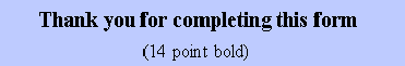
Use 14-point bold type for printed form access details.

Select a font where each character is clearly distinguishable. For example, Consolas has a line through the zeros distinguishing them from the letter 'O'. 

Break a long string of numbers or letters into clusters of three to four characters.

Use spaces between clusters rather than hyphens or dashes.

Do not use zero as the first numeral for a string of numbers.

Do not use vowels, zero, 1, or lower-case L in passwords.

Do not use the same letter or number three or more times in a row (e.g. 'ccc' or '333').   

Do not use capital letters.

Use one font for each part of a form

We use both serif and san serif fonts in ABS paper forms. Serif refers to the small lines at the end of strokes within letters.

  • Serif fonts are traditionally considered the most accessible for long-form printed content like newspapers and novels. 
  • Sans serif (without serif) fonts are considered the most accessible for digital content due to simple, clean letterforms.

You can use one font for questions and another for other parts of the form. This creates recognisable patterns that respondents will follow. For example, whichever font is used for questions, you can use an alternative font for data entry or processing codes. 

Use appropriate fonts for each form element consistently

Form titles

Form subtitles

Section headings

Sub-section headings

Column headings in a matrix

Questions

Sub-questions

Question numbers

Questions continuing across pages

Major notes at the beginning and end of the form

Instructions, explanations, and notes within questions

Instructions in brackets within questions

Sequencing instructions

Form ID

Page number

Thank you note

Processing codes

Office use only boxes

Duplicate forms

Additional resources

Bringhurst, R. (2004). The Elements of Typographic Style. Hartley and Marks Publishers.

Lupton, E. (2010).  Thinking with Type 2nd edition: A critical guide for designers, writers, editors and students. Princeton Architectural Press.

Santa Maria, J. (2015).  On Web Typography. Adams Media.

Wheildon, Colin (1990) Communicating or just making pretty shapes: A study of the validity or otherwise of some elements of typographic design. Newspaper Advertising Bureau of Australia Ltd, Sydney. 

Typography in Inclusive Design Part 2: Choosing Typefaces and Laying Out Text Content | Vision Australia. Blindness and Low Vision Services. www.visionaustralia.org/business-consulting/digital-access/blog/typography-in-inclusive-design-part-2.

Back to top of the page