Paper forms design standards: Lines and boxes
Introduction
Use lines and boxes consistently to improve the appearance of a form and reduce respondent fatigue and errors.
Lines can be used to:
- create columns for split page forms
- divide forms into sections to facilitate navigation
- link text and answer boxes through eye-guide lines.
Follow these guidelines when using boxes:
- Present instruction boxes consistently
- Outline answer box boundaries clearly
- Provide sufficient space for answer boxes
- Left align answer boxes used in matrices
- Format ballot or tick boxes consistently
- Label fields for financial items ($ ,000).
Lines
Use lines only when they are needed for the form to work properly.
Every extra bit of unnecessary ink on a form has to be mentally discarded, contributing to respondent load. This is detrimental to data quality.
Lines should be no thicker than is needed and used consistently throughout the form.
Create columns for split page forms
Use a line to divide columns in a split page layout.
Use a 2-point white line for coloured forms (Diagram 1).
Use a 0.5-point black line for black and white forms (Diagram 2).
Ensure the line begins at the top of the first line of type (or the top of any boxes) and ends at the bottom of the last line of type (or the base of any boxes).

Diagram 1
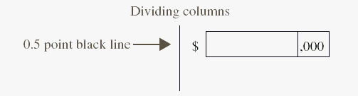
Diagram 2
Divide forms into sections to facilitate navigation
Only use section dividers when they are needed to help respondents navigate their way through the form.
Use section dividers consistently throughout the form.
For coloured forms, use a 2 point (0.7 mm) white line to divide sections (Diagram 3).
For black and white forms, use a 0.5 point (0.18 mm) black line to divide sections (Diagram 4).
For a full-page layout, make sure the dividing line spans the full width of content on the page.
For a split page layout, join the section dividers and column dividers neatly.
Avoid forming a cross where section dividers in both columns meet, as this may lead respondents to incorrectly read across the page rather than down.
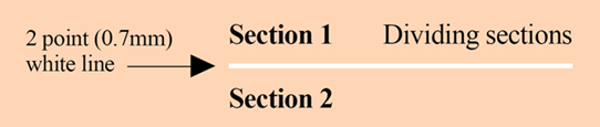
Diagram 3
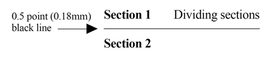
Diagram 4
Link text and answer boxes through eye-guide lines
Eye-guide lines help link the field label with the answer box.
Print eye guides in solid colour or black.
Use a 0.5-point irregular dotted line for eye-guide lines on both coloured and black and white forms. The dotted lines usually consist of three dots then a space (Diagram 5).
Bottom align eye-guide lines to connect the field label and corresponding answer box.
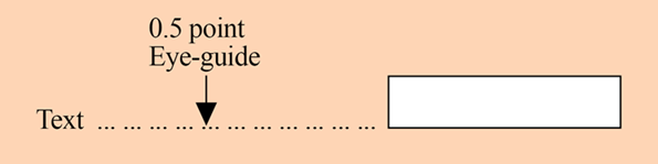
Diagram 5
Boxes
Consistent formatting and presentation of boxes in forms help respondents quickly understand what is required from them, and where they should put their answers.
Present instruction boxes consistently
For coloured forms, place a 10% screened box drawn with a 2-point white line around the instructions (Diagram 6). Screen (also known as opacity) refers to the shading on a form's background created by printing the same colour in varying intensity.
For black and white forms, use a 0.5 black line around the boxes containing instructions (Diagram 7).
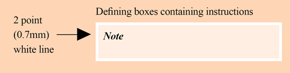
Diagram 6
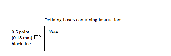
Diagram 7
Avoid different alignments where possible.
Present similar elements within the instruction boxes consistently throughout the form.
Extend instruction boxes to the full width of the page, or slightly less to incorporate an answer box to the right. This includes 'Including/Excluding', 'Note', 'Definition' and 'Examples' boxes.
All instruction boxes should be the same width, even when different kinds of instructions are used within the form (Diagram 8).
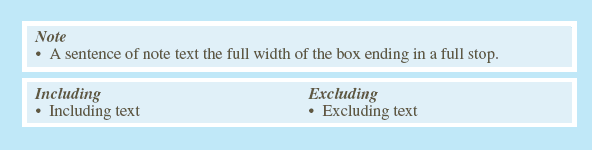
Diagram 8
Maintain the same width even when instruction boxes only have an 'Including' or 'Excluding' rather than both. Put the information in the same position in the box, so that all 'includings' in the form are aligned with each other and all 'excludings' as well (Diagram 9).
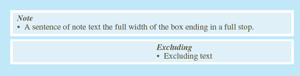
Diagram 9
Extend 'Note' boxes when there are two columns of text to the full useable width of the page where possible.
Outline answer box boundaries clearly
Use a 0.5-point line for normal answer boxes on both coloured and black and white forms (Diagram 10).
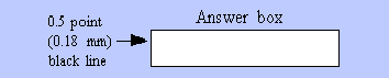
Diagram 10
The line for normal answer boxes is a solid drop-out for Optical Character Recognition (OCR) forms and black for other forms.
Use a 1-point line for 'Total' answer boxes so they stand out more (Diagram 11).

Diagram 11
Provide sufficient space for answer boxes
All answer spaces should be white and bounded by a continuous solid line of the appropriate thickness.
The number and size of answer boxes shapes respondents' perception of the amount of 'work' or 'effort' involved in completing a form.
Provide enough width for the number of characters expected in most cases, rather than the largest possible answer.
Use 8mm x 4mm segmented boxes (Diagram 12) for:
- numeric responses
- text that relies on OCR for editing and coding.
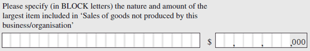
Diagram 12
Include ‘in BLOCK letters' (with 'block' in upper case) for questions that rely on OCR (Diagram 12).
For free text responses, present answer boxes as follows:
- Use 0.5-point regular dotted lines as guidelines within the answer space on both coloured and black and white forms (Diagram 13).
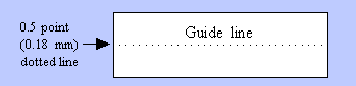
Diagram 13
- Allow 8 mm height for answer spaces that have one line or multiple lines. Note that the base of the answer box is used as a line of answer space (Diagram 14).
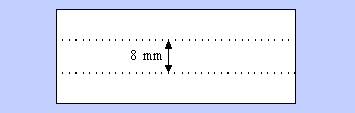
Diagram 14
For coloured forms, use dropout colour (a colour that does not appear on a scanned image) for the boxes and the lines in the free text response boxes.
Left align answer boxes used in matrices
Left align boxes in a matrix format when a mix of box sizes is used. This helps lead the eye across when respondents follow one column of boxes to another (Diagram 15).
Left align boxes with enough digit spaces to match the orders of magnitude.
Line up the commas when different levels of a measurement unit are used, and the boxes for the lower level unit allow for more digits than the higher level (e.g., the 1 in 1 tonne will line up with the 1 in 1,000 kg).
Matching the order of magnitude is not necessary when the answer boxes are the same size, but the commas should still align.
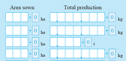
Diagram 15
Format ballot or tick boxes consistently
Use 4mm (5mm for OCR forms) square ballot boxes for most closed questions (Diagram 16). Ballot boxes smaller than 4 mm are difficult to use, and respondents may try to write in boxes above this size.
Place ballot boxes approximately 3 mm to the right of short field labels (including 'No/Yes' labels).
Place the option with the sequencing instruction first for 'No/Yes' options. This saves the respondent from reading the rest of the question when it does not apply to them.
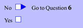
Diagram 16
The gap between the 'No/Yes' text and a ballot box should be no more than about 5 mm.
Left align the 'No/Yes' options with the question text when the question text is short and there are no note boxes in between.
Position the 'No/Yes' text to the bottom right of the question text when the question text is longer and/or when there are note boxes in between.
Left align response options that have four or more words (Diagram 17). Right align the tick boxes with the other answer spaces.
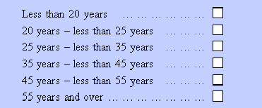
Diagram 17
Right align tick boxes in a vertical row when there are several, preceded by short field labels (Diagram 18). Allow 3 mm between the field labels and the answer boxes.

Diagram 18
Label fields for financial items ($,000)
Position label fields for financial items ($, 000) to make them clearly noticeable.
Place a '$' sign in 12-point plain type, left of the answer space.
For coloured forms, place the characters ',000' in 10-point plain type to the right of the answer space, with a 10% screen (Diagram 19).

Diagram 19
For black and white forms, place the characters ',000' in 12-point plain type at the right-hand side of the answer space.
Include instructions above the answer box about using a negative sign when a negative value may be reported (Diagram 20).
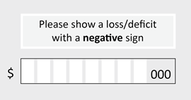
Diagram 20
Additional resource
The following case study on the redesign of Centrelink forms also contains information about lines and boxes, including split page forms.