Graph view
Graphing your table data
TableBuilder includes a function to graph your table data. There are a number of ways to interact with and edit the graph.
Click the Graph view tab to generate a graph based on the table that is currently open.
If the table is currently set to use percentages, then the graph represents the values as percentages.
To maximise the amount of space available for viewing your graph, hide the graph options panel on the left by clicking the < arrow. Click the > arrow to open it again.
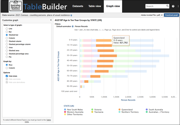
Hover your mouse over the graph to see more information about categories in the graph.
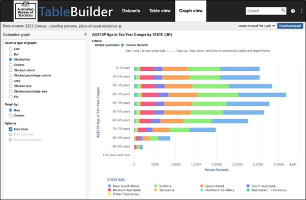
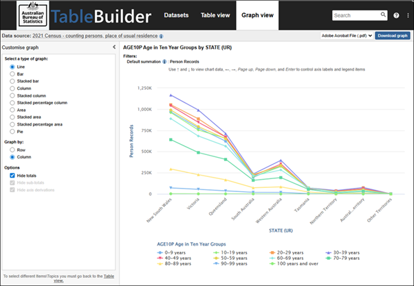
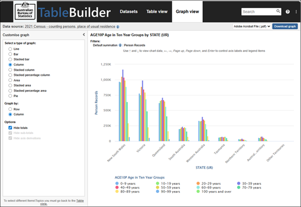
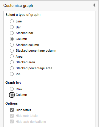
Change the graph type
Select a graph type from the list in the graph options panel. The graph updates automatically.
Line chart
Column chart
Graph by row or column
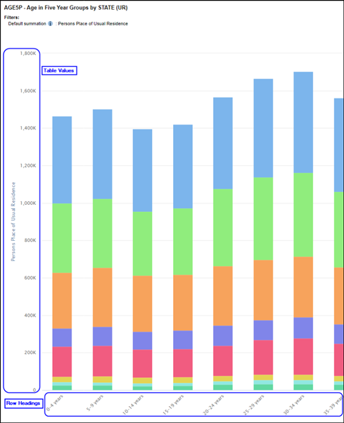
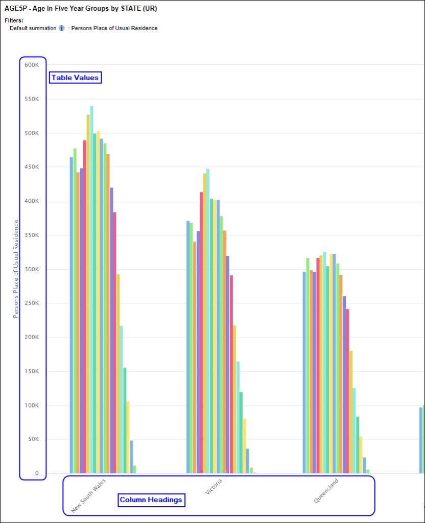
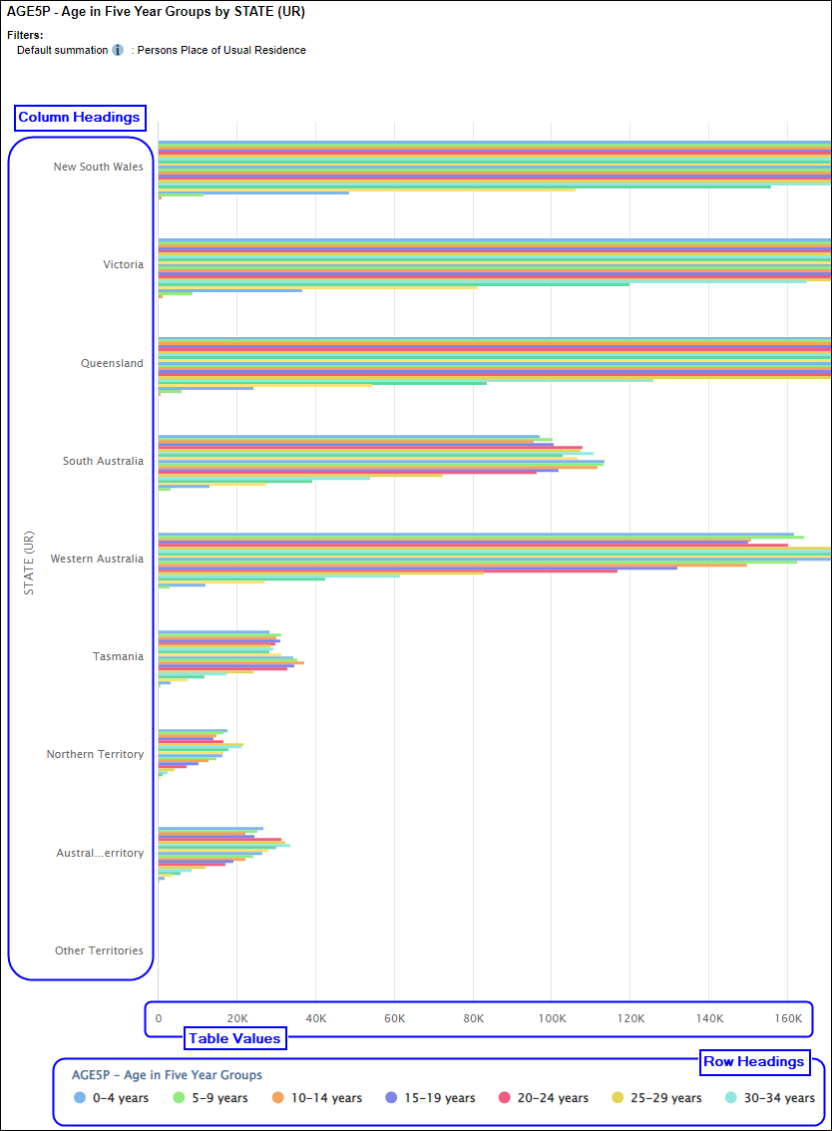
By default, TableBuilder places the variables from the table rows along one axis and shows the categories from the table on the other axis. To swap the headings on the axis, use the Graph by option.
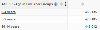
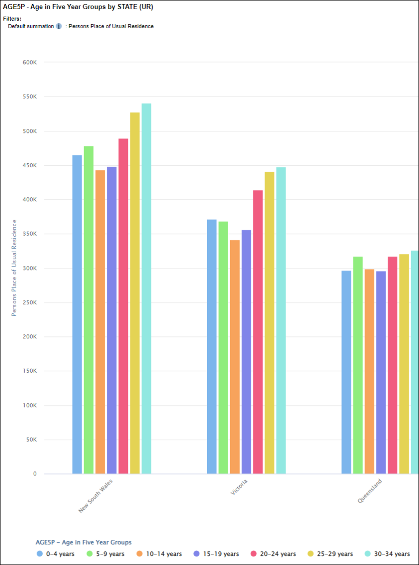
For example, the following table shows age in five year groups.
The default for most graph types is that row headings are placed on the x axis.
The exception to this is bar charts and stacked bar charts, which have the row headings on the y axis by default.
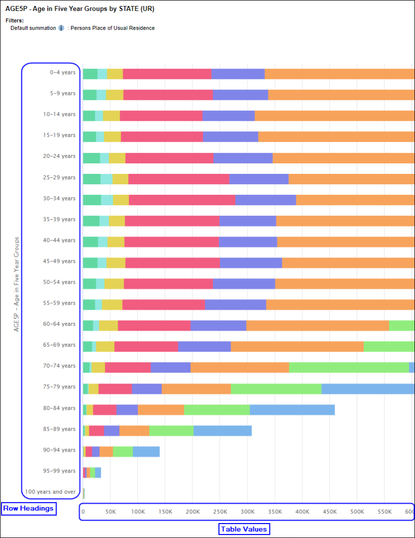
Select Column from the Graph By option to display the column headings on the x axis, instead of the row headings.
For bar charts, select Column from the Graph By option to display the column headings on the y axis, instead of the row headings.
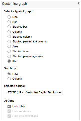
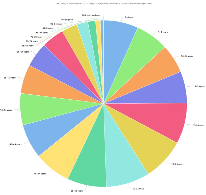
Select series for pie charts
Pie charts can only show a single row or column at a time. Use the Graph by option to choose whether to show a row or column from the table, and the Selected series drop-down to select which row or column. While pie charts can be created in TableBuilder they should be used with care as it can be difficult to make accurate comparisons about the relative size of each category.
For example, this pie chart is showing age in 5 year groups by state. Use the Selected series drop-down to change the range of states shown in the chart.
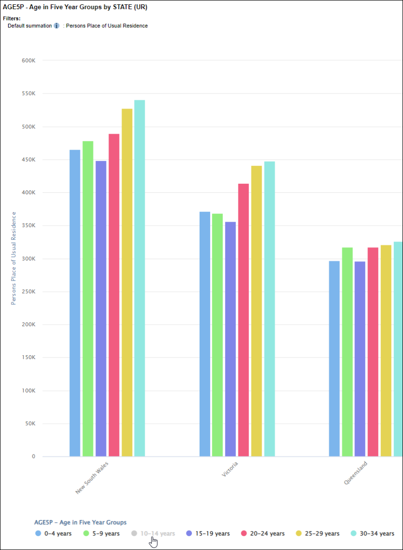
Hide categories
The key below the graph is interactive. Clicking any of the categories temporarily hides them from the graph. This can be particularly useful if you have outlying data that makes it hard to focus on the most relevant data.
In this graph, 30-34 years are much greater then 10-14 years.
Click on 10-14 years in the key to temporarily hide it from the graph. The graph automatically updates, and the scale of the y axis automatically adjusts to make best use of the available screen space.
Edit axis labels
The axis labels can be edited by double clicking on them and entering a new name. Clear the text to revert to the default label.
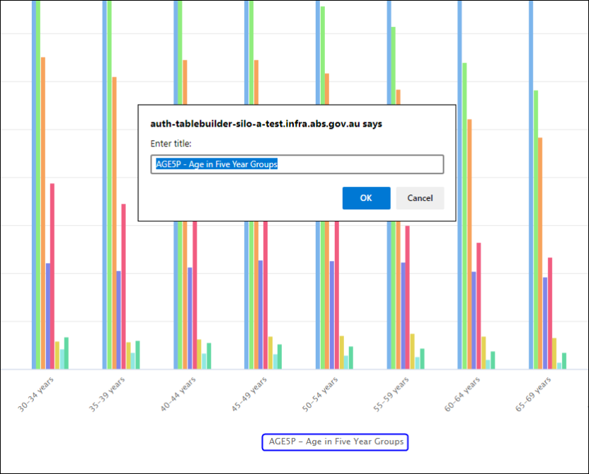
The edited labels are displayed for as long as you remain in Graph view. The labels are also included on PDF or PNG downloads. Changes the graph type and the graph keep the same edited labels. However, the labels are not be saved if you switch to one of the other views. For example, if you switch to Table view and then switch back to Graph view, the graph reverts to the default labels.
Graph size limits
If there are too many items in the table the graph cannot generate. TableBuilder displays a message indicating that the data is too big to be graphed if there are more than:
- 216 variables
- 1,000 cells
Go to Table view and make changes to reduce the table size. You may be able to reduce the table size by applying the Zero suppression options.

If the category labels have very long names, they may not be suitable to graph in TableBuilder. If the category labels are too long, they may be truncated with "..." in the key below the graph and in the text that appears when clicking on the graph. To best display your graph, download the table and use the graph options in your chosen application such as Excel.
Download graphs
Graphs cannot be saved within TableBuilder. Graphs are only available for the current session. However, saving the table used to create the graph allows you to reopen the saved table and then access the graph again via Graph view.
It is not recommended that graphs are printed directly from TableBuilder. Better formatting results can be obtained by downloading the graph or the table data into your chosen application such as Excel.
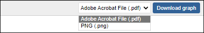
1. To download a graph (for example to use in a report or presentation), choose a download format from the drop-down list at the top right of the screen. Choose to download the graph as a PDF or PNG (image) format.
2. If there are too many categories in a graphed variable, only the first page of categories displays in the downloaded PDF or PNG. You may achieve better results by downloading the table instead, and use the graph options in your chosen application such as Excel.