Summary Indicators of Income and Wealth Distribution
Introduction
There are many ways to illustrate aspects of the distribution of income and wealth, and to measure the extent of inequality. In the Survey of Income and Housing (SIH), five main types of indicators are used - means and medians, frequency distributions, percentile ratios, income and wealth shares, and Gini coefficients. This part of the publication describes how these indicators are derived.
Analysis of both income and wealth provides the most complete understanding of how economic resources are distributed across the population.
Analysis of households and persons
There are two common ways of presenting analysis of households:
- number of households, or
- number of people in households.
In the former, each household contributes the same regardless of its size e.g. a four person household would have the same representation as a person living alone. These are called household weighted estimates.
To provide a better understanding of the circumstances of people it is often preferable to study people in households e.g. the number of people in Australian households experiencing economic hardship. In this analysis, each person is attributed with the characteristics of the household to which they belong e.g. household income is used to determine whether it is a low or high income household but analysis is about numbers of people experiencing hardship. This approach keeps the focus on individual circumstances while recognising that people share household resources. The main income measure used in SIH publications is equivalised disposable household income, while the main wealth measure is net wealth of household. When data is equivalised, the means and medians are person weighted. Most estimates that are not equivalised, are household weighted. The exception is in tables that refer to 'household characteristics of persons' or 'persons in households'. These estimates are person weighted.
Summary measures
Counts
Counts provide an estimate of the total number of people or households with a particular characteristic and are derived by summing the survey weights of each observation of interest. In sample surveys the weights enable extrapolation of the survey responses to official population estimates.
Means and medians
Mean (average) and median (the midpoint when all persons or households are ranked in ascending order) are simple indicators that can be used to show income and wealth differences between subgroups of the population.
Mean
The mean, or average, value of a data item is calculated by multiplying the value of the data item for the population of interest in each record by the weight of the record and summing the resultant products, and then dividing the total by the sum of the weights of the records. For example, the mean gross income of Queensland households is the weighted sum of the gross income of each such household divided by the sum of the weights relating to each such household.
Advantages of the mean are that it is easy to calculate and the means of all subcomponents sum to the mean of all observations. Its drawbacks are the effect of extreme values and asymmetry of the distribution, both of which are relevant for income and wealth data. For example, a small number of very wealthy and a large number of relatively poor households may have the same average income or wealth as a population where there is equal distribution of resources.
Median
Medians divide the population of interest into halves. To identify the median record, the population is first ranked in ascending order according to the data item of interest. Except for person weighted measures of household variables, the weights of the records are then accumulated until half the population is accrued. The record at which this occurs is the median record, and its value for the data item of interest is the median value. For person weighted measures of household variables, the household weights are multiplied by the number of persons in the household before accumulation.
Compared to the mean, the median is a more stable measure and is less affected by extreme values and sample fluctuations. However, median values of subcomponents do not sum to the median of all observations.
Frequency distribution
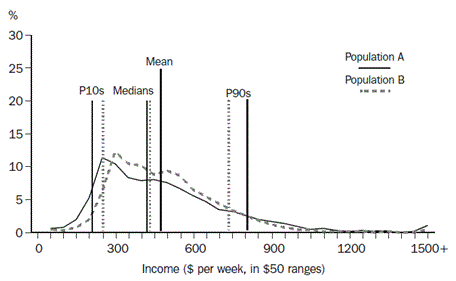
A frequency distribution illustrates the location and spread of income and wealth within a population. It groups the population into classes by size of household income or wealth, and gives the number or proportion of people in each income or wealth range. A graph of the frequency distribution is a good way to portray the essence of the income or wealth distribution. Graph 1 shows the proportion of people within $50 household income ranges.
- Equivalised Disposable Household Income, weekly
Annotation: Persons with an income between $50 and $2,800 are shown in $50 ranges on the graph
Sources: ABS Survey of Income and Housing, 2017–18, 2019–20
Frequency distributions can provide considerable detail about variations in the income or wealth of the population being described, but it is difficult to describe the differences between two frequency distributions. They are therefore often accompanied by other summary statistics, such as the mean and median. Taken together, the mean and median can provide an indication of the shape of the frequency distribution. As can be seen in the Graph 1, above, the distribution of income tends to be asymmetrical, with a small number of people having relatively high household incomes and a larger number of people having relatively lower household incomes. The greater the asymmetry, the greater will be the difference between the mean and the median. The small number of very high values raises the mean, while the median is not impacted by extreme values.
Quantile measures
When persons (or any other units) are ranked from the lowest to the highest on the basis of some characteristic such as their household income or wealth, they can then be divided into equally sized groups. The generic term for such groups is quantiles.
Quintiles, deciles and percentiles
When the population is divided into five equally sized groups, the quantiles are called quintiles. If there are 10 groups, they are deciles, and division into 100 groups gives percentiles. Thus the first quintile will comprise the first two deciles and the first 20 percentiles.
SIH publications frequently present data classified into income or wealth quintiles, supplemented by data relating to those with incomes in the 3rd to 20th percentiles of equivalised disposable household income, i.e. the lowest income quintile excluding the bottom two percentiles. The latter is included to enable quintile-style analysis to be carried out without undue impact from very low incomes which may not accurately reflect levels of economic wellbeing. Estimates for this population in the relevant data cubes are labelled 'Adjusted lowest income quintile'.
Equivalised disposable household income and equivalised net wealth of household are some of the measures used to define the income and wealth quantiles shown in SIH publications, and the quantiles each comprise the same number of persons, that is, they are person weighted.
Gross household income and net worth of household are other measures used to define the income and wealth quantiles in these publications, and the quantiles each comprise the same number of households, that is, they are household weighted.Gross household income and net worth of household are other measures used to define the income and wealth quantiles in these publications, and the quantiles each comprise the same number of households, that is, they are household weighted.
Upper values, medians and percentile ratios
In some analyses, the statistic of interest is the boundary between quantiles. This is usually expressed in terms of the upper value of a particular percentile. For example, the upper value of the first quintile is also the upper value of the twentieth percentile and is described as P20. The upper value of the ninth decile is P90. The median of a whole population is P50, the median of the third quintile is also P50, the median of the first quintile is P10, etc.
Percentile ratios summarise the relative distance between two points on the income or wealth distribution. To illustrate the full spread of the distribution, the percentile ratio needs to refer to points near the extremes of the distribution, for example, the P90/P10 ratio. The P80/P20 ratio better illustrates the magnitude of the range within which the income or wealth levels of the majority of the population fall. The P80/P50 and P50/P20 ratios focus on comparing the ends of the distribution with the midpoint (the median).
Income or wealth shares
Income or wealth shares can be calculated and compared for each income or wealth quintile (or any other subgrouping) of a population. The aggregate income of the units in each quintile is divided by the overall aggregate income of the entire population to derive income or wealth shares.
Gini coefficient
Taken together, the simple measures of income or wealth distribution such as mean, median, percentile ratios and income shares can provide an indication of changes in the income or wealth distribution of a population over time, or differences in the income or wealth distributions of two separate populations. However, none of the simple measures comprise a single statistic that summarises the whole income or wealth distribution in a way that directly considers and compares the individual income or wealth levels of all members of the population. In SIH publications, the Gini coefficient is used to compile a single statistic of inequality by summarising the distribution of income or wealth across the population.
Concept of inequality
It is generally agreed that perfect equality in the distribution of income or wealth can be defined as the situation in which everyone in the population lives in a household with the same equivalised disposable household income or net worth. If any person has lower or higher equivalised disposable household income than any other person, there is inequality in the income distribution, and the same definition applies to wealth inequality. However, there is no unique, generally accepted way of summarising the degree to which a population does not have perfect equality, or, more practically, summarising the difference in inequality between two populations.
Unequal distributions of income can occur in many different ways. The majority of people may have very similar incomes with pockets of very high or very low income. Wealth, due to the effect of accrual over the life course, is generally more unequally distributed, that is, more concentrated among older persons than younger persons. Or entire populations may be heavily clustered at the top and the bottom of the income distribution with few people receiving incomes in between these extremes. To evaluate one distribution as having greater or lesser inequality than another, it is necessary to compare the distributions in terms of which segments of the population have a greater share of income and which segments have a lower share. It is then necessary to at least implicitly judge whether the relative gains by some people is more than offset or less than offset by the relative losses of other people. Different observers may make different judgments about the same situation, depending on factors including personal preferences.
For example, consider the equivalised disposable household income of the two populations A and B depicted in Graph 2, 'Frequency Distributions'. Population A is derived from the 2000–01 SIH population, while population B covers the same people as in population A, but everyone's income is transformed to reduce the proportional differences in income across the population while retaining the same mean income for the population. Therefore fewer people are on very low or very high incomes and more people are between these extremes, with the median for population B closer to the mean, and less spread between P10 and P90.
Graph 2 - Frequency distributions
Image
Description
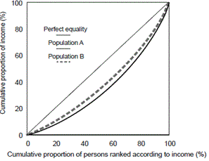
The extent to which the income distributions for populations A and B vary from equality, and from each other, can be illustrated graphically another way, using Lorenz curves.
Lorenz curves
The Lorenz curve is a graph with the horizontal axis showing the cumulative proportion of the persons in the population ranked according to their income and with the vertical axis showing the corresponding cumulative proportion of equivalised disposable household income. The graph then shows the income share of any selected cumulative proportion of the population. The diagonal line represents a situation of perfect equality, i.e., where all people have the same equivalised disposable household income. Graph 3 'Lorenz Curves' shows the Lorenz curves for the two populations described above.
Graph 3 - Lorenz curves
Image
Description
Since the distribution of population B's income is uniformly less widely spread than for population A, all points of the Lorenz curve for population B are closer to the line of perfect equality than the corresponding points of the Lorenz curve for population A. In this situation, population B is said to be in a position of Lorenz dominance and can be regarded as having a more equal income distribution than population A. However, if the Lorenz curves of two populations cross over there is no Lorenz dominance and there is no generally accepted way of defining which of the two populations has the more equal income distribution.
Gini coefficient
The Gini coefficient can best be described by reference to the Lorenz curve. It is defined as the ratio of the area between the actual Lorenz curve and the diagonal (or line of equality) and the total area under the diagonal. The Gini coefficient ranges between zero when all incomes are equal and one when one unit receives all the income, that is, the smaller the Gini coefficient the more even the distribution of income.
Normally the degree of inequality is greater for the whole population than for a subgroup within the population because subpopulations are usually more homogeneous than full populations. This is illustrated in Graph 4 below, which shows two Lorenz curves from the 2019–20 SIH. The Lorenz curve for the whole population of the SIH is further from the diagonal than the curve for persons living in one parent, one family households, with at least one dependent child. Correspondingly, the calculated Gini coefficient for all persons was 0.324 while the coefficient for the persons in the one parent households was 0.311.
- Equivalised Disposable Household Income
Source(s): Survey of Income and Housing 2019–20
Mathematically, the Gini coefficient can be expressed as:
\(G=\left(\frac{1}{2 n^{2} \mu}\right)\displaystyle\sum_{i=1}^{n}\sum_{j=1}^{n}\left|y_{i}-y_{j}\right|\)
where:
n is the number of people in the population
u is the mean equivalised disposable household income of all people in the population
and yi and yj are the equivalised disposable household income of the ith and jth persons in the population.
The Gini coefficient is a summary of the differences between each person in the population and every other person in the population. The differences are the absolute arithmetic differences, and therefore a difference of $x between two relatively high income people contributes as much to the index as a difference of $x between two relatively low income people.
An increase in the income of a person with income greater than median income will always lead to an increase in the coefficient, and a decrease in the income of a person with income lower than median income will also always lead to an increase in the coefficient. The extent of the increase will depend on the proportion of people that have income in the range between median income and the income of the person with the changed income, both before and after the change in income. At the extremes, increasing the income of the person with the lowest income by $x – or increasing the income of the person with the highest income by $x – will respectively decrease and increase the Gini coefficient by the same amount (assuming the lowest income person remains the lowest income person after the change).
The Gini coefficient is sometimes criticised as being too sensitive to relative changes around the middle of the income distribution. This sensitivity arises because the derivation of the Gini coefficient reflects the ranking of the population, and ranking is most likely to change at the densest part of the income distribution, which is likely to be around the middle of the distribution.
The Gini coefficient is the only single statistic summary of income distribution included in the SIH publications. The Gini is preferred over other summary measures because it is not overly sensitive to the very low income or wealth values that can be reported, and it is relatively simple to interpret.