Frequency distribution
Definition
Frequency distributions are visual displays that organise and present frequency counts so that the information can be interpreted more easily.
Frequency distributions can show absolute frequencies or relative frequencies, such as proportions or percentages.
How to show a frequency distribution
A frequency distribution of data can be shown in a table or graph. Some common methods of showing frequency distributions include frequency tables, histograms or bar charts.
Frequency tables
A frequency table is a simple way to display the number of occurrences of a particular value or characteristic.
For example, if we have collected data about height from a sample of 50 children, we could present our findings like the table below.
| Height (cm) of children | Absolute frequency | Relative frequency |
|---|---|---|
| 120 – less than 130 | 9 | 18% |
| 130 – less than 140 | 10 | 20% |
| 140 – less than 150 | 13 | 26% |
| 150 – less than 160 | 11 | 22% |
| 160 – less than 170 | 7 | 14% |
| Total | 50 | 100% |
From this frequency table we can quickly identify information such as 7 children (14% of all children) are in the 160 to less than 170 cm height range, and that there are more children with heights in the 140 to less than 150 cm range (26% of all children) than any other height range.
Frequency graphs
Data can also be presented in graphical form.
Histograms and bar charts are both visual displays of frequencies using columns plotted on a graph. The Y-axis (vertical axis) generally represents the frequency count, while the X-axis (horizontal axis) generally represents the variable being measured.
A histogram is a type of graph in which each column represents a numeric variable, in particular that which is continuous and/or grouped.
A histogram shows the distribution of all observations in a quantitative dataset. It is useful for describing the shape, centre and spread to better understand the distribution of the dataset.
Features of a histogram:
- The height of the column shows the frequency for a specific range of values.
- Columns are usually of equal width, however a histogram may show data using unequal ranges (intervals) and therefore have columns of unequal width.
- The values represented by each column must be mutually exclusive and exhaustive. Therefore, there are no spaces between columns and each observation can only ever belong in one column.
- It is important that there is no ambiguity in the labelling of the intervals on the x-axis for continuous or grouped data (e.g. 0 to less than 10, 10 to less than 20, 20 to less than 30).
For example:
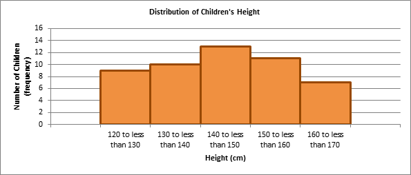
The histogram below shows the same information as the frequency table.
Distribution of children's height
Image
Description
Histogram graph showing the distribution of children's height. Number of children with a height of:
- 120cm to less than 130cm - 9
- 130cm to less than 140cm - 10
- 140cm to less than 150cm - 13
- 150cm to less than 160cm - 11
- 160cm to less than 170cm - 7
A bar chart is a type of graph in which each column (plotted either vertically or horizontally) represents a categorical variable or a discrete ungrouped numeric variable.
It is used to compare the frequency (count) for a category or characteristic with another category or characteristic.
Features of a bar chart:
- In a bar chart, the bar height (if vertical) or length (if horizontal) shows the frequency for each category or characteristic.
- The distribution of the dataset is not important because the columns each represent an individual category or characteristic rather than intervals for a continuous measurement. Therefore, gaps are included between each bar and each bar can be arranged in any order without affecting the data.
For example:
If data had been collected for 'country of birth' from a sample of children, a bar chart could be used to plot the data as 'country of birth' is a categorical variable.
| Country of Birth | Absolute frequency | Relative frequency |
|---|---|---|
| Australia | 16 | 32% |
| Fiji | 3 | 6% |
| India | 8 | 16% |
| Italy | 10 | 20% |
| New Zealand | 9 | 18% |
| United States of America | 4 | 8% |
| Total | 50 | 100% |
The bar chart below shows us that 'Australia' is the most commonly observed country of birth of the 50 children sampled, while 'Fiji' is the least common country of birth.
Birthplace of children
Image

Description
Bar graph showing the frequency of children's birthplace.
- Australia - 16
- Italy - 10
- New Zealand - 9
- India - 8
- USA - 4
- Fiji - 3