Census interactive maps
Explore data on Australia's population movement and journey to work
Population movement in Australia
Internal migration data from the Census allows us to understand the movements of our population across the whole country, and over time. This map looks at arrivals, departures and net migration of each Statistical Area Level 4 (SA4), within Australia over two Census cycles (2016 and 2021).
Further analysis on internal migration using Census data can be found in the Population movement in Australia article.
To explore data on population movement in different areas, visit the interactive map.
Image
Description
Australia’s journey to work
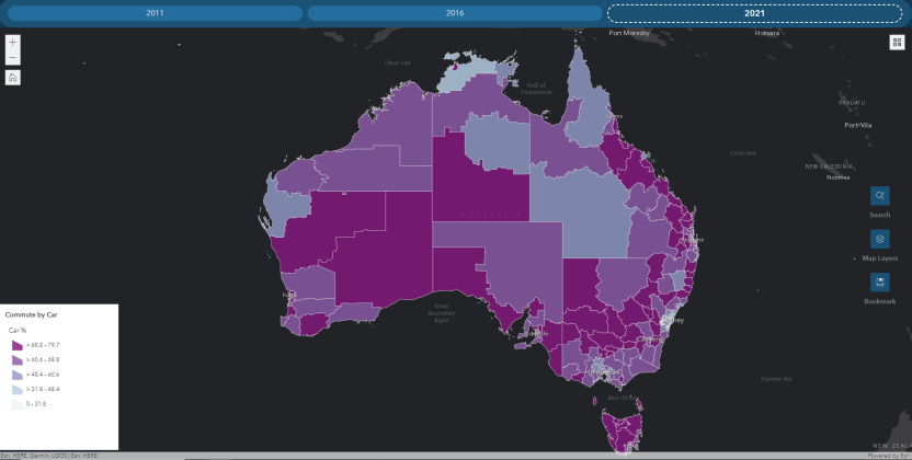
This interactive map illustrates how employed Australians travelled to work on the day of the Census in 2011, 2016 and 2021 by Statistical Area Level 3 (SA3). It shows the most common modes of transport: Train, Bus, Car, Active (includes Bicycle and Walked only), Worked from home and Did not go to work.
Further analysis on the modes of transport Australians used to commute to work, and the type of work they did, can be found in the Australia's journey to work article.
To explore data on how Australians travelled to work, visit the interactive map.
Image

Description
How to use
- To interact with the map visit the Population movement in Australia map or the Australia's journey to work map.
- If the map page does not load, please try again later.
- Use the tabs across the top of the map to view different years of data. On mobile devices click on the word 'Experience' where the map should appear and a new tab will open. Best viewed on a desktop or tablet device.
- You can search for locations using names, addresses, suburbs or statistical area names.
- Click on a region of interest to view data and graphs about that region.