CHAPTER 4 HOW TO INTERPRET SEIFA SCORE DISTRIBUTIONS
INTRODUCTION
This chapter aims to assist the interpretation of the index scores, using distributions, examples and maps. This chapter also briefly introduces the geographic areas used in SEIFA.
- WHAT DO THE INDEXES LOOK LIKE?
- INTERPRETING SEIFA USING A COMPARISON OF TWO CDS
- INTERPRETING SEIFA USING MAPS
- INTRODUCTION TO GEOGRAPHY
WHAT DO THE INDEXES LOOK LIKE?
Terms: Scores, ranks, deciles and percentiles
SCORES: A score for a collection district (CD) is created by adding together the weighted characteristics of that CD. The scores for all CDs are then standardised to a distribution where the average equals 1000 and roughly two-thirds of the scores lie between 900 and 1100.(footnote 1)
This means that approximately 15% of CDs have a score lower than 900 with the remaining 85% of CDs having a score higher than about 900. Approximately 85% of CDs have a score lower than 1100 with the remaining 15% of CDs having a score higher than about 1100. The scores are used to rank the CDs, so care should be taken when comparing scores. For example, an area with a score of 500 is not twice as disadvantaged as an area with a score of 1000; it just had more markers of relative disadvantage.
RANKS: The CDs are ranked in order of their score, from lowest to highest.
DECILES: Decile 1 contains the bottom 10% of CDs, Decile 2 contains the next 10% of CDs and so on.
PERCENTILES: Percentile 1 contains the bottom 1% of CDs, Percentile 2 contains the next 1% of CDs and so on.
Index distributions and interpretation
Please refer to Chapter 2 for further discussion on the interpretation of each index.
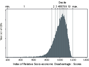
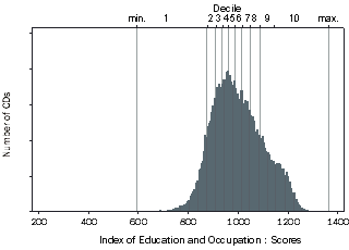
Figures 4.1 - 4.4 show the distribution of CD scores for each index.(footnote 2) Most of the CDs have scores somewhere in the middle, with a few areas having very high or very low scores. Because these are standardised scores, the mean score equals 1000 and approximately two-thirds of the scores lie between 900 and 1100.(footnote 3) Despite standardisation, the shape of the distribution and the minimum and maximum score are different for each index. These different distributions highlights the fact that there are many ways to capture relative socio-economic disadvantage.
Care must be taken when directly comparing individual CD scores, particularly where the scores are similar. It is more appropriate to compare deciles groups than scores of individual CDs. Figures 4.1 - 4.4 show the decile cut-offs marked along the top axis of the index distributions. However, for all four indexes, the middle deciles are close together. This means that care must be taken when comparing these middle deciles because the CDs in these deciles are not particularly disadvantaged or advantaged. The distributions of each index are described further below. For additional information on the interpretation of SEIFA scores refer to Chapter 2. For information on the use of SEIFA refer to Chapter 5.
Index of Relative Socio-economic Disadvantage (IRSD) Distribution
Figure 4.1 shows the distribution of the Index of Relative Socio-economic Disadvantage, the index that includes only variables related to relative disadvantage (17 variables in total). The full list of variables appear in the Appendix, including:
- Proportion of low income households in the area;
- Proportion of people who do not speak English well;
- Proportion of households who pay low rent; and
- Proportion of people with no post-school qualifications.
This index is therefore appropriate for distinguishing between relatively disadvantaged areas. This is shown by the long left tail in the distribution. The decile cut-offs (marked along the top axis), show that the middle deciles are close together. It is not appropriate to use SEIFA indexes to distinguish between these deciles. This indicates that CDs with mid-range scores are neither particularly disadvantaged nor lacking disadvantage relative to other areas. This index is appropriate for users who are interested in the relative disadvantage of people in an area (lower deciles), and the relative lack of disadvantage of people in an area generally (upper deciles). Note that compared to the other indexes, the CDs in the upper deciles have more similar scores for this index. This is because these CDs lack indicators of disadvantage, and it will therefore be more difficult to distinguish between them using this index, compared to the other indexes.
Figure 4.1 IRSD Scores Histogram
Index of Relative Socio-economic Advantage and Disadvantage (IRSAD) Distribution
Figure 4.2 shows the distribution for the Index of Relative Socio-economic Advantage and Disadvantage. This index utilised 21 variables which are listed in the Appendix, including:
- Proportion of high income households in the area;
- Proportion of low income households in the area;
- Proportion of households with broadband internet connection; and
- Proportion of households without access to the internet.
The decile cut-offs again show that the middle scores are close together. However, the higher scores are more spread out than the Disadvantage index. Because this index also includes variables related to relative advantage, it is useful for distinguishing between advantaged areas (as well as disadvantaged areas). Therefore, this index is appropriate for users who are interested in relative advantage as well as disadvantage.
For the Disadvantage index, the higher deciles indicate only a relative lack of disadvantage. For the Index of Relative Advantage and Disadvantage, the higher deciles indicate relative advantage. A CD could have a high 'disadvantage' score (relative lack of disadvantage), but not necessarily a high 'advantage/disadvantage' score (relative advantage).
Figure 4.2 IRSAD Scores Histogram
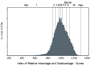 Figure 4.3 IER Scores Histogram
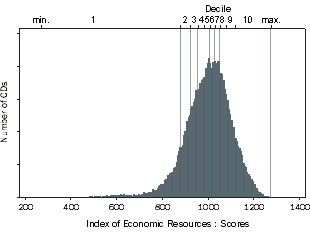 Figure 4.4 IEO Scores Histogram
Index of Economic Resources (IER) Distribution
Figure 4.3 shows the distribution for the Index of Economic Resources. This index also includes variables related to both relative disadvantage and advantage (15 in total). The variables are selected to represent 'access to economic resources'. These variables are listed in the Appendix, and include:
- Proportion of high income households in the area;
- Proportion of low income households in the area;
- Proportion of home owners in the area; and
- Proportion of unemployed people in the area.
This index is appropriate for users who are interested in comparing areas based on the overall access to economic resources of people in the area. While this index includes a broad range of information, it does not include information, such as superannuation, that is not measured by the Census.
Index of Education and Occupation (IEO) Distribution
Figure 4.4 shows the distribution for the Index of Education and Occupation. This index also includes variables related to both relative disadvantage and advantage (nine in total). The variables are selected to represent education and occupation. The education variables are designed to measure low or high levels of educational attainment of people in the area. The occupation variables are designed to measure people with jobs requiring low skills, few qualifications and have little control over one's own worktime; as well as people with jobs that tend to require high skills, high qualifications and are autonomous. These variables are listed in the Appendix, and include:
- Proportion of people with a diploma qualification;
- Proportion of people with no post-school qualifications;
- Proportion of people employed in a job classified in occupation-skill group 1 (such as managerial and professional jobs); and
- Proportion of people employed in a job classified in occupation-skill group 5 (such as some labouring and sales jobs).
This index is appropriate for users who are interested in comparing areas based on the qualifications and jobs of the people in the area.
INTERPRETING SEIFA USING A COMPARISON OF TWO CDS
Comparison
This section aims to assist the interpretation of SEIFA scores, ranks and deciles by using two CDs located in Sydney as examples:
- A CD located in Manly (located at the Sydney Harbour entrance); and
- A CD located in Macquarie Fields (located on the south-west outskirts of Sydney).
It is important to note that there may be a diverse range of CDs within an area (as shown by the SLA map in
figure 4.7). Similarly, there can be a diverse range of people and households within each CD. The CD selected for this example may not be representative of the area as a whole, or of an individual person living in the CD.
Figure 4.5 shows the scores, ranks and deciles for each of the four indexes for both the 'Manly' and 'Macquarie Fields' CDs.
Figure 4.5 Comparison of SEIFA scores, ranks, deciles |
|  |
 | IRSD | IRSAD | IER | IEO |  |
 | score | rank | decile | score | rank | decile | score | rank | decile | score | rank | decile |  |
|  |
| CD in Manly | 1 116 | 34 598 | 10 | 1 180 | 36 254 | 10 | 1 094 | 31 519 | 9 | 1 196 | 36 272 | 10 |  |
| CD in Macquarie Fields | 1 000 | 16 116 | 5 | 989 | 17 345 | 5 | 996 | 16 865 | 5 | 970 | 15 858 | 5 |  |
|  |
The first thing to note is that each particular area has a different score for each index. It can be difficult to know at first glance whether a score is relatively high or low, especially since the range of scores is slightly different for each index (as shown by the distributions in figures 4.1 - 4.4).
CD in Manly
For example, the CD in Manly has a different score for each index, although they do look roughly the same (IRSD 1116; IRSAD 1180; IER 1094; IEO 1196). All of these index scores are above 1100 (apart from IER), which means that for every index except IER, this CD has a higher score than at least 85% of the other CDs.(footnote 4) This is confirmed by the rank for each index, remembering that ranks range between 1 and 37,457 for CDs (IRSD 34,598; IRSAD 36,254; IER 31,519; IEO 36,272). This is also confirmed by the decile for each index (IRSD 10; IRSAD 10; IER 9; IEO 10). This means that this CD lies within the top 10% of CDs for IRSD, IRSAD and IEO; and in the top 20% of CDs for IER.
As a whole, the people in this area as a whole tend to lack disadvantage, are relatively advantaged, have relatively high access to economic resources and are relatively highly educated and skilled. An area will tend to have similar scores for every index, however this is not necessarily the case because each index is based on different information.
CD in Macquarie Fields
The CD in Macquarie Fields also has roughly similar scores for each of the four indexes (IRSD 1000; IRSAD 989; IER 996; IEO 970). These scores are all at, or just below, the mean of 1000, which means they are in the mid range. This is confirmed by the ranks (IRSD 16,116; IRSAD 17,345; IER 16,865; IEO 15,858). This is also confirmed by the deciles (IRSD 5; IRSAD 5; IER 5; IEO 5).
As a whole, people in this area do not particularly lack disadvantage, are neither relatively advantaged or disadvantaged, have medium access to economic resources and have a mid level of education and skills relative to other areas. SEIFA is a general measure of relative socio-economic disadvantage that includes a wide range of variables. Therefore, care must be taken when comparing this CD to other CDs with scores in the mid range. As discussed in Chapter 5, areas may have similar scores, but for very different reasons due to the wide range of variables included in the index construction.
However, in this case, the individual CDs in this example can be compared because their scores are so different. The CD in Manly is generally more advantaged (and less disadvantaged) than the CD in Macquarie Fields, for each of the four indexes. Note that it is possible for a high (or low) income household to be located in either of these CDs.
INTERPRETING SEIFA USING MAPS
Maps
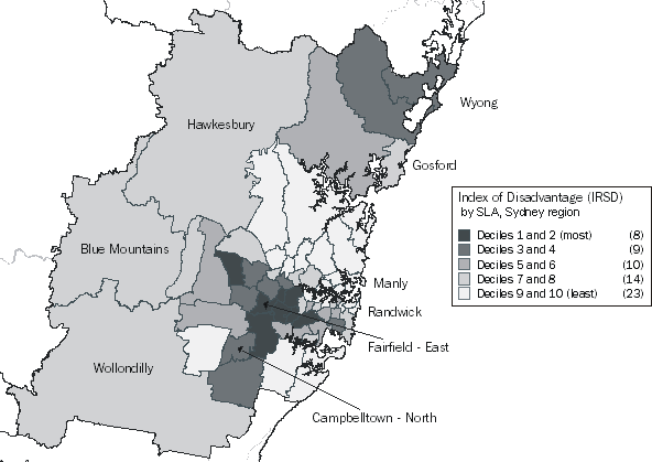
Maps are useful as visual comparisons of areas for the SEIFA indexes. Figure 4.6 maps the Index of Relative Disadvantage for Statistical Local Areas (SLAs) within the Sydney region. This map shows SLAs with a score in the lower deciles (reflecting more disadvantage), such as Liverpool East, as well as SLAs with a score in the highest deciles (reflecting less disadvantage), such as Manly.
At the Australia-wide level, there are an equal number of SLAs in each decile. However, as shown on the legend, Sydney has many more SLAs in the highest deciles (less disadvantage) than in the lower deciles (more disadvantage).
Figure 4.6 Index of Relative Socio-economic Disadvantage, SLA deciles, Sydney region
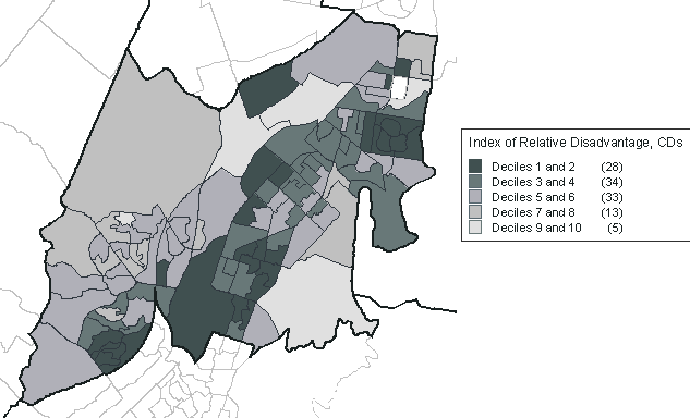
While areas of relatively high or low disadvantage tend to be clustered together, it is important to note that there can be a lot of diversity within an area. This is highlighted by
figure 4.7, which maps the Index of Relative Disadvantage for the collection districts within
Campbelltown North Statistical Local Area. The entire SLA has an IRSD decile of 3, however every CD decile is represented by the collection districts within this SLA. Because of this diversity, using the SEIFA indexes for CDs are generally more appropriate than for larger areas, such as SLAs. If using SEIFA indexes for larger areas, any diversity should be acknowledged.
Figure 4.7 Index of Relative Socio-economic Disadvantage, CD deciles, Campbelltown North
INTRODUCTION TO GEOGRAPHY
Geography
SEIFA indexes are released for four levels of area. Collection Districts (CD), Statistical Local Areas (SLA) and Local Government Areas (LGA) are ASGC standard geographical areas. Postal Areas (POA) and State Suburbs (SSC) are not ASGC areas, however are commonly used geographical areas. These geographies are explained further in the Glossary. Refer also to Geographies in the Glossary.
Creation of SEIFA for Areas larger than a CD
As discussed in Chapter 2, the SEIFA index scores were first created at a CD level. The index scores for other geographic levels (SLA, LGA, POA, SSC), were constructed using the scores of the CDs within these areas.(footnote 5) Even though a CD is the smallest type of area currently available, people and households within a CD can be quite different to each other. While SEIFA represents an average of all these different people, SEIFA does not represent the individual situation of each person. Larger areas are more likely to have a greater diversity of people and households. While SEIFA indexes are created for larger areas, the best use of SEIFA will be achieved at the CD level. Where SEIFA is required for analysing a larger area (such as SLA), we recommend carefully examining the distribution of CDs within these areas.
Care must be taken when interpreting the index scores at these other geographic levels. Refer to Population Weighting and Geographies in the Glossary for more information.
Further information on geographies
Refer to the following references for further information on geographies.
- Statistical Geography: Volume 2 - Census Geographic Areas, Australia, 2006 : Chapter 1, Introduction (ABS cat. no. 2905.0)
- Statistical Geography: Volume 2 - Census Geographic Areas, Australia, 2006 : Chapter 4, Postal Areas ABS cat. no. 2905.0)
- Statistical Geography: Volume 2 - Census Geographic Areas, Australia, 2006 : Chapter 5, State Suburbs ABS cat. no. 2905.0)
- Census Dictionary, 2006 (Reissue) : Glossary, Collection District (CD) (ABS cat. no. 2901.0)
- Census Dictionary, 2006 (Reissue) : Glossary, Postal Areas (POA)
- Census Dictionary, 2006 (Reissue) : Glossary, State Suburbs (SSC)
1 Actually, around 74% of CDs lie between 900 and 1100 for the Index of Relative Disadvantage. Please refer to Standardisation in the Glossary for more information.
<back
2 The horizontal axis shows the SEIFA score, and the vertical axis shows how many CDs have that score (37,457 CDs in total).
<back
3 Refer to Standardisation in the Glossary.
<back
4 Note that these proportions are approximate only. Please refer to Standardisation in the Glossary.
<back
5 Indexes for these areas were constructed by taking the population-weighted mean of the CD score within the area, as explained further in the Glossary and the Technical Paper.
<back
 Print Page
 Print All