6523.0 - Household Income and Wealth, Australia, 2013-14  Quality Declaration
Quality Declaration ARCHIVED ISSUE Released at 11:30 AM (CANBERRA TIME) 04/09/2015
Page tools:
 Print Page Print Page
 Print All Print All
| ||
|
INCOME AND WEALTH DISTRIBUTION There are a range of measures that can support analysis of how income and wealth are shared among households in Australia. One method is to consider the distribution of income and wealth by ranking households from lowest to highest income or wealth and then divide the population into five equal groups (quintiles). As shown in Graph 1, after taking account of the number and age of people in the household, households in the highest income quintile received over 40% of total income in 2013–14. By comparison, households in the lowest quintile received 7.3% of total income. This pattern has remained relatively stable over the past 20 years. The distribution of wealth is more unequal than for income. Graph 1 shows that the top 20% of households when ranked by their level of wealth, owned 62% of total household wealth in 2013–2014. By comparison, the bottom 20% of households, owned less than 1% of all household wealth.  per quintile, 2013-14.GIF) Footnote(s): (a) Equivalised Disposable Household Income Source(s): Graph data SIH The mean equivalised disposable household income of all households in Australia in 2013–14 was $998 per week. The median was lower, however, at $844 per week. This reflects the unequal distribution of income with a larger proportion of low income households and a smaller proportion of very high income households, as shown in Graph 2. , 2013-14.GIF) Annotation(s): Persons with an income between $50 and $2,500 are shown in $50 ranges on the graph. Footnote(s): (a) Equivalised Disposable Household Income Source(s): Graph data SIH Similarly, while the mean wealth of all households in Australia in 2013–14 was $809,900, the median was much lower at $461,500. As shown in Graph 3, there is greater inequality in the net worth distribution. The 20% of households with the lowest net worth had a mean net worth of $35,600. Of these, 93,800 households had negative wealth. In comparison, the 20% of households with the highest net worth had a mean net worth of $2,514,300. 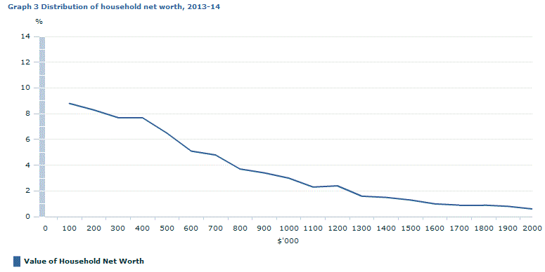 Annotation(s): Households with net worth between $0 and $2,000,000 are shown in $100,000 increments. Source(s): Graph data SIH There are many summary indicators of the distribution of income and wealth across the population. The ABS uses the Gini coefficient as an internationally comparable indicator. The Gini coefficient is not overly sensitive to low and negative incomes. The Gini is a single statistic that lies between 0 and 1. If everyone in the population had the same income or wealth, the Gini coefficient would be zero. Gini coefficient values that are closer to 1 represent greater inequality. In 2013–14, the Gini coefficient was 0.333 for income, compared to 0.320 in 2011–12. The Gini coefficient is quite sensitive to high values and more high income households were included in the 2013–14 cycle of the SIH than previously, due to sampling variation. The Gini coefficient for wealth is typically higher than for income, reflecting the greater level of inequality in the distribution of wealth. The Gini coefficient for wealth in 2013–14 was 0.605 compared to 0.593 in 2011–12. Change in the distribution of income and wealth over time is a key area of interest for social and economic policy analysts and researchers. Distribution analysis can indicate whether the material living standards of the community are improving evenly across the population. Document Selection These documents will be presented in a new window.
|
|