Archived content. This page is no longer actively maintained and may not function as intended. For the latest information and statistics visit the ABS Website.
Footnote(s): (a) Household income measured at the 10th percentile (P10) and the median (P50) are used in the calculation of this ratio (P10/P50 ratio). (b) Household income has been equivalised and adjusted to include imputed rent.
Fair outcomes in Australia have not changedgreatly in recent years
Indicator: Ratio of income received by low income households relative to middle income households
Why is this theme important?
Australians told us that it was important that all Australians shared equitably in economic progress. Many share concerns about disadvantage and inequity and want to ensure all Australians have basic standards of living. In particular, there is a feeling that people should have opportunities to improve their wellbeing, regardless of differences in education, socioeconomic background or other factors. Moreover, many believe that contributing to these balanced economic outcomes should be the shared responsibility of individuals, governments and the private sector.
How have we decided things haven't changed greatly?
We have decided that there has been little change in fair outcomes in Australia in recent years because the ratio of income received by low income households relative to middle income households (our headline progress indicator for fair outcomes) hasn't moved much.
In order for there to be improvement in fair outcomes, we would expect so see an increase in the ratio, indicating that the income received by households on the lower end of the income scale is moving closer towards the population median.
In 2007-08, the ratio of income received by low income households (measured at the 10th percentile of the income distribution) relative to middle income households (measured using the population median) was 0.52. Four years later in 2011-12, the ratio was similar at 0.53. This ratio tells us that households with low incomes receive slightly more than half the amount of income as households in the middle of the distribution (53% in 2011-12).
Why this headline progress indicator?
The level of income received by different households is an important part of the aspiration for an economy that supports fair outcomes.
The ratio of income received by low income households relative to middle income households is considered a good measure of progress for fair outcomes because it shows how the income of households with very low incomes compare to households with average income. Using income percentiles, the measure summarises the relative distance between the income received by low income households and households in the middle of the distribution. If the ratio (also known as the P10/P50 ratio) was to decrease, this would suggest movement towards greater income disparity (as measured by this indicator). Conversely, an increase in the ratio would suggest a movement towards greater income equity among Australian households.
The ratio published here is adjusted to include imputed rent. The inclusion of imputed rent allows for meaningful comparison of the income circumstances of people living in different tenure types, changes over time in income levels and the distribution of income.
This indicator also uses equivalised disposable household income. This means that the income households receive has been adjusted to account for differences in household size and composition. For example, a household comprising two people would normally need to receive more income than a lone person household to enjoy the same standard of living. While equivalised disposable household income allows for better comparisons between households, it also assumes that all individuals have the same resource needs if they are to enjoy the same standard of living.
This indicator is a partial measure of the concept of fair outcomes as described above (based on Aspirations for our Nation)
The data source is of high quality.
But that is not the whole story...
There is more to fair outcomes than the ratio of income received by low income households relative to middle income households. Look through the other tabs on this page to see if the other elements of fair outcomes have progressed.
Check out our further info page for useful links, a glossary and references relating to this chapter.
Living standards in Australia have progressed over the last decade
Indicator: Real net national disposable income per capita
Why is this element important?
Living standards are an important aspect of progress as they determine people's ability to consume goods and services thereby supporting their wellbeing. In order to maintain a high level of wellbeing, people must consume a sufficient quantity of goods, such as food and clothing, and services, such as education and health care. When living standards are low, there is an increased likelihood that people will be unable to acquire these items, impacting their quality of life.
We have decided that living standards in Australia have progressed over the past decade because real net national disposable income per capita (our progress indicator for living standards) has increased.
During the decade 2001-02 to 2011-12, Australia's real net national disposable income grew from $40,600 per person to $51,800 per person. Year-on-year growth of around 2-3% was consistent for most of the decade, with only the 2009-10 financial year recording a decline in real net national disposable income per capita (-2%).
Real net national disposable income per capita tells us about living standards as part of the aspiration for fair outcomes.
Real net national disposable income per capita is considered a good measure of progress for living standards because it is an indicator of Australians' capacity to purchase goods and services for consumption. This measure is one of a series of real incomes which go beyond gross domestic product (GDP) to provide a more comprehensive picture of economic welfare and living standards. Increasing real income allows Australian residents to spend more on food, clothing, housing, utilities, health care, education and other goods and services. Moreover, growth in real income not only has benefits for current consumption, but can be used to generate future income and support future consumption as well. This is because income can also be used to accumulate assets which can offer people benefits both now and in the future.
This indicator is a partial measure of living standards.
The data source is of high quality.
But that is not the whole story...
There is more to fair outcomes than living standards. Look through the other tabs on this page to see if the other elements of fair outcomes have progressed.
Check out our further info page for useful links, a glossary and references relating to this chapter.
Footnote(s): (a) Household income measured at the 10th percentile (P10) and the median (P50) are used in the calculation of this ratio (P10/P50 ratio). (b) Household income has been equivalised and adjusted to include imputed rent.
Equity in Australia has not changed greatly in recent years
Indicator: Ratio of income received by low income households relative to middle income households
Why is this element important?
A fair share amongst all Australians is an important part of measuring progress. Many Australians feel that as societies develop, it is essential to ensure that members of the community are fairly afforded the opportunities to maintain and enhance their level of wellbeing. Equitable societies not only provide benefits for each individual, but also at a broader level, contributing to social cohesion through a sense of justice and fair reward.
How have we decided things haven't changed greatly?
We have decided that there has been little change in equity in Australia in recent years because the ratio of income received by low income households relative to middle income households (our progress indicator for equity) hasn't moved much.
In order for there to be improvement in equity, we would expect so see an increase in the ratio, indicating that the income received by households on the lower end of the income scale was moving closer towards the population median.
In 2007-08, the ratio of income received by low income households (measured at the 10th percentile of the income distribution) relative to middle income households (measured using the population median) was 0.52. Four years later in 2011-12, the ratio was similar at 0.53. This ratio tells us that households with low incomes receive slightly more than half the amount of income as households in the middle of the distribution (53% in 2011-12).
Why this progress indicator?
The level of income received by different households is an important part of the aspiration for fair outcomes.
The ratio of income received by low income households relative to middle income households is considered a good measure of progress for equity because it shows how the income of households with very low incomes compare to households with average income. Using income percentiles, the measure summarises the relative distance between the income received by low income households and households in the middle of the distribution. If the ratio (also known as the P10/P50 ratio) was to decrease, this would suggest movement towards greater income disparity (as measured by this indicator). Conversely, an increase in the ratio would suggest a movement towards greater income equity among Australian households.
The ratio published here is adjusted to include imputed rent. The inclusion of imputed rent allows for meaningful comparison of the income circumstances of people living in different tenure types, changes over time in income levels and the distribution of income.
This indicator also uses equivalised disposable household income. This means that the income households receive has been adjusted to account for differences in household size and composition. For example, a household comprising two people would normally need to receive more income than a lone person household to enjoy the same standard of living. While equivalised disposable household income allows for better comparisons between households, it also assumes that all individuals have the same resource needs if they are to enjoy the same standard of living.
There is more to fair outcomes than equity. Look through the other tabs on this page to see if the other elements of fair outcomes have progressed.
Check out our further info page for useful links, a glossary and references relating to this chapter.
Footnote(s): (a) Household income measured at the 10th percentile (P10) and the median (P50) are used in the calculation of this ratio (P10/P50 ratio). (b) Household income has been equivalised and adjusted to include imputed rent.
Economic disadvantage in Australia has not changed greatly in recent years
Indicator: Ratio of income received by low income households relative to middle income households
Why is this element important?
Economic disadvantage and inequity within communities is an issue of concern to many Australians. Reducing disadvantage is a wide-spread aspiration and an indication of a progressive and compassionate society. Societies with large populations of economically disadvantaged people may suggest a failure of communities, governments and the economy to adequately provide people with reasonable opportunities to develop and retain a basic standard of living.
How have we decided things haven't changed greatly?
We have decided that there has been little change in economic disadvantage in Australia in recent years because the ratio of income received by low income households relative to middle income households (our progress indicator for economic disadvantage) hasn't moved much.
In order for there to be improvement in economic disadvantage, we would expect so see an increase in the ratio, indicating that the income received by households on the lower end of the income scale were moving closer towards the population median.
In 2007-08, the ratio of income received by low income households (measured at the 10th percentile of the income distribution) relative to middle income households (measured using the population median) was 0.52. Four years later in 2011-12, the ratio was similar at 0.53. This ratio tells us that households with low incomes receive slightly more than half the amount of income as households in the middle of the distribution (53% in 2011-12).
Why this progress indicator?
The level of income received by different households is an important part of the aspiration for fair outcomes.
The ratio of income received by low income households relative to middle income households is considered a good measure of progress for economic disadvantage because it shows how the income of households with very low incomes compare to households with average income. Using income percentiles, the measure summarises the relative distance between the income received by low income households and households in the middle of the distribution. If the ratio (also known as the P10/P50 ratio) was to decrease, this would suggest movement towards greater income disparity (as measured by this indicator). Conversely, an increase in the ratio would suggest a movement towards greater income equity among Australian households.
The ratio published here is adjusted to include imputed rent. The inclusion of imputed rent allows for meaningful comparison of the income circumstances of people living in different tenure types, changes over time in income levels and the distribution of income.
This indicator also uses equivalised disposable household income. This means that the income households receive has been adjusted to account for differences in household size and composition. For example, a household comprising two people would normally need to receive more income than a lone person household to enjoy the same standard of living. While equivalised disposable household income allows for better comparisons between households, it also assumes that all individuals have the same resource needs if they are to enjoy the same standard of living.
This indicator is a partial measure of economic disadvantage.
The data source is of high quality.
But that is not the whole story...
There is more to fair outcomes than economic disadvantage. Look through the other tabs on this page to see if the other elements of fair outcomes have progressed.
Check out our further info page for useful links, a glossary and references relating to this chapter.
Footnote(s): (a) Taxation revenue receivable from residents relative to gross disposable income excluding net taxation revenue receivable from non-residents.;(a) Taxation revenue receivable from residents relative to gross disposable income excluding net taxation revenue receivable from non-residents.
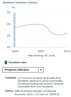
Shared contribution and responsibility in Australia has regressed over the last decade
Indicator: Resident taxation rate
Why is this element important?
Shared contribution and responsibility is important to progress as it is about ensuring that everyone in the community contributes towards building the economy that supports fair outcomes. This obligation applies to individuals, and the public and private sectors due to the large role they play in the Australian economy.
We have decided that shared contribution and responsibility in Australia has regressed over the last decade because the resident taxation rate (our progress indicator for shared contribution and responsibility) has decreased.
In 2001-02, taxes payable by residents to the Australian government were equal to 28.4% of their gross disposable income. While this grew gradually during the early part of the decade, the rate peaked at 30% in 2005-06, after which point the rate declined. In the 2011-12 financial year, the rate was 26.3% which is 2.1 percentage points lower than the decade previous.
Why this progress indicator?
The resident taxation rate tells us about shared contribution and responsibility as part of the aspiration for fair outcomes.
The resident taxation rate is considered a good measure of progress for shared contribution and responsibility because it measures the extent to which individuals and corporations contribute towards public administration through taxation. In order for governments to fund public works and programs that benefit the community, it is necessary that they collect revenue through taxation. The resident taxation rate measures the amount of taxes payable by residents (that is, both individuals and corporations) to the Australian government relative to their available gross disposable income. Progress is shown by an increase in this rate which indicates that Australians are collectively contributing a greater amount of their income to the community.
This indicator is a partial measure of shared contribution and responsibility.
The data source is of high quality.
Let's break it down!
A more complete picture of tax liabilities is often gained by looking at historical trends. Since the early 1960s, the level of taxes payable relative to available income has generally trended upwards with significant declines only occurring during downturns in economic activity. The most recent decline in the taxation rate following the global financial crisis of 2007-08 is notable as it is a sustained reversal of the general upwards trend of the series over preceding years.
Use the drop down menu on the graph to look at other breakdowns of the indicator (graphs are also available on the further info page).
But that is not the whole story...
There is more to fair outcomes than shared contribution and responsibility. Look through the other tabs on this page to see if the other elements of fair outcomes have progressed.
Check out our further info page for useful links, a glossary and references relating to this chapter.
Document Selection
These documents will be presented in a new window.
This page first published 14 November 2013, last updated 8 May 2014

(b).gif)
.gif)