|
|
The tabs across the top of this page provide information about the MAP dashboard, how to navigate MAP and its structure, its graphs, and how to find further information.
The MAP Dashboard
To assist readers in gaining a quick 'at a glance' view of recent progress in Australia, Measures of Australia's Progress (MAP) presents a 'traffic light' dashboard of headline progress indicators on the MAP home page. The dashboard is arranged into four broad areas of life - society, economy, environment and governance. Each of these areas is made up of themes, which collectively summarise the aspirations that Australians told us were important for progress in these four areas; for example, health (society), opportunities (economy), a healthy environment (environment), and trust (governance).
Progress for each theme is shown by a green tick (for progress), a red cross (for regress), or an orange line (for little or no change). Progress is calculated by comparing two points in time; the most recent point where data is available, and an earlier period (which is dependent upon how much data is available). The blue question marks show where there is no current measure and highlights where we may be able to show indicators in the future.
More information about the headline indicators or measures 'behind' the dashboard symbols is found by simply clicking on the themes. For example, clicking on health will take you to the life expectancy headline indicator, which we use to measure the overall progress of Australia's health. The dashboard format allows you to quickly view all domains of progress at once so you can more readily assess, on balance, whether life in Australia is getting better.
The MAP dashboard is an interactive gateway to a rich picture of progress within Australia. Click on the tabs on each theme page and you will find progress indicators for more areas that Australians told us are important for progress. For example, the tabs on the health page will provide indicators for such areas as physical health, mental health and healthy lifestyles.
While MAP provides a picture of broad national progress, there is also some information available at state level, and by age and gender. Links are provided to further information, including data sources, and detailed tables are available under the downloads heading so you can explore further.
An alternative dashboard view is also provided on the '...by status' tab, to allow the MAP themes to be grouped by their progress status - for example, all the ticks grouped together.
MAP dashboard - what do the symbols mean?
The full explanation of the symbols is as follows:
 The headline progress indicator for this theme has shown progress. The headline progress indicator for this theme has shown progress.
When comparing current data to earliest data included, the change is in a direction which clearly signals progress and, where applicable, that change is statistically significant.
 The headline progress indicator for this theme has shown regress. The headline progress indicator for this theme has shown regress.
When comparing current data to earliest data included, the change is in a direction which clearly signals regress and, where applicable, that change is statistically significant.
 The headline progress indicator for this theme has not changed greatly. The headline progress indicator for this theme has not changed greatly.
When comparing current data to earliest data included, there is no meaningful movement or the movements observed in any direction are not statistically significant.
 There is a data gap for this theme as there is currently no headline progress indicator. There is a data gap for this theme as there is currently no headline progress indicator.
The traffic light format is a visual tool to help you quickly assess whether life in Australia is getting better. To support this, we ensure that the movement shown is an actual movement and is not the result of 'statistical noise'. As is standard procedure, where appropriate, the ABS has undertaken significance testing to determine whether the movements are statistically significant. Statistical significance means a movement or comparison is not likely to have happened just by chance.
|
The new Measures of Australia's Progress (MAP) format is intended to enhance accessibility to the data for all Australians, by making it easy to navigate web product. It is designed to show the most high-level and summary data on the home page to provide a quick overview. More detailed data is presented as you follow the links on the MAP dashboard and 'drill down' into the product. Tabs appear across the top of each page, to allow easy access to all relevant data about that page to minimise scrolling and changing pages.
The panel on the left-hand side of the screen shows the structure of the MAP product and can also be used to navigate between topics. The home page can be accessed by clicking MAP Homepage on the left hand navigation bar.
Links throughout the product will take you to relevant information either within MAP, the ABS website, or external information sources.
|
|
In summary, the product has information at the following levels of detail:
| LEVEL |  | DESCRIPTION |
|
| MAP Homepage | | The MAP Dashboard (by theme and by progress status).
'At a glance' progress assessment of areas that Australians told us were important for progress. Headline themes are grouped under the four broad areas of society, the economy, the environment and governance. The data relates to two points in time only; the beginning and end of a 10 year period, or of the time series available.
What is MAP? animation.
MAP Brochure of headline indicators. |
| | |
| | |
| | |
| | |
| Domain pages | | Provides an overview of each of the four areas in MAP - society, the economy, the environment and governance. |
| | |
| | |
| | |
| | |
| Theme pages and headline progress indicators | | Provides headline progress indicators, explanatory text, graphs and links to further information for the 26 MAP themes. A graph summary tab contains all the graphs included within each theme. |
| | |
| | |
| | |
| | |
| Tabs on theme pages | | Provides progress indicators, explanatory text, graphs and links to further information for important elements of the theme. A graph summary tab contains all the graphs included within each theme. |
| | |
| | |
| | |
| | |
| About MAP pages | | Explains how MAP was developed and how to interpret the product. |
| | |
| | |
| | |
| | |
| Population and Regional progress pages | | A chapter discussing the demographic context for the measurement of progress in MAP.
A chapter discussing progress below the national level and the challenges in providing rural and regional-level information. |
| | |
| | |
| | |
| | |
| Data and Downloads | | All graphed data is provided in an excel spreadsheet for each theme. |
| | |
| | |
| | |
| | |
| Related information | | Previous versions of MAP as well as the MAP consultation report , MAP Information paper, and other relevant information sources are linked for reference. |
| | |
| | |
| | |
| | |
| Feedback | | Details about how to provide feedback for future versions of MAP. |
|
|
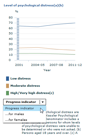
Where possible we have provided graphs to visually represent the information reflected in the commentary. As a new feature of MAP in 2013, you can use the 'multi graph selector' to explore different stories about the indicators. You can access the 'multi graph selector' by clicking on the drop down menu, as illustrated in the graphic below .
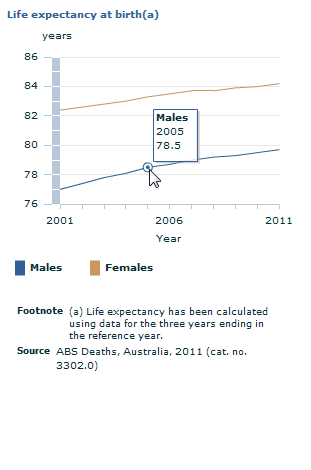
If you want to find out a figure from the graphs on the theme and element tabs, you can simply hover the mouse over the graph at the point of interest. As illustrated in the graphic below, the figure will then appear in a small box.
For devices that are non-flash compatible (e.g. Apple and Android supported devices) only the top level graph will appear as a static image. However, you can still view all graphs on the graph summary tab of the further info page. Note: Graphs are designed to be viewed at 100% zoom within a browser.
Example graphs
| Multi graph selector | Hover over points of interest |
|  |
|
|
We also provide opportunities for users to find out further information about the indicators.
For each theme there is a further info page. The further info pages contain links to useful sections of the MAP publication, such as the glossary, references and graphs. Also provided are helpful links to related ABS and non-ABS pages.
All of the data presented in the commentary and graphs is available in our data cubes. You can access these excel spreadsheet files by clicking on the Data and downloads page on the left hand navigation bar. We also provide links to the source of the data, in the commentary and the spreadsheets, so you can investigate further if you wish.
Our Regional progress page provides specific information about progress in regional areas of Australia and where to go for further regional information.
Our Population page provides specific information about the composition and distribution of the Australian population, as well as information about Aboriginal and Torres Strait Islander and overseas born populations.
|
|
|
|