With the release of the 2016 Census Data, people from all over Australia have begun to delve in and sort through the data. Whether they be Government departments and agencies, local councils, public and non-for-profit organisations, academics, researchers, students, or businesses and local groups, numerous people use Census data for a wide variety of purposes.
Below are some specific examples of how Census data is used:
- Show:
-
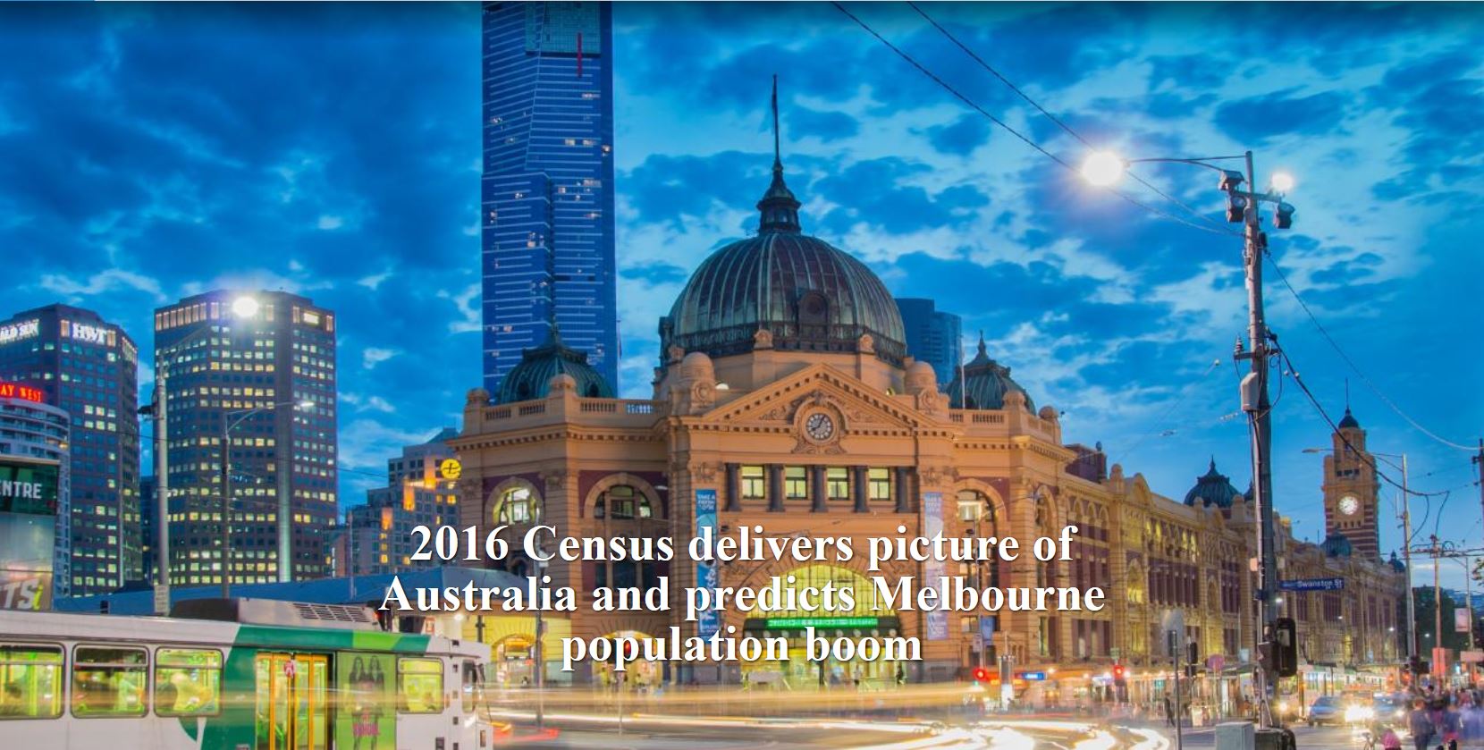
The Age
For generations Melbourne's suburbs have been shaped by cultures and people from all around the world. The interactive map shows where migrants from around the world have settled in Melbourne.
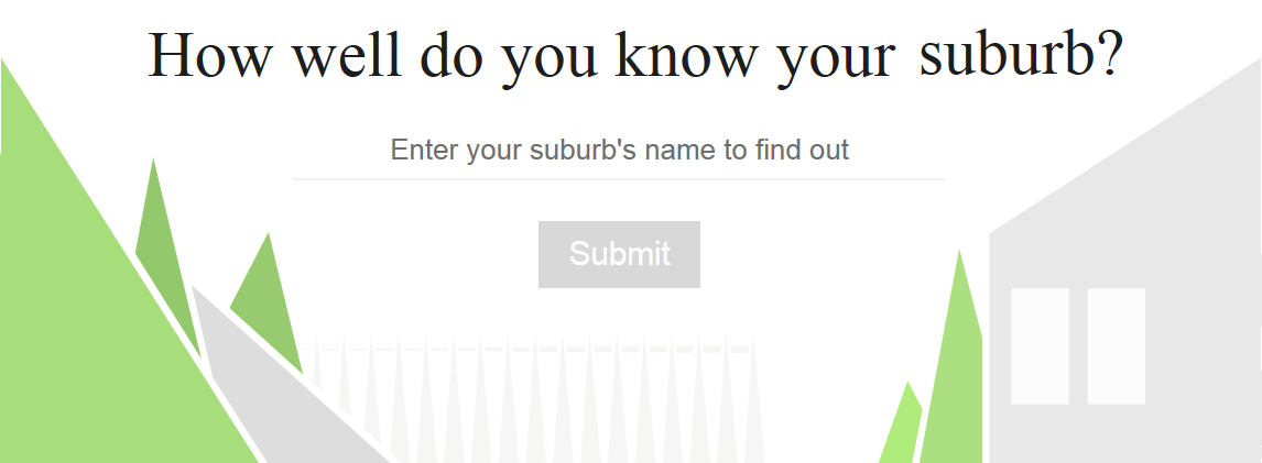
The Age have also developed a fun quiz based on 2016 Census data: How well do you know your suburb?
-
Small Multiples
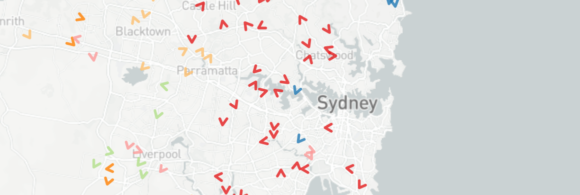
Where people choose to live is important - it's a lively reflection of the past, present and future of Australian cities. Small Multiples have developed a suite of interactive maps that offer a fascinating insight into the cultural diversity of our capital city suburbs.
Check out the maps at the Small Multiples website.
-
SBS Census Explorer
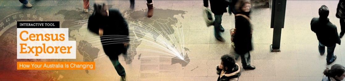
The Census Explorer lets you go behind the statistics to uncover a rich, visual portrait of who we are, where we live, where we come from, and what languages we speak.
To see how your Australia is changing, use Census Explorer on the SBS website.
-
Lifeline
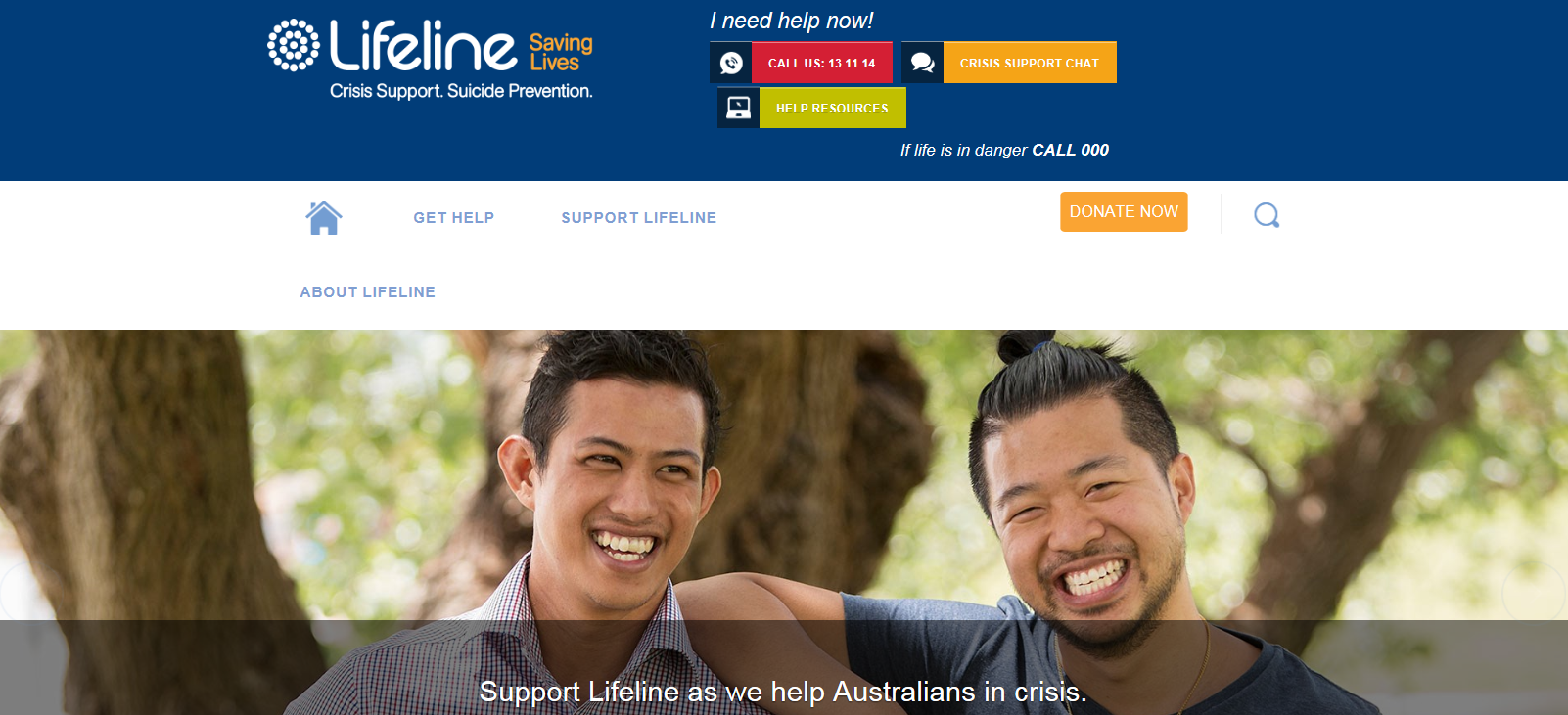
Lifeline is committed to meeting the needs of people from all ages, backgrounds and ethnicities, and uses Census data to better aid the people of Australia.
To find out how Lifeline is using the Census data and the steps they are taking to reach their goals visit Lifeline.
If you ever need help call Lifeline at: 13 11 14.
-
ABC
Reading tables full of data can be hard on the eyes and mind, sometimes the best way to view the information is through visual data.
The folks from ABC News have analysed the results from the 2016 Census, re-imaging the data into a colourful and easy to read infographics.
Find these awesome infographics on the ABC News website.
-
Herald Sun - Kids News
Kids News provides a fun article about the results from the Census for students in the classroom.
The content has been re-written using child appropriate language and provides a safe online environment, allowing pupils to use the site unsupervised or for independent learning.
The article also includes two classroom activities which can be used by teachers to base their lesson around.
Check out the article on the Kids News website.
-
The Guardian
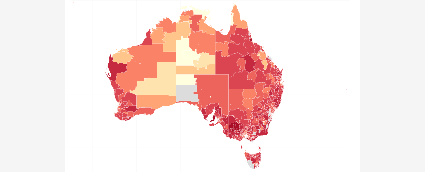
The whizzes from The Guardian have developed a wonderful interactive map that allows you to explore the ABS 2016 Census data.
The map shows results for every region with 100 or more people within categories such as average household size, languages spoken, male to female ratio and many more.
Find the maps and more on The Guardian website.
-
Queensland Government
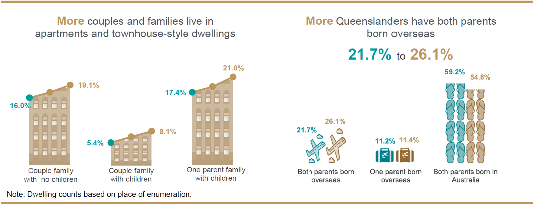
The Queensland Government Statistician's Office website contains a wide range of demographic, economic and social data relating to the State of Queensland.
Access a wide range of documents that provide summary reports, statistical snapshots, highlighting key findings about Queensland's residents, community's and region.
-
ID Consulting
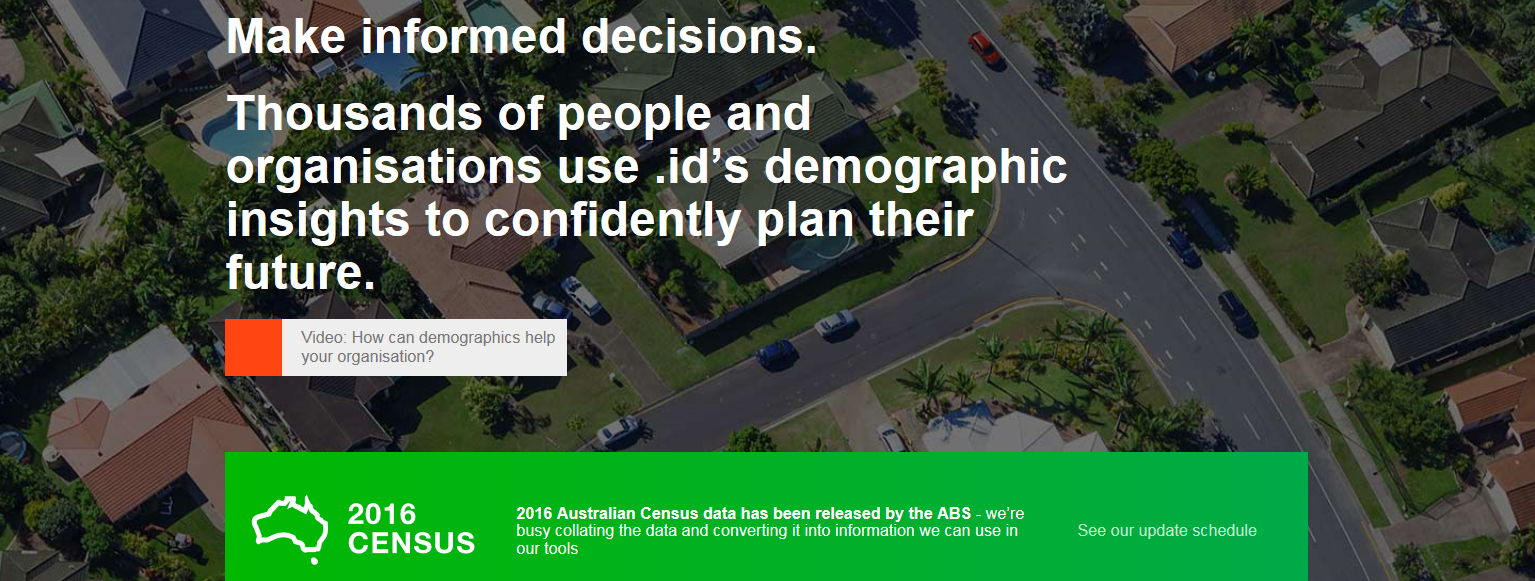
The people from .ID continue to create helpful tools that use Census data allowing you to easily gather in-depth information for local government areas and suburbs within Australia.
Tools such as Community Profiles, Populations Forecasts and Social Atlases are used by a diverse range of clients including to make confident decisions about when and where to locate their services based on demographic and economic evidence.
Find creative tools on the ID Consulting website.
-
The Guardian
Are people moving into your area or away? Is the population getting older? Has the cost of housing gone up?
The Guardian has developed another helpful tool; the Census Stories, allowing you to view how your town or suburb has changed over 10 years though easy to read information and charts.
Check out the page on The Guardian website.
-
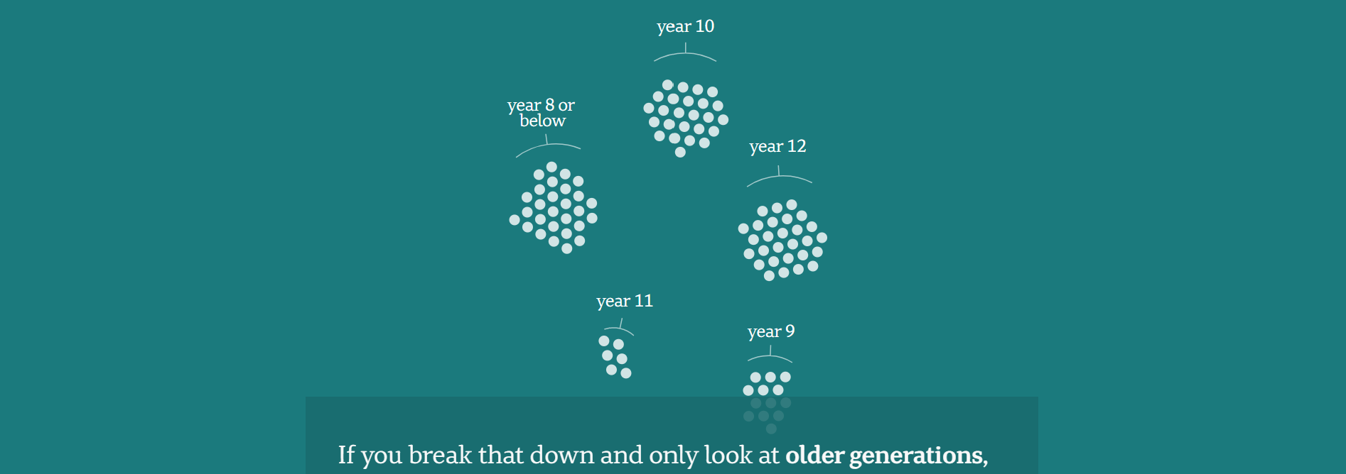
McCrindle
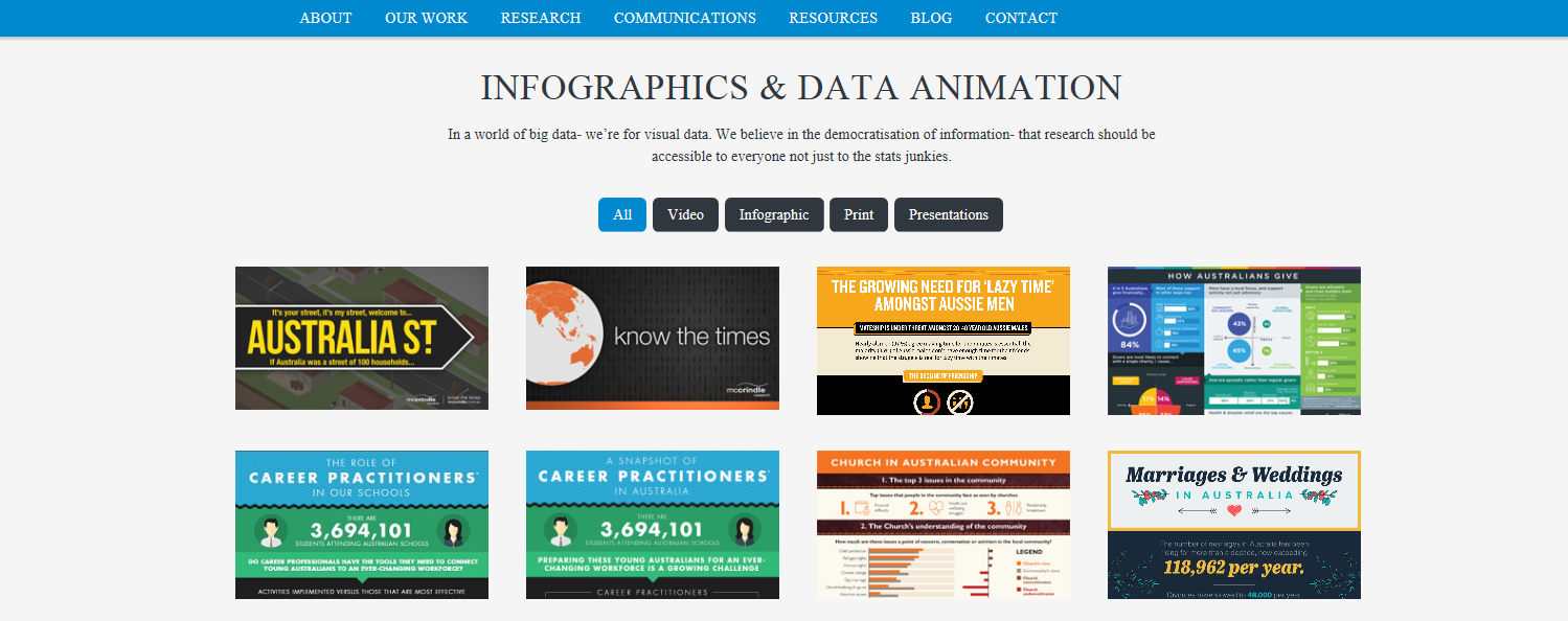
The team from McCrindle are experts in analysing the results from the Census, re-imaging the data into colourful and easy to read infographics and data animations that help every day users understand the data; believing in the free flow of information, "research should be accessible to everyone, not just to the stats junkies".
Check out their infographics on the McCrindle website.