Page tools:
 Print Page Print Page
 Print All Print All
| ||
|
HEALTH The Health section contains the following sub-topics:
LATEST HIGHLIGHTS Men's life expectancy is increasing at a greater rate than women's Latest data from ABS Deaths, Australia shows that women continue to have a longer life expectancy than men. Data from 2011-13 show that women's life expectancy is 84.3 years, while men's is 80.1 years. However, the gap between male and female life expectancy has slightly narrowed. Over the last 10 years, male life expectancy has increased by 2.3 years, from 77.8 years in 2001-03. Female life expectancy has increased by 1.5 years in this time, from 82.8 in 2001-03. GRAPH: Life Expectancy at Birth (years) for Males and Females, 2003 to 2013 (a)
 for Males and Females, 2003 to 2013 (a).GIF) Footnote(s): (a) Based on three years of data ending in the year shown in the table Source(s): ABS Deaths, Australia (cat. no. 3302.0) Incidence of cancer declines between 2010 and 2011 Latest data from the Australian Institute of Health and Welfare shows that there has been a decrease in the incidence of cancer for men and women between the last two reference periods. In 2010, the incidence of cancer for men was 591.2 per 100,000 which dropped to 579.7 per 100,000 in 2011. For women, there was a slight decrease as the rate fell from 408.8 per 100,000 in 2010 to 403.6 per 100,000 in 2011. Decline in participation in sport and recreational physical activity Latest data shows that there has been a decline in participation in sport and recreational physical activity for both males and females between 2011-12 and 2013-14. In 2013-14 61% of males aged 15 years and over (age standardised) participated in sport or recreational physical activity, a 5 percentage point decrease from 2011-12. There was also a 4 percentage point decrease for females, from 64% in 2011-12 to 60% in 2013-14.
DATA VISUALISATION 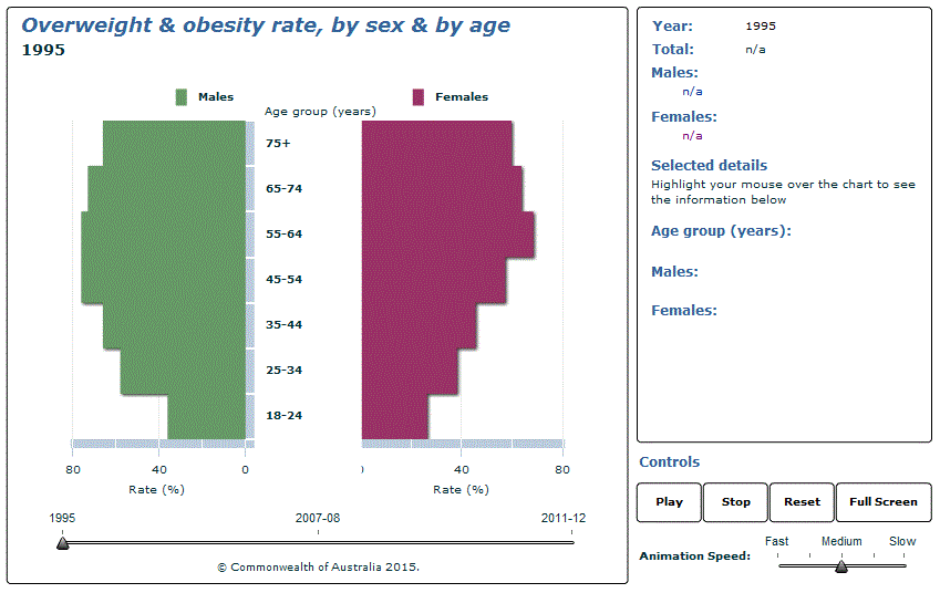 Source(s): Gender Indicators, Australia Document Selection These documents will be presented in a new window.
|
|
4125.0 - Gender Indicators, Australia, Feb 2015
ARCHIVED ISSUE Released at 11:30 AM (CANBERRA TIME) 24/02/2015

This page last updated 24 August 2015